INTERACT FORUM

Please login or register.

Login with username, password and session length
Advanced search  

Poll

Do you use the up/down clicky bits at the ends of scroll bars?

Yes
- 1 (10%)
No
- 7 (70%)
Sometimes
- 2 (20%)

Total Members Voted: 9


Pages: [1] 2   Go Down

Author Topic: seamless skin preview  (Read 27175 times)

marko

  • MC Beta Team
  • Citizen of the Universe
  • *****
  • Posts: 9137
seamless skin preview
« on: March 07, 2009, 06:15:30 am »

I've been kicking some new skin ideas about over here...

When creating 'Black and Blue', it occurred to me that scroll bars are just about everywhere in MC (except the search wizard, right? ;)) and their appearance can have a dramatic effect on the overall skin experience...

I've been thinking about how we use scroll bars these days, and for me, I never use the clicky bits. I either scroll with mouse wheel, grab the slider and drag, or very occasionally, I hold the mouse down in the scroll bar area to bring the slider to the cursor.

I am interested to find out if that's the same for everyone. Are those clicky bits essential for some usage scenarios?
In my sketches, the clicky bits would still be clicky bits, but you wouldn't know that by looking...

Seamless:
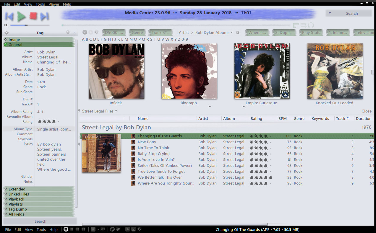


As attached. (attachments only available when logged into the forum)

Edit (30/08/2010)
The attached png file fixes the missing pause button when playing last.fm radio. Save it into the skin directory overwriting the existing file. The same file will work for both Glass and Standard versions of the skin. Removed as it is now included in the attached, updated, skin archive.

Edit (05/09/2017)
Updated the attached archive with the new tag window, as shown in the picture above.

Updated (28/01/2018)
Fixed the squished tag window icons, and, whilst there, completely reworked the look of the groups to be more fitting with the rest of the skin.

Updated (24/11/2019)
Added suitable colours for the new MC 26 waveform progress bar.

Updated (12/06/2022)
Integrity checked xml vs filenames. Skin should now work correctly on Linux.
Added a Spotlight button.
Set the Spotlight page background colour.
Added greyscale icons throughout.

Edit (04/02/2023):
Updated attached mjp file, which should now work for Linux and Mac as well as Windows.

Download is via a Media Center package installer file which is attached to this post. Simply download the file and double click to have MC download and apply the skin.
Package installer files only work on Windows. If using another OS, open the mjp file in a text editor, copy the download link and manually install the downloaded skin into your MC standard view skins folder.

-marko

Mr ChriZ

  • Citizen of the Universe
  • *****
  • Posts: 4375
  • :-D
Re: Scroll bar up/down arrows (the clicky bits at each end)
« Reply #1 on: March 07, 2009, 07:37:04 pm »

I think one problem you may find is that the click bits have a minimum size, so something has to go there even if it's nothing, if that makes any sense.

skeeterfood

  • Citizen of the Universe
  • *****
  • Posts: 779
  • We're all just food for the skeeters.
Re: Scroll bar up/down arrows (the clicky bits at each end)
« Reply #2 on: March 09, 2009, 10:21:46 pm »

I don't think I've touched a scroll-bar except for VERY LONG documents since the dawn of the scroll mouse :)  The "clicky bits" are just wasted space in my book.

-John
Logged

dcwebman

  • Citizen of the Universe
  • *****
  • Posts: 2154
Re: Scroll bar up/down arrows (the clicky bits at each end)
« Reply #3 on: March 10, 2009, 07:39:13 am »

There are sometimes in various programs when scrolling otherwise just scrolls too much so I have to use the ends of the scroll bar to make sure I am only scrolling by a tiny bit.
Logged
Jeff

marko

  • MC Beta Team
  • Citizen of the Universe
  • *****
  • Posts: 9137
Re: Scroll bar up/down arrows (the clicky bits at each end)
« Reply #4 on: March 13, 2009, 03:18:50 am »

Hmmm...
The project was to create a (as much as possible) seamless skin...


(click for full size preview)

Started work on the player display area...
I'm still in half a mind to bin it as a bad idea, but will continue for a while longer...

If I arrive at something that I feel works, anyone want to test drive it for me?

-marko.

Screenshot updated - 03/05/09

Mr ChriZ

  • Citizen of the Universe
  • *****
  • Posts: 4375
  • :-D
Re: Scroll bar up/down arrows (the clicky bits at each end)
« Reply #5 on: March 13, 2009, 03:34:09 am »

Looking good Marko!

marko

  • MC Beta Team
  • Citizen of the Universe
  • *****
  • Posts: 9137
Re: Scroll bar up/down arrows (the clicky bits at each end)
« Reply #6 on: March 16, 2009, 12:52:34 pm »

cheers Mr Chriz,
updated screenshot above. The file list, tree and action window slowly coming together. So far, works better than expected... I shall continue with this a while longer yet.

Player bar next, then on to the options stuff....

llafriel

  • World Citizen
  • ***
  • Posts: 230
Re: Scroll bar up/down arrows (the clicky bits at each end)
« Reply #7 on: March 18, 2009, 11:03:16 am »

A bit OT here but how did you add the 3 ekstra items in the left menu? 'Where is it?', 'Workshop' and '3D Albums'?
Logged

llafriel

  • World Citizen
  • ***
  • Posts: 230
Re: Scroll bar up/down arrows (the clicky bits at each end)
« Reply #8 on: March 18, 2009, 11:04:54 am »

Nevermind, figured it out myself..
Logged

Doof

  • MC Beta Team
  • Citizen of the Universe
  • *****
  • Posts: 5908
  • Farm Animal Stupid
Re: seamless skin preview
« Reply #9 on: March 21, 2009, 11:29:15 pm »

Another totally off topic question... how did you get your thumbnails to lump 0-9 into one group, but then all of the others are only individual letters? If I set the Grouping to 1, then I get seperate groups for each number, in my case I have a 1, 3, and 4.
Logged

marko

  • MC Beta Team
  • Citizen of the Universe
  • *****
  • Posts: 9137
Re: seamless skin preview
« Reply #10 on: March 22, 2009, 06:09:34 am »

Another totally off topic question... how did you get your thumbnails to lump 0-9 into one group, but then all of the others are only individual letters? If I set the Grouping to 1, then I get seperate groups for each number, in my case I have a 1, 3, and 4.
I got there using a custom library field. I called it Artists. It's a 'calculated data' field using the template:

if(isequal([album artist (auto)],multiple,8),/(various/),if(isequal(mid([album artist (auto)],0,4),the/ ,1),mid([album artist (auto)],4,1),if(isequal(Mid([album artist (auto)],0,1),1,6),0 - 9,Mid([album artist (auto)],0,1)))

In my library, I keep "The Beatles" as "The Beatles" as I really don't like the "Beatles, The" approach, however, the expression above will list "The Beatles" under "B", "The Rolling Stones" under "R", etc. etc.
Hope you find it useful :)

Yesterday, I worked on the search bar and thumbnail slider, and tossed around some player button ideas...
I've been trying to work a bit more colour into the skin, and so far, failing abysmally, winding up with neutral greys...
I'm not going to touch it today as I will be helping the 'children' (all over 20 now) make a fuss of the wife on her day, and I'll be pushed for time next week as we're short staffed at work, I think the break will be good!!

Is the work so far really not piquing anyone's interset?

-marko.

ThoBar

  • Citizen of the Universe
  • *****
  • Posts: 992
  • Was confishy
Re: seamless skin preview
« Reply #11 on: March 22, 2009, 08:17:38 pm »

Looking foward to trying this skin... I like where you're going....
Logged

phalanthus

  • Galactic Citizen
  • ****
  • Posts: 461
Re: seamless skin preview
« Reply #12 on: March 23, 2009, 03:56:28 am »

looks good- keep at it
Logged

phalanthus

  • Galactic Citizen
  • ****
  • Posts: 461
Re: seamless skin preview
« Reply #13 on: April 09, 2009, 04:24:29 pm »

thanks to marko i have the skin and like it - i hope he keeps working on it. ;D
Logged

marko

  • MC Beta Team
  • Citizen of the Universe
  • *****
  • Posts: 9137
Re: seamless skin preview
« Reply #14 on: April 13, 2009, 01:41:17 am »

He's still working at it...
He's spent the past 3 days messing around with the frame button!!

Here, you can see the disabled, the normal, and the mouse-over states...


I'm still not happy. I may 'make do' with a button that has a clear and precise outline. I'm going to leave it alone for a few days as I find I've been going round in circles with it. I need it to sit nicely against this green, and also the cold blue/grey of the GUI background, I also need/want there to be no doubt about the button states, as sometimes, such as the "enable pane tagging" dialogue, one of the buttons is already active, and with some of my efforts, I've felt that it's not immediately apparent which button will be fired by pressing the Enter key...

Mr ChriZ

  • Citizen of the Universe
  • *****
  • Posts: 4375
  • :-D
Re: seamless skin preview
« Reply #15 on: April 13, 2009, 01:42:55 am »

Love the buttons! :-)

phalanthus

  • Galactic Citizen
  • ****
  • Posts: 461
Re: seamless skin preview
« Reply #16 on: April 13, 2009, 10:05:17 am »

 ;D ;D looking great
Logged

marko

  • MC Beta Team
  • Citizen of the Universe
  • *****
  • Posts: 9137
Re: seamless skin preview
« Reply #17 on: May 03, 2009, 11:14:45 am »

Updated Screenshot.

Do you think those player control buttons are a bit too "Fischer-Price"?

Mr ChriZ

  • Citizen of the Universe
  • *****
  • Posts: 4375
  • :-D
Re: seamless skin preview
« Reply #18 on: May 03, 2009, 11:21:39 am »

No I like them!   :)

phalanthus

  • Galactic Citizen
  • ****
  • Posts: 461
Re: seamless skin preview
« Reply #19 on: May 06, 2009, 09:46:18 pm »

 ;D ;D i second that
finished product soon i hope
Logged

marko

  • MC Beta Team
  • Citizen of the Universe
  • *****
  • Posts: 9137
Re: seamless skin preview
« Reply #20 on: May 17, 2009, 02:07:55 pm »

I'm still not wildly enthusiastic about this skin. It's taken quite a while, so far, and doesn't feel quite 'right' somehow ?

Anyhoo, I think this skin is perhaps one that MC beginners might not like too much as it trys to remove all the area defining borders in the program. I remember being glad of a skin with clearly defined areas, as it helps a lot when you're learning your way around the program, once you've learned though, you might find it all a tad compartmentalised and claustrophobic, and you might look for a seamless skin!!
Of course, everyone is not me, and you might like this from the get-go, regardless of your place on the learning curve, why not try, and decide, and let me know what you think.

There's a release candidate available for download here. (removed. see first post.)

As always, any feedback, suggestions, thoughts, things I missed, greatly appreciated.

regards,
-marko.

Mr ChriZ

  • Citizen of the Universe
  • *****
  • Posts: 4375
  • :-D
Re: seamless skin preview
« Reply #21 on: May 17, 2009, 02:38:47 pm »

I've just downloaded it, and I think it looks awesome. 
Definitley one of the best most complete 3rd party skins I've seen in ages.
Cheers Marko.

gbrav

  • Member
  • *
  • Posts: 1
Re: seamless skin preview
« Reply #22 on: May 17, 2009, 03:30:56 pm »

  I may have a replacement for your Black and Blue skin.

  Thanks.
Logged

marko

  • MC Beta Team
  • Citizen of the Universe
  • *****
  • Posts: 9137
Re: seamless skin preview
« Reply #23 on: May 22, 2009, 10:18:31 am »

Cheers Mr. ChriZ, and gbrav, first post, you old lurker you!! Glad you're enjoying both skins :)

If you're interested, I've added a "Slim" view image and a 'group header' graphic.

I've also managed to get the skin down to under 200 Kb!!

-marko.

marko

  • MC Beta Team
  • Citizen of the Universe
  • *****
  • Posts: 9137
Re: seamless skin preview
« Reply #24 on: May 27, 2009, 01:10:39 am »

I was looking at some skin screenshots I'd posted here on a PC at work, and they looked bad... really, really bad!

I received a new 24" monitor for my birthday back in April, an HPw2448hc.
It's not a bad monitor, but not outstanding either. Viewing angles a very poor, face on or nothing baby, and an 'all black' screen displays slight backlight bleeding, especially along the bottom.
It does sport a webcam/mic and a two USB ports though which is nice, and in regular use, the backlight bleeding is not noticeable.

The nice people at digitalversus have provided a calibration file for this monitor, and while I understand it might not be absolutely 100% accurate due to the calibration not being performed on this actual monitor, the difference is huge, and I tried in vain, for too long, to try and get close using the manual settings, so, respect is due to them, as far as I'm concerned.

Here, the main background colour of the skin is a cold blue/grey, and the greens in the menus and dialogue backgrounds is perhaps very slightly darker than duck egg green.
On the work PC, the green was barely recognisable as green, showing as really dark and dirty, and disappointing.

I got to wondering if it's just the crap kit at work, or if the rest of the world was seeing something similar?
I'm also assuming that there's very little I can do about it, right?

-marko.

Daydream

  • Citizen of the Universe
  • *****
  • Posts: 771
Re: seamless skin preview
« Reply #25 on: May 31, 2009, 03:21:01 am »

Here, the main background colour of the skin is a cold blue/grey, and the greens in the menus and dialogue backgrounds is perhaps very slightly darker than duck egg green.

On a monitor with "warmer" settings there is no cold blue/gray, and the dialog background green is... let's say it's not helped. As I have 3 Samsungs of different series that proved impossible to be calibrated to the same color tones, I can see some of the differences you're mentioning. Time for a Spyder3Pro! :D
Logged

marko

  • MC Beta Team
  • Citizen of the Universe
  • *****
  • Posts: 9137
Re: seamless skin preview
« Reply #26 on: June 02, 2009, 01:11:47 am »

Quote
Time for a Spyder3Pro!

For you, or for me?

marko

  • MC Beta Team
  • Citizen of the Universe
  • *****
  • Posts: 9137
Re: seamless skin preview
« Reply #27 on: August 31, 2009, 01:19:42 am »

Has anybody with a properly calibrated screen tried this skin?

I'm wondering whether I should submit this skin, or just leave it as a secret download in here?
I have not done any further work on it, and have been using it, since the last update in May.
It kind of grows on you, and nothing about it has annoyed me thus far...

-marko

kurushi

  • Citizen of the Universe
  • *****
  • Posts: 683
Re: seamless skin preview
« Reply #28 on: November 27, 2009, 10:16:20 am »

HI
This skin is very original and i like the "flat" style.
Scketchy buttons are simply funny.
A excellent idea for the tiny title bar.

Maybe too white in my screen (padkard bell maestro default settings)
(it 'll be good with old paper textures and blue polices.)

I 'll use it.
Thx.
Logged

marko

  • MC Beta Team
  • Citizen of the Universe
  • *****
  • Posts: 9137
Re: seamless skin preview
« Reply #29 on: March 23, 2010, 04:09:43 am »

Despite my original misgivings over this skin, plus the doubt over how it looks on other monitors out there, it has really grown on me. I use the 'glass' version all the time, and have added that to the first post as an optional download. Both skins will work with the soon to surface Media Center 15.

-marko.

gappie

  • MC Beta Team
  • Citizen of the Universe
  • *****
  • Posts: 4580
Re: seamless skin preview
« Reply #30 on: March 23, 2010, 07:29:00 am »

it is a very nice skin, marco.. im gonna use it for my other library. very nice icons and original thoughts.. and i like it when a skin is not to 3disch.. im gonna enjoy using this one.

thanks
 :)
gab
Logged

marko

  • MC Beta Team
  • Citizen of the Universe
  • *****
  • Posts: 9137
Re: seamless skin preview
« Reply #31 on: August 30, 2010, 01:20:22 pm »

New "Pause" button, with inactive button for last.fm radio play included attached to first post.

Regards,
-marko

gappie

  • MC Beta Team
  • Citizen of the Universe
  • *****
  • Posts: 4580
Re: seamless skin preview
« Reply #32 on: September 15, 2010, 04:19:40 pm »

did you ever submitted this skin.. i really like it and its my favorite second skin. but could not find it on the skin page..

 :)
gab
Logged

kurushi

  • Citizen of the Universe
  • *****
  • Posts: 683
Re: seamless skin preview
« Reply #33 on: September 16, 2010, 04:49:26 am »

Hi,
Gappie the dl link is on the first post :)
Logged

marko

  • MC Beta Team
  • Citizen of the Universe
  • *****
  • Posts: 9137
Re: seamless skin preview
« Reply #34 on: September 16, 2010, 11:55:28 am »

Hi gappie, I didn't submit this skin as yet. I was a little put-off by "my choice of colours and the LCD temperature settings" thing....

I was looking at some skin screenshots I'd posted here on a PC at work, and they looked bad... really, really bad!

I received a new 24" monitor for my birthday back in April, an HPw2448hc.
It's not a bad monitor, but not outstanding either. Viewing angles a very poor, face on or nothing baby, and an 'all black' screen displays slight backlight bleeding, especially along the bottom.
It does sport a webcam/mic and a two USB ports though which is nice, and in regular use, the backlight bleeding is not noticeable.

The nice people at digitalversus have provided a calibration file for this monitor, and while I understand it might not be absolutely 100% accurate due to the calibration not being performed on this actual monitor, the difference is huge, and I tried in vain, for too long, to try and get close using the manual settings, so, respect is due to them, as far as I'm concerned.

Here, the main background colour of the skin is a cold blue/grey, and the greens in the menus and dialogue backgrounds is perhaps very slightly darker than duck egg green.
On the work PC, the green was barely recognisable as green, showing as really dark and dirty, and disappointing.

I got to wondering if it's just the crap kit at work, or if the rest of the world was seeing something similar?
I'm also assuming that there's very little I can do about it, right?

-marko.

I wasn't exactly deluged with "It's just your cheapskate bosses at work, it looks great here" responses, which gave me the impression that those of us that had our LCDs set right might be in the minority.
You think I should submit it anyway?

-marko.

eba

  • Galactic Citizen
  • ****
  • Posts: 351
Re: seamless skin preview
« Reply #35 on: September 16, 2010, 12:41:18 pm »

I love this skin - it's been the only skin I've used since you put it here last year :)

Thanks Marko

kurushi

  • Citizen of the Universe
  • *****
  • Posts: 683
Re: seamless skin preview
« Reply #36 on: September 19, 2010, 05:59:40 am »

Oops sorry for the mistake :p
Marko you should release it it's a great skin with really good ideas!
Logged

gappie

  • MC Beta Team
  • Citizen of the Universe
  • *****
  • Posts: 4580
Re: seamless skin preview
« Reply #37 on: September 19, 2010, 07:46:02 am »

Hi gappie, I didn't submit this skin as yet. I was a little put-off by "my choice of colours and the LCD temperature settings" thing....

I wasn't exactly deluged with "It's just your cheapskate bosses at work, it looks great here" responses, which gave me the impression that those of us that had our LCDs set right might be in the minority.
You think I should submit it anyway?

-marko.
im sorry marco.. im not in anyway an expert about this. it looks great on the two monitors i have. a nice dell and a cheap big benq. if i like a skin i use it, if i dont like it i wont, im not going to callibrate a monitor for a skin. im a cheapskate in those cases for shure.
but i do think you should submit, its one of the more original skins.

 :)
gab
Logged

maxxsid

  • MC Beta Team
  • Citizen of the Universe
  • *****
  • Posts: 866
Re: seamless skin preview
« Reply #38 on: June 08, 2012, 01:46:36 am »

Hi Marko / All,
Any idea why this expression stopped working?

if(isequal([album artist (auto)],multiple,8),/(various/),if(isequal(mid([album artist (auto)],0,4),the/ ,1),mid([album artist (auto)],4,1),if(isequal(Mid([album artist (auto)],0,1),1,6),0 - 9,Mid([album artist (auto)],0,1)))

That's Artists custom field by Marko.


Thanks!
--max
Logged

MrC

  • Citizen of the Universe
  • *****
  • Posts: 10462
  • Your life is short. Give me your money.
Re: seamless skin preview
« Reply #39 on: June 08, 2012, 11:04:18 am »

Logged
The opinions I express represent my own folly.

maxxsid

  • MC Beta Team
  • Citizen of the Universe
  • *****
  • Posts: 866
Re: seamless skin preview
« Reply #40 on: June 08, 2012, 11:24:44 am »

Cool - thanks much! I actually counted parentheses but miscounted, apparently..

See: http://yabb.jriver.com/interact/index.php?topic=72309.0
Logged

Maverick07

  • World Citizen
  • ***
  • Posts: 104
Re: seamless skin preview
« Reply #41 on: June 09, 2012, 05:41:28 pm »

hey marko,
i know its a little bit of topic, but....

do you know how to fix the problem with the 1px wide scrollbar like "Arctic Winter" or the Metro skin.
What i mean is that sometimes if you click in at a different View / Folder, the scrollbar appears and is about 10px wide
=> if you select an item the scrollbar disappears - "no" scrollbar - again "seamless"

any idea?
 
Logged

SkGe

  • Galactic Citizen
  • ****
  • Posts: 433
Re: seamless skin preview
« Reply #42 on: June 10, 2012, 05:34:13 am »

hey marko,
i know its a little bit of topic, but....

do you know how to fix the problem with the 1px wide scrollbar like "Arctic Winter" or the Metro skin.
What i mean is that sometimes if you click in at a different View / Folder, the scrollbar appears and is about 10px wide
=> if you select an item the scrollbar disappears - "no" scrollbar - again "seamless"

any idea?
 
There is a bug or a glitch of how the skin work with the scrollbar.
That problem occur for me as well, when i did try to create the skin with scrollbar small as possible, but that glitch appear all the time. If you create a 1x1 pixel, sometimes appear larger than it use to be, use F5 to refresh it, and it will get back to the size you have done it.
So far i don't find a way to solve this problem so you need to deal with that :D
Logged

marko

  • MC Beta Team
  • Citizen of the Universe
  • *****
  • Posts: 9137
Re: seamless skin preview
« Reply #43 on: September 05, 2017, 12:51:13 am »

Is anyone still using this? It had 70-odd downloads in the seven years since I posted it, so maybe not the most popular skin in the world, but it's here, so I'll try to keep it current.

It's an interesting skin in as much as it was the precursor to my first skin without vertical scrollbars. This one has no 'up/down' arrows. When I pushed the idea to no vertical scrollbar at all, it proved to be a pretty popular idea.

Here, I've tweaked the Action Window header bars, just slightly, to get them to blend in more, and added skinning for the new tag window that keeps with the "Seamless" theme the skin was aiming for. See updated pic in the first post for that.

Sadly, I seem to have lost all of the psd files for this skin, so updating it to include scaling and retina displays is out of the question. Apart from the scaling, as far as I can tell, it all still works fine with MC23.

The archive attached to the first post contains the updated skin.

Enjoy,
-marko

marko

  • MC Beta Team
  • Citizen of the Universe
  • *****
  • Posts: 9137
Re: seamless skin preview
« Reply #44 on: January 28, 2018, 05:19:52 am »

That's the squished tag window icons fixed in this skin too. Think that's them all done now.

I've completely reworked the look of the new tag window in this skin to be more fitting with the look and feel of the rest of the skin.

Download is via a Media Center package installer file which is attached to the first post. Simply download the file and double click to have MC download and apply the skin.
Package installer files only work on Windows. If using another OS, open the mjp file in a text editor, copy the download link and manually install the downloaded skin into your MC standard view skins folder.

-marko

swiv3d

  • Guest
Re: seamless skin preview
« Reply #45 on: June 14, 2018, 12:30:56 pm »

I like it. My standard MC screen.
Logged

marko

  • MC Beta Team
  • Citizen of the Universe
  • *****
  • Posts: 9137
Re: seamless skin preview
« Reply #46 on: June 14, 2018, 02:22:22 pm »

Thank you for taking the time to say so. Glad to hear you're enjoying it.

-marko

marko

  • MC Beta Team
  • Citizen of the Universe
  • *****
  • Posts: 9137
Re: seamless skin preview
« Reply #47 on: November 24, 2019, 09:15:44 am »

Updated (24/11/2019)
Added suitable colours for the new MC 26 waveform progress bar.

eba

  • Galactic Citizen
  • ****
  • Posts: 351
Re: seamless skin preview
« Reply #48 on: March 13, 2022, 06:24:28 am »

I love this skin - it's been the only skin I've used since you put it here last year :)

Thanks Marko

Just to update on this, 11 1/2 years later, still the only skin I use!

Thanks again!  ;D

marko

  • MC Beta Team
  • Citizen of the Universe
  • *****
  • Posts: 9137
Re: seamless skin preview
« Reply #49 on: June 12, 2022, 11:57:15 am »

Just to update on this, 11 1/2 years later, still the only skin I use!

Thanks again!  ;D
You're most welcome, thank you for taking the time to post.

I've just posted an update for this, changes are below. If you're not a fan of the greyscale icons, let me know...

Updated (12/06/2022)
Integrity checked xml vs filenames. Skin should now work correctly on Linux.
Added a Spotlight button.
Set the Spotlight page background colour.
Added greyscale icons throughout.
Pages: [1] 2   Go Up