INTERACT FORUM

Please login or register.

Login with username, password and session length
Advanced search  
Pages: [1]   Go Down

Author Topic: Knit-Knots  (Read 15505 times)

marko

  • MC Beta Team
  • Citizen of the Universe
  • *****
  • Posts: 9143
Knit-Knots
« on: January 17, 2012, 03:33:27 am »


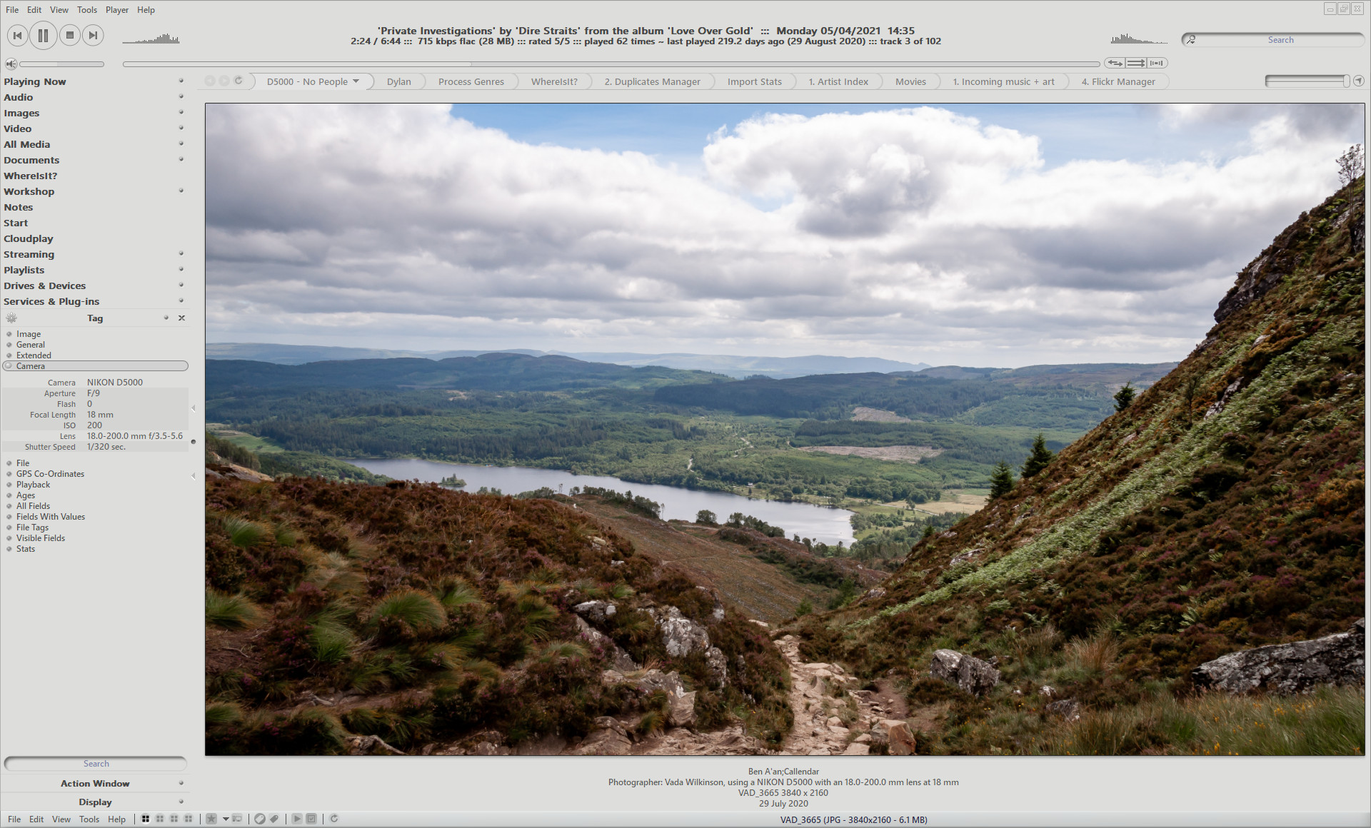
After completing "Seamless" almost two years ago, despite my original misgivings, I've used it almost exclusively. This skin follows the same 'remove the boundaries' concept of Seamless...

A skin with no colour (apart from the "Mute" warning) - Knit-Knots.
Knit-Knots works best with the icon sets shared by Maverick07. I don't have permission to share, and am not sure of the links to them anymore, but they are really neat colourless icons that work well with many skins, especially this one! I don't think the default MC coloured tile icons fit so well, but hey, that may just be me!

Maverick, is there any possibility you can provide a link for those icon sets?

-marko

EDIT - 22/12/2014
anyone still using this?
The recent change to a dynamically changing search bar length kind of messed up the signature cut outs at the ends of the player bar in this skin. It's also messed up the symmetry of the top bar in all skins, making it all but impossible to get the player display placed centrally between the transport buttons and the search bar, but heyho...
As it's one my favourites that I still use mostly all the time, I couldn't take the mess in the top right any longer, so set about changing it. I've had to re do the top bar, which required that the transport buttons be raised a pixel or five. The attached "PlayerBar.zip" file contains the six images required to fix the skin as shown above. Just download and extract into your Knit-Knots folder, replacing the existing files and reload the skin. Hope you like it still.

EDIT - 06/09/2017
Updated the skin to include the new tag window.
I've also updated the vertical scrollbars in the "No Scrollbar" version. Much less jarring now.

Updated: 28/01/2018
Squished tag window expanded group icons now fixed in both of these skins.

Updated (24/11/2019)
Added suitable colours for both variations for the new MC 26 waveform progress bar.

Updated (05/04/2021)
Major updates to Knit-Knots. The "NSB" version has not received these updates at this time, but will do, hopefully, sooner than later.

Updated (19/06/2022)
Integrity checked xml vs filenames. Skin should now work correctly on Linux.
Added a Spotlight button.
Set the Spotlight page background colour.
Added greyscale icons throughout.
The "NSB" version is now all caught up. The only difference between these two now, is one has skinny vertical scrollbars and one does not.

Edit (04/02/2023):
Updated attached mjp files, which should now work for Linux and Mac as well as Windows.

Updates are via Media Center "mjp package installer files", both of which are attached to this post. Just double click the mjp file to download and apply the skin.

Enjoy :)
-marko

kurushi

  • Citizen of the Universe
  • *****
  • Posts: 683
Re: Knit-Knots
« Reply #1 on: January 19, 2012, 06:30:16 am »

A lot of originality like you're others skins.
I love integration of the menu to the display and flat rounded tabs are good.
Keep up!
Logged

Fabricio

  • Citizen of the Universe
  • *****
  • Posts: 685
  • No one has patience with me.
Re: Knit-Knots
« Reply #2 on: January 19, 2012, 10:46:33 am »

I like. Excellent work. But I prefer: SPLITTER Data DefaultSize="1", more screen space (I use notebook 14" ;)).

Waiting ...

Fabricio

  • Citizen of the Universe
  • *****
  • Posts: 685
  • No one has patience with me.
Re: Knit-Knots
« Reply #3 on: January 21, 2012, 10:34:27 am »

Thanks ...

Fabricio, from Brazil.

AoXoMoXoA

  • Regular Member
  • Citizen of the Universe
  • *****
  • Posts: 1551
  • I am a kangaroo . . . . no, really!
Re: Knit-Knots
« Reply #4 on: January 21, 2012, 11:01:06 am »

Very nice Marko!
Logged
. . . the game is rigged

Maverick07

  • World Citizen
  • ***
  • Posts: 104
Re: Knit-Knots
« Reply #5 on: January 23, 2012, 09:56:47 am »

ofc you can use them, but i once again note, that most of the icons are only resized eclipse 2 icons by chrfb.

you can find the icons by downloading one of my skins from the deviantart profile...
Logged

lepa

  • MC Beta Team
  • Citizen of the Universe
  • *****
  • Posts: 2033
Re: Knit-Knots
« Reply #6 on: January 27, 2012, 11:22:27 am »

Very nice marko. Thanks fo sharing. As I like mine dark I used negative skin effect and I think this is what I'm using now. Thanks again.
Logged

Magic_Randy

  • MC Beta Team
  • Citizen of the Universe
  • *****
  • Posts: 2367
  • I used to be indecisive, but now I'm not so sure..
Re: Knit-Knots
« Reply #7 on: January 27, 2012, 09:33:10 pm »

Thanks marko :)
Logged

MrC

  • Citizen of the Universe
  • *****
  • Posts: 10462
  • Your life is short. Give me your money.
Re: Knit-Knots
« Reply #8 on: January 27, 2012, 10:15:50 pm »

Soooooo smoooooooooth.
Logged
The opinions I express represent my own folly.

marko

  • MC Beta Team
  • Citizen of the Universe
  • *****
  • Posts: 9143
Re: Knit-Knots
« Reply #9 on: January 28, 2012, 02:26:59 am »

I'm glad you're all enjoying it.

The one thing I'm not quite happy with is the symmetry. The display area is centered within the program window, but I struggled a bit to get the actual display itself to center. It's more noticeable when you pay attention to the little analysers at each end, and couple that with trying to find a happy medium for those who prefer a stop button, and those who don't!!

Still, I quite like what we have, and am still using it. Setting myself the challenge to attempt to smooth away the area defining borders within MC, but still keep it usable has produced a couple reasonable skins so far.
I started something else too, and thought "hey, that looks cool and clever..." then I enabled a few split view variants and it began to look very much like an escher design!! Back to the drawing board... I've not quite thrown in the towel with it, yet.

-marko


Fabricio

  • Citizen of the Universe
  • *****
  • Posts: 685
  • No one has patience with me.
Re: Knit-Knots
« Reply #10 on: January 28, 2012, 05:24:17 am »

I'm glad you're all enjoying it.

The one thing I'm not quite happy with is the symmetry. The display area is centered within the program window, but I struggled a bit to get the actual display itself to center. It's more noticeable when you pay attention to the little analysers at each end, and couple that with trying to find a happy medium for those who prefer a stop button, and those who don't!!

Still, I quite like what we have, and am still using it. Setting myself the challenge to attempt to smooth away the area defining borders within MC, but still keep it usable has produced a couple reasonable skins so far.
I started something else too, and thought "hey, that looks cool and clever..." then I enabled a few split view variants and it began to look very much like an escher design!! Back to the drawing board... I've not quite thrown in the towel with it, yet.

-marko


Waiting news

MrC

  • Citizen of the Universe
  • *****
  • Posts: 10462
  • Your life is short. Give me your money.
Re: Knit-Knots
« Reply #11 on: January 28, 2012, 11:41:07 am »

I know little about the skinning of MC, so pardon perhaps a silly question or two.

I've been wondering if it is possible, for any skins, to:

 - move the Repeat, Shuffle, and DSP Tools buttons could be moved next to the player controls (they really make more sense near the player controls in my opinion)
 - widen the Search box (search text is always cutoff, which makes selecting a word difficult)
 - allow the playback bar to extend as far to the right as possible for maximum positional control
Logged
The opinions I express represent my own folly.

marko

  • MC Beta Team
  • Citizen of the Universe
  • *****
  • Posts: 9143
Re: Knit-Knots
« Reply #12 on: January 29, 2012, 04:57:31 am »

Waiting news
Don't hold your breath for it...

MrC,
Unfortunately, we are unable to move skin elements around like that. We can push them around (relative to each other) a bit within their immediate locations, but that's about it.
Waaay back, the MC search bar used to extend as we typed into it, reducing the player display area to the left as it grew. It was useful, but very ugly. It got dropped. It's size is completely fixed by the software, so no matter the size of the image used, MC will adjust it to fit in that space.

-marko

AoXoMoXoA

  • Regular Member
  • Citizen of the Universe
  • *****
  • Posts: 1551
  • I am a kangaroo . . . . no, really!
Re: Knit-Knots
« Reply #13 on: February 17, 2012, 02:11:29 pm »

Marko, have you decided whether you will go back and remove the scroll bars in Knit-Knots?


Also, is there an easy way to use the colors from Arctic Winter HC in Knit-Knots?
Something I can copy into Knit-Knots or something I can edit easily perhaps?

I really like Arctic Winter but the upper part of Knit-Knot is nice the way the buttons and sliders are separate from the menu items. Ideally the Knit-Knots form with the Arctic Winter colors and lack of scroll bars would be my perfect skin.
Logged
. . . the game is rigged

marko

  • MC Beta Team
  • Citizen of the Universe
  • *****
  • Posts: 9143
Re: Knit-Knots
« Reply #14 on: February 29, 2012, 12:36:20 pm »

Attached to the first post, is "Knit Knots NSB"

Being a lighter skin, the no scrollbars effect was a little more challenging. How does it work for you?

Changing the colours is a big job. I may have a look at that in the near future, we'll see...

AoXoMoXoA

  • Regular Member
  • Citizen of the Universe
  • *****
  • Posts: 1551
  • I am a kangaroo . . . . no, really!
Re: Knit-Knots
« Reply #15 on: February 29, 2012, 12:49:00 pm »

Lookin' good Marko, thank you muchly  :)
Logged
. . . the game is rigged

marko

  • MC Beta Team
  • Citizen of the Universe
  • *****
  • Posts: 9143
Re: Knit-Knots
« Reply #16 on: December 22, 2014, 04:28:04 am »

Anyone still using this?
The recent change to a dynamically changing search bar length kind of messed up the signature cut outs at the ends of the player bar in this skin. It's also messed up the symmetry of the top bar in all skins, making it all but impossible to get the player display placed centrally between the transport buttons and the search bar, but heyho...

As it's one my favourites that I still use mostly all the time, I couldn't take the mess in the top right any longer, so set about changing it. I've had to re do the top bar, which required that the transport buttons be raised a pixel or five. The attached "PlayerBar.zip" file (in first post) contains the six images required to fix the skin as shown above. Just download and extract into your Knit-Knots folder, replacing the existing files and reload the skin.

Hope you like it still.

-marko

marko

  • MC Beta Team
  • Citizen of the Universe
  • *****
  • Posts: 9143
Re: Knit-Knots
« Reply #17 on: September 06, 2017, 01:06:44 am »

New tag window is now skinned.
Vertical scrollbars updated in the "NSB" version.

Both updates are attached to the first post.

Enjoy,

-marko

marko

  • MC Beta Team
  • Citizen of the Universe
  • *****
  • Posts: 9143
Re: Knit-Knots
« Reply #18 on: January 28, 2018, 04:19:22 am »

Both of these have now had their expanded tag window icons fixed.

Files on the server have been updated, so just double click your mjp file (attached to the first post if you need a new one) to download and apply the updated skin.

-marko

marko

  • MC Beta Team
  • Citizen of the Universe
  • *****
  • Posts: 9143
Re: Knit-Knots
« Reply #19 on: February 01, 2018, 12:08:51 am »

The depth of shadow in the expanded tag window group headers has been reduced as I felt they were too deep. Updated screenshot in the first post.

Both archives have been updated on the server.

marko

  • MC Beta Team
  • Citizen of the Universe
  • *****
  • Posts: 9143
Re: Knit-Knots
« Reply #20 on: November 24, 2019, 10:37:42 am »

Updated (24/11/2019)
Added suitable colours for the new MC 26 waveform progress bar.

-marko

marko

  • MC Beta Team
  • Citizen of the Universe
  • *****
  • Posts: 9143
Re: Knit-Knots
« Reply #21 on: April 05, 2021, 10:05:19 am »

Updated (05/04/2021)
Major updates to Knit-Knots. The "NSB" version has not received these updates at this time.

In case anyone was wondering, "Knit Knots" got its name from a kids TV show I used to watch with granddaughter called "The Imagination Movers". Uncle Knit Knots was all beige, and very boring  ;) :D

When the skin was first released, MC had a fixed-width search bar, which allowed the skin to wrap around it, like so:


When the search bar began dynamically changing width, it made a bit of a mess for this skin, and I got a bit disheartened with it. After giving it a spin this weekend for the first time in years, I realised that it was, really, quite ropey, with much I was not happy about, so, you know how it is... once you start 'fixing' things, the job grows arms and legs.

The picture in the first post has been updated to show the changes.
Files on the server have also been updated so the mjp file will pull the new skin.

Will get the NSB version done as soon as time allows.

Updated
The whole player display area (apart from the DSP, shuffle and repeat buttons)
New tabs
Options icons and options control icons
Edit and combo boxes
buttons
tag window (this was really quite bad, is better now)
Action Window header
Pane Headers
List column headers

-marko

marko

  • MC Beta Team
  • Citizen of the Universe
  • *****
  • Posts: 9143
Re: Knit-Knots
« Reply #22 on: June 19, 2022, 12:07:22 pm »

Updated (19/06/2022)
Integrity checked xml vs filenames. Skin should now work correctly on Linux.
Added a Spotlight button.
Set the Spotlight page background colour.
Added greyscale icons throughout.
The "NSB" version is now all caught up. The only difference between these two now, is one has skinny vertical scrollbars and one does not.

A fair bit of work went into these two over this weekend. Knit-Knots received a little bit of polish, and the NSB version has been brought fully up-to-date in line with it. Apologies that took so long to get around to.

There are a few changes in there this time around, so don't hesitate to shout out if you follow these skins and something got broken.
MJP files, as always, are attached to the first post.

Enjoy,

-marko

marko

  • MC Beta Team
  • Citizen of the Universe
  • *****
  • Posts: 9143
Re: Knit-Knots
« Reply #23 on: February 03, 2023, 10:56:46 pm »

Edit (04/02/2023):
Updated mjp files attached in first post, which should now work for Linux and Mac as well as Windows.

EnglishTiger

  • Regular Member
  • Citizen of the Universe
  • *****
  • Posts: 1092
Re: Knit-Knots
« Reply #24 on: February 05, 2023, 06:10:19 am »

ET TrackInfo Plugins are available for Marko's Knit-Knots and Knit-Knots NSB Skins and all his other skins.
You can read about them here - https://yabb.jriver.com/interact/index.php/topic,134776.0.html
or View and Download them here - http:// [url]https://englishtiger.uk/index.html [/URL}
Logged
Apple Mac Mini Desktop Computer with M4 Pro chip with 12 core CPU and 16 core GPU: 24GB Unified Memory, 512GB SSD Storage, Gigabit Ethernet, 3 Thunderbolt5 + 2USBC ports.
Pages: [1]   Go Up