INTERACT FORUM

Please login or register.

Login with username, password and session length
Advanced search  
Pages: [1]   Go Down

Author Topic: Another Feature Request: Reset Selection  (Read 1522 times)

locust

  • Citizen of the Universe
  • *****
  • Posts: 699
Another Feature Request: Reset Selection
« on: October 12, 2011, 08:05:50 am »

Whilst having made a selection of "Lee Combs" in my drop down pane, once I re-click on the pane it is automatically focused on Lee Combs, because I've set the panes to filer both ways. Clicking on another pane will only filter it down more..

My problem is that there is no quick way that I know of to Reset the selection, the closest thing to a short-cut is to press "A" on the keyboard and scroll up one.. The only problem this makes for me, is that this way may be intuitive for me but for my friends who may use my library it may not be..

Scrolling back up to "All Album Artists" is kind of a hassle..

My suggestion once something is selected in a drop down pane when you re-click it, where I've circled in red just under the search box, could be a Reset Selection button that is static and doesn't disappear when you scroll. So if you are way down at the letter Z, You don't have to scroll all the way back up to A...
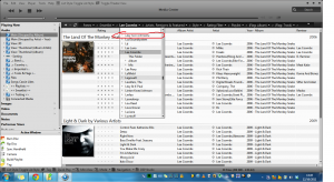


Thank you for your time & consideration, I hope I am bringing valuable comments and suggestions to J River, I kind of ramble on sometimes...

Oh and one other tiny suggestion, if you look at the bottom left of the image, you'll see the buttom "List Style: Toggle List Style". It would be great if I could have toggle buttons for "Group by" & "Sort Inside Columns by"
Logged

bunglemebaby

  • Galactic Citizen
  • ****
  • Posts: 469
Re: Another Feature Request: Reset Selection
« Reply #1 on: October 12, 2011, 09:07:52 am »

Quote
My suggestion once something is selected in a drop down pane when you re-click it, where I've circled in red just under the search box, could be a Reset Selection button that is static and doesn't disappear when you scroll.
I like this idea a lot. It would work well for any panes as well (not just the dropdown panes). It might make more sense to just keep the "All..." selector floating, rather than add a "Reset..." selector, but the idea would be a nice subtle, useful change.

Quote
It would be great if I could have toggle buttons for "Group by" & "Sort Inside Columns by"
This would be a bit much to have a toggle button for (in both cases). What would either one toggle through? Group By can use any tag available in the library, and Sort By can use any combination of all tags in the library. If you click on the arrow next to "Panes >" in your attached picture you will at least get a menu that you can relatively quickly change both the grouping and sorting through.

-JB
Logged

locust

  • Citizen of the Universe
  • *****
  • Posts: 699
Re: Another Feature Request: Reset Selection
« Reply #2 on: October 12, 2011, 09:27:16 am »

Yeah that would be better an "All selector"

Quote
This would be a bit much to have a toggle button for (in both cases). What would either one toggle through? Group By can use any tag available in the library, and Sort By can use any combination of all tags in the library. If you click on the arrow next to "Panes >" in your attached picture you will at least get a menu that you can relatively quickly change both the grouping and sorting through.

I don't mean all the tags just the default ones that automatically show, they'd be enough for me.. I was only thinking about it on the same premise that users that are not familiar with Media Center would benefit, so they could switch the view style intuitively with the toggle buttons... My friends would never think to right click the panes to change the list style, Group by & Sort Inside Groups

Group by has
~None
~Album
~Album (by date)
~Year
~Rating

Sort Inside groups by has
~(Default)
~Date (Newest First)
~Date (Oldest First)
~Date Imported
~Date Played
~Name
~Plays
~Random
~Rating

Thanks

Logged

rick.ca

  • Citizen of the Universe
  • *****
  • Posts: 3729
Re: Another Feature Request: Reset Selection
« Reply #3 on: October 12, 2011, 02:38:13 pm »

It might make more sense to just keep the "All..." selector floating...

+1. Another reason to keep it locked at the top of the list is it shows the number of values included in the current selection.
Logged

locust

  • Citizen of the Universe
  • *****
  • Posts: 699
Re: Another Feature Request: Reset Selection
« Reply #4 on: October 13, 2011, 08:20:39 pm »

Quote
+1. Another reason to keep it locked at the top of the list is it shows the number of values included in the current selection.

That's a good addition, never thought of that...

I'm not sure what kind of panes I like now, drop down or top.. I like that with the top panes you can see the all the entries in the list without having to click away.. But with the drop down panes I like that they don't take any space..

Could the top panes get a search bar added just like the drop down panes as well as hopefully the floating All selector? Their absence is one of the only reasons I don't use top, left or right panes..

Thanks
Logged
Pages: [1]   Go Up