INTERACT FORUM

Please login or register.

Login with username, password and session length
Advanced search  
Pages: [1]   Go Down

Author Topic: My Modern Cards: Dark Edition  (Read 3142 times)

marko

  • MC Beta Team
  • Citizen of the Universe
  • *****
  • Posts: 9139
My Modern Cards: Dark Edition
« on: November 24, 2019, 11:24:39 am »

After Dirhael's excellent 'Modern Cards' skin grew awesome (;)) wings and flew, becoming a default MC look, there were some elements that were, for me, sadly lacking.

Things like clear selection indicators and grouping headers immediately spring to mind, though for sure there were more tiny things that for me, made a big difference.

I'm quite comfortable with it now, and have been using it without any annoyance for several months.
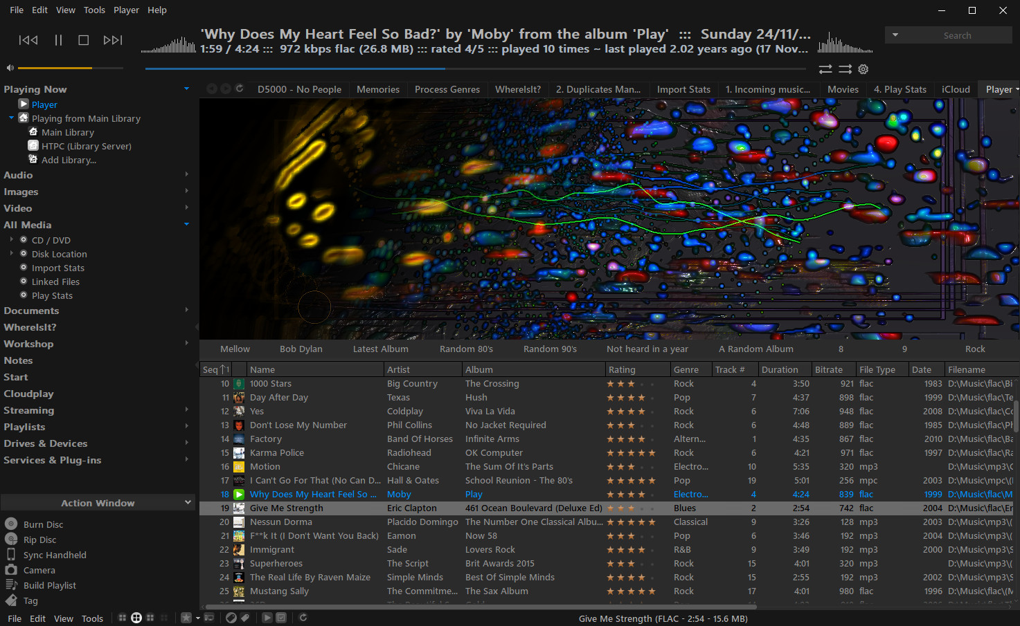


I'll keep my tweaked copy up to date here for anyone that may be interested in using it.

Download is via a Media Center package installer file which is attached to this post. Simply download the file and double click to have MC download and apply the skin.
Package installer files only work on Windows. If using another OS, open the mjp file in a text editor, copy the download link and manually install the downloaded skin into your MC standard view skins folder.

-marko

Edit: 26/06/2020
Many, if not all of these tweaks have now been incorporated into the original default MC skin, rendering this one redundant. As such, the download link has been removed.

LETRA

  • World Citizen
  • ***
  • Posts: 123
Re: My Modern Cards: Dark Edition
« Reply #1 on: December 14, 2019, 10:41:13 am »

I like it to be neutral and consistent. I wonder what it would be like if other dark colors had been chosen, not just black.
Logged

Awesome Donkey

  • Administrator
  • Citizen of the Universe
  • *****
  • Posts: 7804
  • Autumn shade...
Re: My Modern Cards: Dark Edition
« Reply #2 on: June 26, 2020, 04:49:32 am »

marko quick question, am I correct to assume what this user is asking about is indeed intended?

https://yabb.jriver.com/interact/index.php/topic,125945.msg872706.html#msg872706
Logged
I don't work for JRiver... I help keep the forums safe from "male enhancements" and other sources of sketchy pharmaceuticals.

Windows 11 24H2 Update 64-bit + Ubuntu 24.10 Oracular Oriole 64-bit | Windows 11 24H2 Update 64-bit (Intel N305 Fanless NUC 16GB RAM/500GB M.2 NVMe SSD)
JRiver Media Center 33 (Windows + Linux) | iFi ZEN DAC 3 | JBL 306P MkII Studio Monitors | Audio-Technica ATH-M50x Headphones

marko

  • MC Beta Team
  • Citizen of the Universe
  • *****
  • Posts: 9139
Re: My Modern Cards: Dark Edition
« Reply #3 on: June 26, 2020, 06:48:08 am »

Not intended. The skin folder contains a grey-scaled version of the default SmallIcons file. As I don't use zones, I've never noticed that before. I'll try and have a look at it over the weekend.

Is the different toned icon, presumably for the non-selected zones, an icon in it's own right, or is MC doing something with it that I have no control over?
Pages: [1]   Go Up