INTERACT FORUM

Please login or register.

Login with username, password and session length
Advanced search  
Pages: [1]   Go Down

Author Topic: Skinning tutorial - info request  (Read 3181 times)

RorK

  • Recent member
  • *
  • Posts: 29
Skinning tutorial - info request
« on: August 05, 2013, 01:21:57 pm »

Hi all,

I'm rebuilding the MetroX standard View skin a little bit, so it will be a bit more "finger-friendly" on my tablet.

What I have a hard time figuring out, is the relation between all images and their offsets in the .xml file.
I made the lower volumebar/control, progressbar/control and loop/shuffle/DSP buttons larger, so it's easier to hit them with my fingers.
So far I can't seem to get the images into the position I want, regarding changing offsets on these images and the top controls/infowindow.

I looked into the other skins, but cannot seem to find the connection :-\

 It would be great if this info would be added to the tutorial on the wiki. It's a bit marginal atm.

Any tips would be nice.

cheers,

rob
Holland
Logged

SkGe

  • Galactic Citizen
  • ****
  • Posts: 433
Re: Skinning tutorial - info request
« Reply #1 on: August 05, 2013, 04:18:13 pm »

Look at the size of image, because you are limited on the maintoolbar and how they are put in that area.
If you can't put in the right place working with offset try to change in the image bring them up or down and see how they fit. Usual if you make a image of let say an icon, you put that icon in the middle of the image, now try to lower/raise the icon in the image.
Maybe this will help you, if not, send me that image and i will see what i can help you.
Logged

RorK

  • Recent member
  • *
  • Posts: 29
Re: Skinning tutorial - info request
« Reply #2 on: August 06, 2013, 02:35:15 am »

HI,

Yes, I already tried to make the images larger/higher and offsetting the icons themself, to compensate for the difference, but that didn't work properly. Than I tried the offsets.
It would explain some things if there's a 'locked' height to all of this.

I'll have a look again at the wiki and other skins to see if I can 'fix' my offsets.

cheers,

rob
Logged

RorK

  • Recent member
  • *
  • Posts: 29
Re: Skinning tutorial - info request
« Reply #3 on: August 06, 2013, 06:28:44 am »

Hi again,

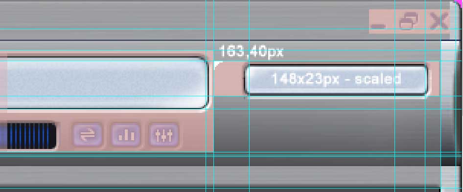
I looked into a skin more closely, and did some PS work to see where all images go, in relation to size, margins and offsets.
Picked the 'Blue Steel' skin, just for reference.

Here are the images making up the skin topbar with some values:


The pink blocks and lines are the actual image sizes. The white 'arrows' and numbers are the pixel coord.

And here's the .xml code for the skin:
<PLAYERBAR>
   <Entry Name="Display" Bitmap="Playerbar_Display.png" NumberImages="1" Margins="69,0,106,0" DrawMode="REGION_E_HTILE,REGION_E_VSTRETCH" >
      <Colors TitleText="132243" StatusText="0E1A34" />
   </Entry>
   <Entry Name="PositionSlider" Bitmap="PlayerBar_SliderPos.bmp" TransColor="FF00FF" Margins="0,8,0,0" DrawMode="REGION_E_HTILE" />
   <Entry Name="PositionSliderFront" Bitmap="PlayerBar_SliderPosFront.bmp" TransColor="FF00FF" Margins="0,3,0,2" DrawMode="REGION_E_HTILE" />
   <Entry Name="PositionSliderThumb" Bitmap="Playerbar_SliderPosThumb.png" NumberImages="4" />
   <Entry Name="VolumeSlider" Bitmap="PlayerBar_SliderVol.png" />
   <Entry Name="VolumeSliderFront" Bitmap="PlayerBar_SliderVolFront.bmp" TransColor="FF00FF" Margins="0,6,0,2" DrawMode="REGION_E_HTILE" />
   <Entry Name="VolumeSliderThumb" Bitmap="PlayerBar_SliderVolThumb.png" NumberImages="4" />
   <Entry Name="PlayButton" Bitmap="PlayerBar_PlayButton.png" NumberImages="3" />
   <Entry Name="StopButton" Bitmap="PlayerBar_StopButton.png" NumberImages="3" />
   <Entry Name="PauseButton" Bitmap="PlayerBar_PauseButton.png" NumberImages="3" />
   <Entry Name="NextButton" Bitmap="PlayerBar_NextButton.png" NumberImages="3" />
   <Entry Name="PreviousButton" Bitmap="PlayerBar_PrevButton.png" NumberImages="3" />
   <Entry Name="Search" Bitmap="Playerbar_Search.bmp" NumberImages="1" TransColor="FF00FF" Margins="20,0,20,0" OffsetY="52" />
   <Entry Name="MediaMode" Bitmap="" OffsetY="89" />
   <Entry Name="ShuffleButton" Bitmap="PlayerBar_ShButton.png" NumberImages="3" />
   <Entry Name="ShuffleOffButton" Bitmap="PlayerBar_ShOffButton.png" NumberImages="3" />
   <Entry Name="ContinuousButton" Bitmap="PlayerBar_ContButton.png" NumberImages="3" />
   <Entry Name="ContinuousOffButton" Bitmap="PlayerBar_ContOffButton.png" NumberImages="3" />
   <Entry Name="ContinuousSongButton" Bitmap="PlayerBar_ContSongButton.png" NumberImages="3" />
   <Entry Name="DSPButton" Bitmap="PlayerBar_DSPButton.png" NumberImages="3" />
   <Entry Name="MuteButton" Bitmap="PlayerBar_MuteButton.png" NumberImages="3" />
   <Entry Name="MuteOffButton" Bitmap="PlayerBar_MuteOffButton.png" NumberImages="3" />   
</PLAYERBAR>

<TOOLBARS>
   <Colors InactiveBlend="8791A7" />
   <Entry Name="StatusBar" Bitmap="Statusbar_Display.bmp" NumberImages="1" TransColor="FF00FF" Margins="12,4,22,3" TextColor="16284F" />
   <Entry Name="LocationBar" Bitmap="TargetBar.bmp" Margins="10,0,10,0" TextColor="16284F" />   
   <Entry Name="TargetBar" Bitmap="TargetBar.bmp" Margins="10,0,10,0" TextColor="16284F" ActiveTextColor="0154D5" />
   <Entry Name="TopBar" Alignment="0" OffsetX="148" OffsetY="0" >
      <Colors Text="16284F" HilightText="0154D5" SelectedText="0154D5" Separator="16284F" />
   </Entry>
   <Entry Name="BottomBar" >
      <Colors  Text="16284F" HilightText="0154D5" SelectedText="0154D5" Separator="16284F" />
   </Entry>
</TOOLBARS>

Some questions on this:
- <Entry Name="TopBar" Alignment="0" OffsetX="148" OffsetY="0" >    <--Is this the offset for the File>Edit..... menu on top?
- The Y offset for the start of the control buttons and Statusbar_Display is fixed to 32 pixels? It seems the Y-placement is the same for all skins?
- How are the margins defines? Is it left-top-right-bottom?
- The Playerbar_Search.bmp is much smaller than shown in the UI. Can it also be scaled in height? Also the margins and offset for the search box make no sense to me looking at the placement coord.
- This is also the case for the Playerbar_xxx images with a margin setting and offset. How does one set the horizontal values, like in the top image for instance, like the 20px and 210px?

If someone can explain this in more detail than the wiki, it would be great.

cheers,

rob

Logged

SkGe

  • Galactic Citizen
  • ****
  • Posts: 433
Re: Skinning tutorial - info request
« Reply #4 on: August 06, 2013, 01:51:26 pm »

How to explain you this.
First of all you mentioned that you want to adjust/change skin on your tablet. Now the tablet have a x-width and y-height, and when you work with skin you are pretty limited on the size of things. If you enlarge too much an image, the program itself will not recognize because either is too big, or can't be drawn on the skin, and therefore you will have a black area instead of that image desired.
Like i used to work with skin and create some of them, the thing you will count is like i say before, the size of the image, and second the offset how much you can pull it.
This is an example:
You have a toolbar with 100 height and 600 pixels width. Now the rest of the image will be in this area or will be off.
If you have let's say, button play/stop at 50 pixels height you will have space for 50 pixel more, in this space you will need to make room for sound icon and sound slider (wich you will use let say 20 or less pixel) just to fit in your toolbar. Now maybe this all thing i say early don't apply because i never touch a tablet to create and how the skin is on it so who knows.
But as for desktop this will apply for sure.
Maybe this will help you.
Logged

krutsch

  • Recent member
  • *
  • Posts: 5
Re: Skinning tutorial - info request
« Reply #5 on: January 03, 2014, 09:38:51 am »

Hi all,

I'm rebuilding the MetroX standard View skin a little bit, so it will be a bit more "finger-friendly" on my tablet.

<snip, snip>

rob
Holland

Hi Rob,

Did you ever finish your tablet friendly skin?  I would love to try it, if you have. 

I have a Lenovo Yoga that I use with MC and the standard UI is just too small - even with the trackpad, let alone using the touch screen.

Thanks, Ken
Logged

RorK

  • Recent member
  • *
  • Posts: 29
Re: Skinning tutorial - info request
« Reply #6 on: January 03, 2014, 10:11:27 am »

Hi Ken,

No, not really.
I made some small iterations to the .css file of the 'blue' theme, but that's it.

Work was distracting me all the time, and in the end I basically gave up until I was able to properly sit down and do this. So far no luck ;-)

sorry,

rob
Logged
Pages: [1]   Go Up