Hi
Recently I've started using Panes and there great, although I don't like the vertical space they consume, so I opted to use drop down panes.. This setup is great except for one major annoyance. I've tried to live with it but its too annoying.

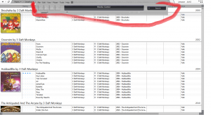
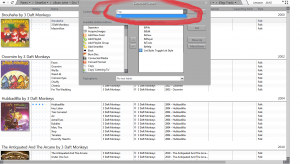
I like to view my schemes in Cover View (Full screen). My drop down panes are located at the top but the threshold for the track navigation (Toobar) (Circled in red) to appear when I go to click on my drop down panes is too sensitive... The navigation thing always appears when I go to click on the drop down panes... The only way to get it not to appear, is to move the mouse really slowly up to the top.. (Not good if you've had a drink...

) even then it gets really frustrating.. I thought there was a way to change it, when you right click the track navigation (Toolbar) > Customise there is a drop down list but it only contains Top... I don't know if that is what I am looking for but there is only one selection..
I would like the ability to set the navigation thing to dock or appear elsewhere i.e. the bottom of the screen or even being able to dock the panes at the bottom of the screen or even the ability to move both, I don't know which setup I'd prefer...
Please consider this, it would help me out immensely

The sooner the better


Is there any way to know if any of your suggestions have been considered or do we just have to wait to see the change log??
Thanks


 Author
Topic: Feature Request: Docking Player Elsewhere (Read 973 times)

