So, anyone who has been here for a while knows that there have been a few, let's say, passionate discussions around the look and feel of Theater View. I'd like to say at the outset, that I don't want this to become one of those. However, Jim and Matt's response to critique in this area has often been to say effectively that "reasonable, concrete examples that
don't seek to revolutionize what is there now will be considered."
Well, I've been thinking about it a bit, and I think I might have a piece of one of those.
I'll do my best (but likely fail) to keep this from being a typical Siracusaean length diatribe, at least before I get to the point. But I must detour slightly first, and this is (itself) a nice story about MC anyway.
My daughter is a few months shy of four-years old. She's recently learned how to use Media Center on the TV with our remote control. She can't do everything, of course. But in Theater View she's pretty good with the up/down/left/right/OK control scheme. She can navigate through the View of her shows, pick
Dora (and, despite other options, it's always
Dora), and then on the next screen, pick which episode she wants. While it is playing, she can pause and stop playback (and knows the difference), control volume, and skip ahead and back. She can turn the whole contraption on and off and knows how to launch MC into Theater View if the TV is already on and Theater View happens to be closed.
For the first few weeks, she was tentative, and asked questions constantly as she went. But over the past 2 or 3 weeks, she's gotten pretty confident. Dora doesn't usually have commercials mid-show, but on the occasional outlier, she can now skip past them like a pro (including the backup at the end). She makes dad proud.
Okay. That's all awesome. But there are two things she's "stuck" on, and I've been thinking about how to get her past them:
* She can open Theater View and get back to the home screen (the F11 toggle/Green button thing). But she cannot navigate to the View of "her shows" that I made for her.
* She can navigate "down" into a View of shows (picking Dora, then an episode). But once she does this, if she wants to go "back up" a level, she gets lost. So, if she
does decide she'd rather watch one of her other series, she struggles to go back to the series listing of the view.
They're both related, and simple to explain, really:
She can't read.I think both can be solved by allowing us to optionally add graphical elements to the Views that are configured in Theater View, and to have a switch to turn them on for a few of the big UI "buttons" (like Back). And, it might help make the UI a little more flexible for those of you who want Theater View to have a little more eye candy. I propose:
* Add a
Show Icons option to
Tools > Options > Theater View > Appearance.
* If enabled, Theater View adds tasteful, matching icons to at least Home and Back (stylized house and some kind of left-arrow). And maybe to Gadgets, Exit, and Playing Now.
* To each View configured for Theater View, add a Show Icon checkbox and a way to select a PNG to show.
* When enabled, light up a second checkbox where the user can uncheck
Show Text if they want to show just the graphic.
* Under the PNG browser doohickey, include a few generic default images, of course.
Getting the graphics themselves to use for this should be
easy. The View icons you
already have in Standard View, tweaked a bit, are perfect for this role. Tweak and mask, desaturate them or grayscale them, export them to a larger size, and you have a darn good set to start with right there. Between that and the stuff Patrick has for JRemote, you should be golden (in fact, I'd let him take a crack, at any new stuff you need, he does good work if the JRemote stuff is all his).
I think those few things, solves her problem, might make Theater View more approachable for some customers, and can easily give those who want it a simple way to do some really whiz-bang graphical stuff. You'll have to design size constraints for those PNGs of course, but... Between that and the option to toggle the Text description on and off? You could go through and give all of your Views pretty custom graphics and really "eye candy" it up a bit if you wanted.
For me, I'd be subtle. I'd only add a few. But I think it would help her, and honestly, I think it would help
me too, once I got used to it.
It comes down to
reading, really. The Theater View UI is very text heavy. It is flat, and texty. The design is actually quite lovely, in my opinion, and was very forward looking. Theater View was non-skeuomorphic, text-first, and flat before it was cool to be anti-skeuomorphism and all that. In fact, you probably know I've always been a pretty big fan of the classy, understated, simple design of Theater View (I believe I've said that many of the XBMC screenshots I see out there make me throw up in my mouth a little bit).
But, graphical elements and iconography are still useful, and even the most extreme of the "newer" UI designs haven't done away with them entirely. I guess it took watching someone who can't read interact with MC to see it here, but... Even assuming you
can read, it takes less brain power to process a left-pointing arrow as back than it does to read the word "back". Not much less, but less. That, times 1000 repetitions performing an everyday task, builds up a technical debt. You can do it, but you can't do it everywhere. And so, there are a ton of places in iOS, Android, and Windows where they've gone more text heavy, but there is iconography and visual cues too. And, you'll note, they're most heavy in their continued usage with navigation. The "go back up a level" icon in particular, is nearly universally a left-pointing arrow of some kind.
Even more, though, looking at my daughter using it. I can see it plainly. Once I get her to her "view" she's good, and can completely take over. Why? It is still text heavy. But there are pictures. Her main shows View looks like:

Click to embiggen.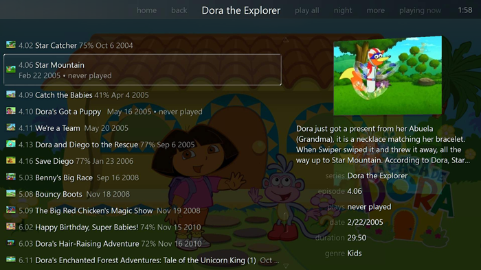
Click to embiggen.She knows how to pick Dora because she can see Dora. Once she opens the view, she can't read the episode titles, but she can scroll through and look at the pictures. She knows conceptually it is a list of her shows, and even understands that the text she can't read is a description or title for each episode.
From the home screen. She knows to pick
Video, and then to
pick Television from under that to open up the TV Shows View. But she knows those items
positionally, and she only has to pick from a few choices. She can't read the text, but she knows
where they are, as long as she can start from "home". But, then my TV Shows view opens and it defaults to
the "adult series" View. She knows there is a Kids view. She even now gets that there is a Second Roller bar up there, and you can use it to get to her shows. But, she doesn't remember if it is left or right from there, or how many "notches" over it is, and she can't read the word Kids.
The second issue I listed above, going up a "level" in a View, is actually really frustrating for her. She completely understands conceptually that she wants to go "back" in the hierarchy. She and
even knows, I think somewhat subconsciously, that she's looking for the
word "back" (in that line of words up there), but she can't
read.
Basically all TV entertainment she's watched
in her life has been in Media Center (or in AirVideo on my iPad, which has a similar navigational structure). She's watched me do it for her, with something like the current setup, probably 1000 or more times in her short life. So she gets it, but she doesn't know where to go.
I think that's illustrative of some of the underlying "truth" behind those recurring Theater View eye candy discussions. In some instances, parsing graphical representations of a concept just requires slightly less thought, on the millisecond-scale timeframes that matter for "flow" in a UI, than text does. Even if that text is short, has nice fonts, and is clear, it takes just a tiny bit extra brain power. And that brain power equals time and effort, which equals, to a large degree, how intuitive and "smooth" a UI feels to users.
I'm not screaming for this now, or anything. But I do know that reorganizing the setup of Theater View (and unifying it with Media Network) was at least on the table for MC20, so if that can be done, maybe it is worth doing now. And, you'd help at least one three year old. And maybe untold others as well.
So... If you made it this far, then /rant and I'll stop. I'd
love some thoughts.


 Author
Topic: Graphical Elements in Theater View (Read 6243 times)
Author
Topic: Graphical Elements in Theater View (Read 6243 times)