INTERACT FORUM

Please login or register.

Login with username, password and session length
Advanced search  
Pages: [1]   Go Down

Author Topic: Interface Question- Column Arrangement  (Read 2358 times)

BobMack

  • Recent member
  • *
  • Posts: 9
Interface Question- Column Arrangement
« on: April 14, 2016, 02:49:58 pm »

I've  been using JRiver software since Media Jukebox 8 back in 2002 and recently upgraded from MC17 to MC21. Now I'm having trouble arranging the list columns to my preferences and have been unable to find answers in the help file or by forum search.

Two questions:

1. How do I make a preset column arrangement the default? I would like to have it so that every time I'm in list view and switch from one artist or genre to another, it always displays my preferred column selection and order. Right now I can't find how to do that.

2. Is there a way of disabling the circular gray  go-to icons to the left of the text in the artist, album, and other columns? I don't use that feature and I find the icons visually distracting.

Any help would be greatly appreciated!
Logged

glynor

  • MC Beta Team
  • Citizen of the Universe
  • *****
  • Posts: 19608
Re: Interface Question- Column Arrangement
« Reply #1 on: April 14, 2016, 11:26:21 pm »

1. How do I make a preset column arrangement the default? I would like to have it so that every time I'm in list view and switch from one artist or genre to another, it always displays my preferred column selection and order. Right now I can't find how to do that.

You can't.

There never has been a way in MC to make all columns match in all Views all the time, for the record. At least not since I've been around which was MJ8-era. In the long-distant past (still way pre-MC17), we had a cool thing where you could apply the column changes to "this View and all child Views" (which allowed you to force a particular setup "down the stack" in the Tree). Unfortunately, that's been long-gone.

However, each View does remember the column setup, and you can make Column setup presets (which include the order, visibility, and sizing, of the columns). So, if you have a bunch of similar views defined and you want them to all have the same Column setup then:

1. Set one of them like how you want it.
2. Save a Preset via the View Header's Disclosure Triangle > Columns > Presets
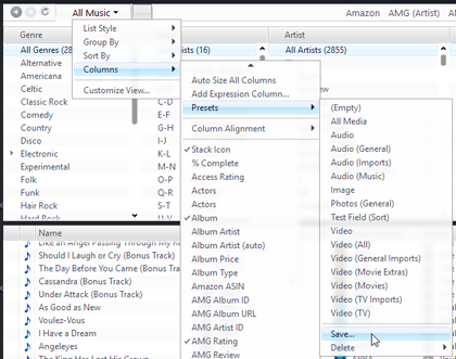
3. Switch to your other Views where you want the same setup and apply the preset you just saved.

It is a pain if you have a bunch of them, but you only have to do it once.

2. Is there a way of disabling the circular gray  go-to icons to the left of the text in the artist, album, and other columns? I don't use that feature and I find the icons visually distracting.

The quick-search arrow widgets? Yes, but it isn't super simple and there is a downside.

Those arrows only appear for certain "special fields": [Artist], [Album], and [Genre]. Even if you want to use those fields, you don't have to display them in a column. At least not directly. You could display a calculated field or expression column instead, which just gives the value of the one you really want.

So, for example, instead of adding a [Genre] column, add an Expression Column called "Genre" where the expression is just: [Genre].

That works well, and since the expression is so simple, MC even lets it edit bi-directionally (so you can still edit the Genre using the column). But here's the downside, it doesn't show the drop-down menu when you edit on it (only a freeform text entry box). You might be able to work around this if you use a Calculated Field instead, but I'm not sure (I've never tried, I like the little arrows).
Logged
"Some cultures are defined by their relationship to cheese."

Visit me on the Interweb Thingie: http://glynor.com/

marko

  • MC Beta Team
  • Citizen of the Universe
  • *****
  • Posts: 9139
Re: Interface Question- Column Arrangement
« Reply #2 on: April 15, 2016, 12:28:36 am »

2. Is there a way of disabling the circular gray  go-to icons to the left of the text in the artist, album, and other columns? I don't use that feature and I find the icons visually distracting.
The quick-search arrow widgets? Yes, but it isn't super simple and there is a downside.

Those arrows only appear for certain "special fields": [Artist], [Album], and [Genre]. Even if you want to use those fields, you don't have to display them in a column. At least not directly. You could display a calculated field or expression column instead, which just gives the value of the one you really want.

So, for example, instead of adding a [Genre] column, add an Expression Column called "Genre" where the expression is just: [Genre].

That works well, and since the expression is so simple, MC even lets it edit bi-directionally (so you can still edit the Genre using the column). But here's the downside, it doesn't show the drop-down menu when you edit on it (only a freeform text entry box). You might be able to work around this if you use a Calculated Field instead, but I'm not sure (I've never tried, I like the little arrows).
Even easier than that...
Tools > Options > General > Features > take the tick out of "Linkable Columns"
Press OK.

-marko

glynor

  • MC Beta Team
  • Citizen of the Universe
  • *****
  • Posts: 19608
Re: Interface Question- Column Arrangement
« Reply #3 on: April 15, 2016, 06:30:20 am »

Oh. They did add that then. I looked but didn't know what it was called.
Logged
"Some cultures are defined by their relationship to cheese."

Visit me on the Interweb Thingie: http://glynor.com/

marko

  • MC Beta Team
  • Citizen of the Universe
  • *****
  • Posts: 9139
Re: Interface Question- Column Arrangement
« Reply #4 on: April 15, 2016, 07:07:07 am »

Yeah. I'm not sure when, 2010 was the earliest I could find...
https://yabb.jriver.com/interact/index.php?topic=56666.msg385821#msg385821

BobMack

  • Recent member
  • *
  • Posts: 9
Re: Interface Question- Column Arrangement
« Reply #5 on: April 15, 2016, 07:34:06 am »

Thanks both of you for the helpful replies!

Logged
Pages: [1]   Go Up