Cheers Matt.
Having spent an hour or two on this, I have to say that the default drop shadow is really quite clever in the way it transitions between light and dark backgrounds.
After much switching back and forth though, I decided that I like mine better. Truthfully though, there's not a lot in it.
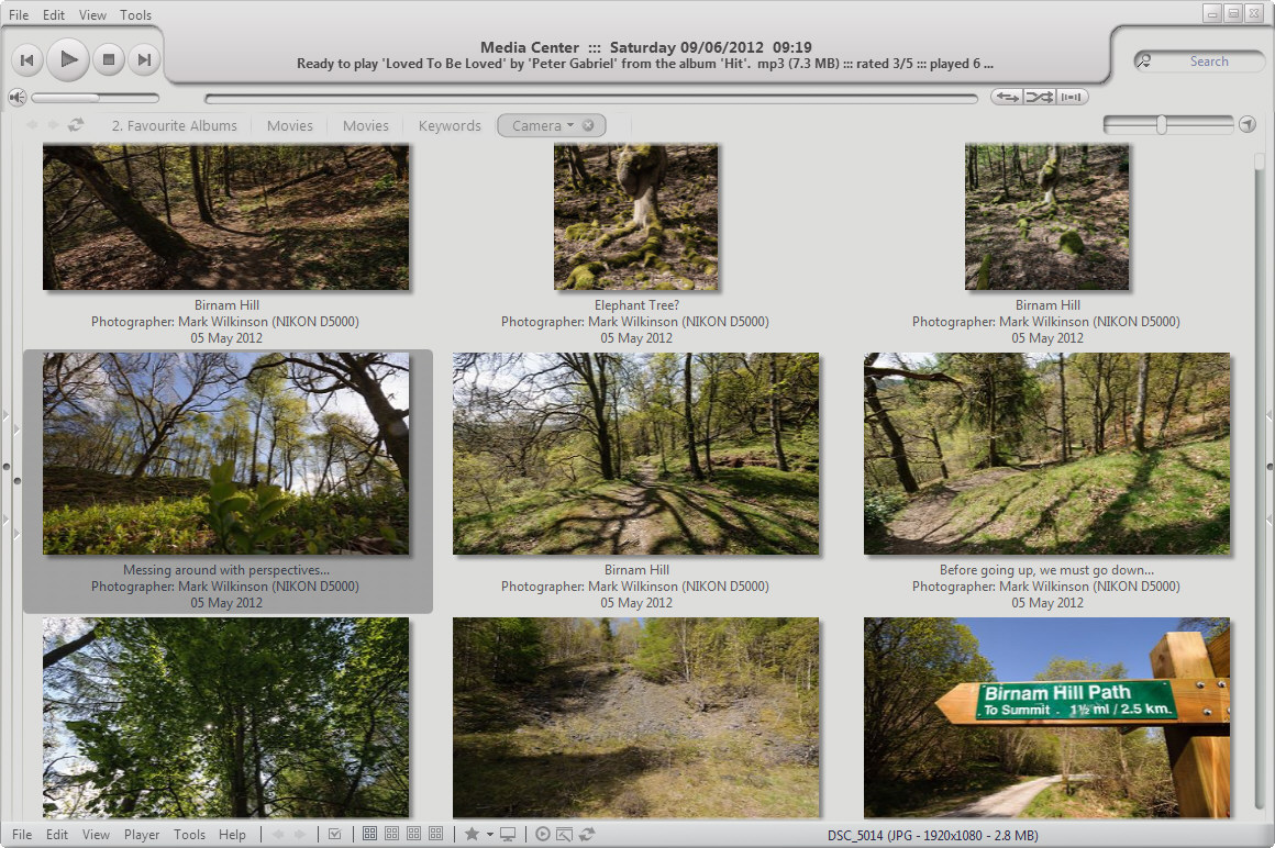
So, build 161 had the old drop shadow effect that served us all so well for so long...
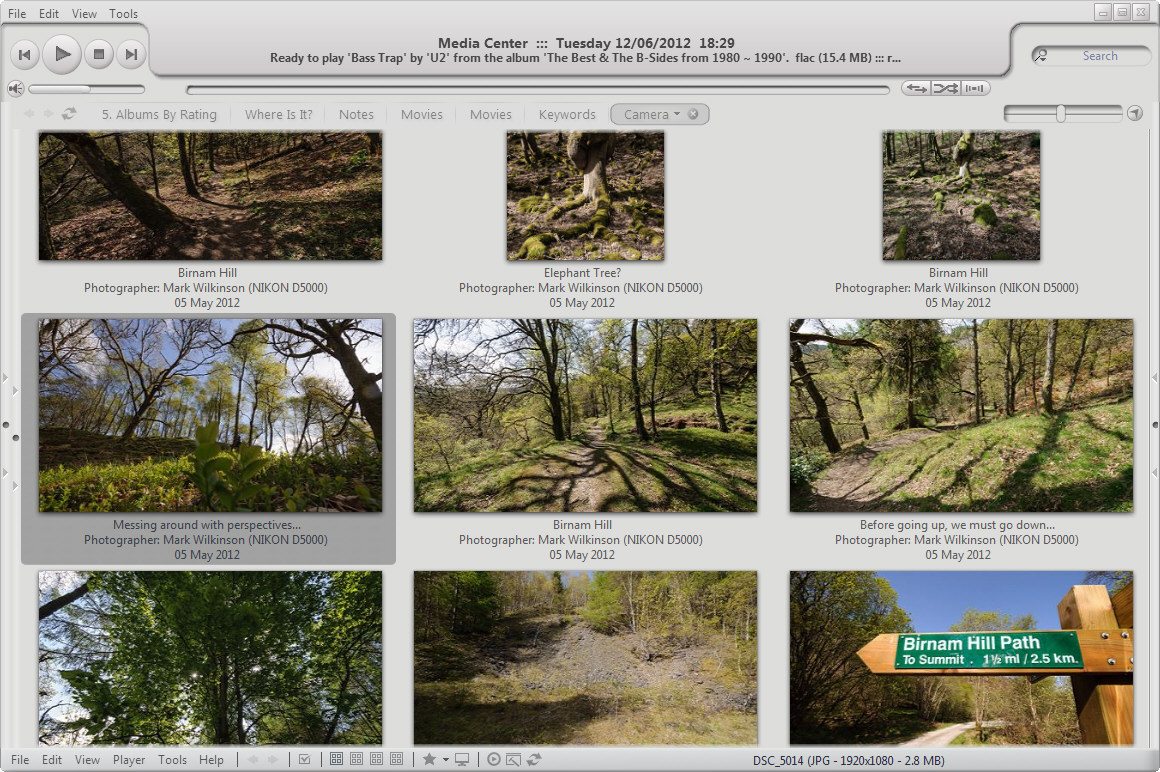
The default from build 171 onwards looks like so...
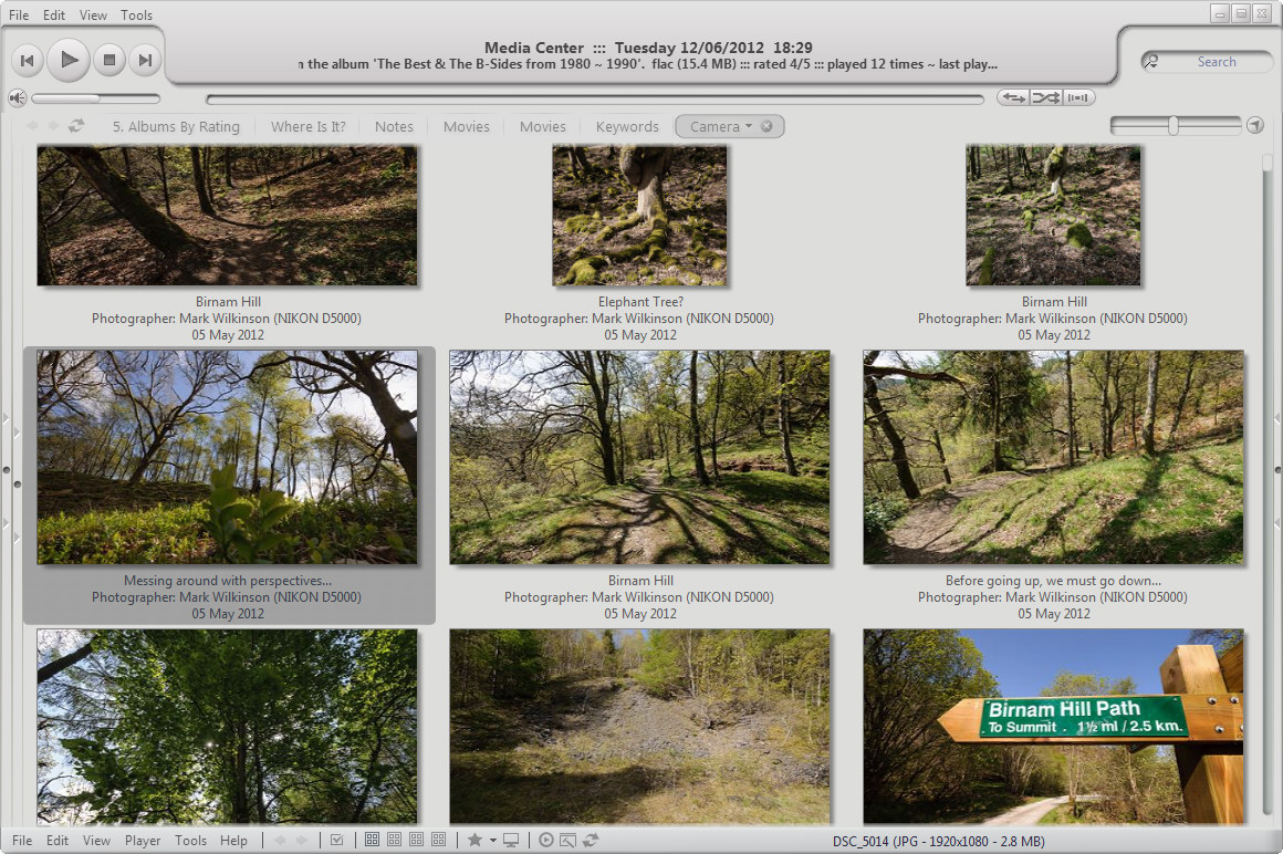
Build 171 also allows us to modify the shadow effect via skinning. I like this, which is more like build 161, keeping the edges crisp and clean...
As I said, there's not a lot in it.
The only things left now are really minor...
- The new system has a larger minimum thumbnail space. Build 161 allowed the thumbs to get really close, which was quite nice, will be missed, but in no way a deal breaker.
- When selecting a thumbnail, the selected thumb does not sit in the center of the selection outline. It sits almost right-justified, and is a little off-putting. I've been scrutinising these things for hours now though, so quite possibly, no-one else will notice this. Again, nothing even approaching deal breaker for me.
Thank you again for coming up with an innovative solution to the problem.
If anyone wants a copy of the Border_DropShadow file I've used above, save this...

add it to your skin folder, and finally, add the following code to your skin xml file...
<BORDER>
  <Entry Name="DropShadow" Bitmap="Border_DropShadow.png" Rows="1,?-Flex,9" Columns="1,?-Flex,9" Cells="B2-Skip">
    <Data InternalMarginLeft="1" InternalMarginTop="1" InternalMarginRight="9" InternalMarginBottom="9"></Data>
  </Entry>
</BORDER>
-marko


 Author
Topic: Skinnable frames & borders introduced in build 171 (Read 1730 times)
Author
Topic: Skinnable frames & borders introduced in build 171 (Read 1730 times)