1. Only use default fields in a search unless keywords are used. I get very bad results when searching in Media Center.
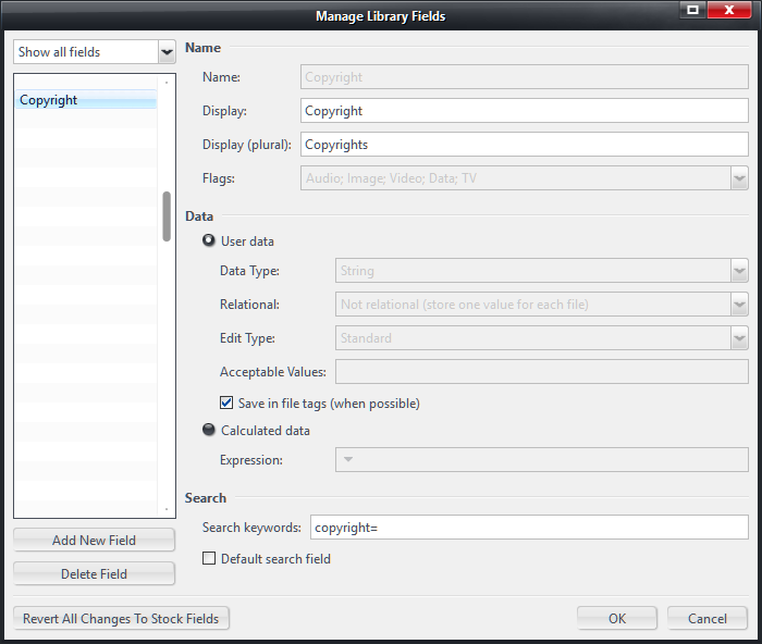
The first reason for that is because Media Center does not obey the "default search field" preference:

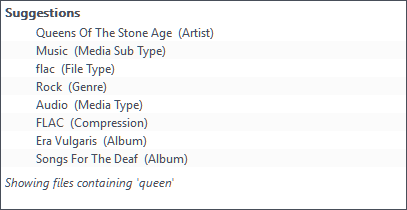
This means I get very unhelpful search results like this:

I don't understand this behavior at all.
2. Provide consistent results. In the same view as the previous results, but in another session of using Media Center, I got these results instead:
 Better
, but still not great.
Another time today, shortly after restarting MC I was greeted with these amazing results:

All of these search results were in the same view, and all were a search for
queenI don't know why I was getting such different results each time. I had to restart MC after this to get the "correct" results.
3. Improve usability of search Now that we have an expanded width for the search bar
(though I personally think it's too wide now) it would be useful to list the current Library View's name in the search field.
So that you have "Search Artists
" or "Search Movies
" rather than "Search".
While it may not matter for people using a single pane view, it would improve usability for those of us using a split pane view.
What would
greatly improve usability for the split pane views, would be a menu option which lets you lock search to a pane.
I think most people that are using a split view work with their "Now Playing" views on one side, and their Library Views in the other. Being able to lock search to the Library View pane would prevent the common issue of searching "Now Playing" by mistake.
http://yabb.jriver.com/interact/index.php?topic=93058
4. Improve the appearance of the search results Especially compared to what web services are now offering (the primary source of music for many people these days) the presentation of the search results is not great.
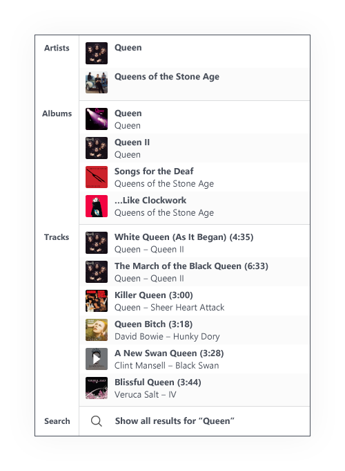
Here's an idea of what I think would work well in Media Center:

- All category types are grouped together.
- It would support any type of category you use, and present the results in a clear manner.
- Including album art makes it much easier to find that album, artist, or track you searched for in the list of results.
What I'm imagining is that it would display something like:
- All artists containing "Queen"
- Top two album results for each artist, plus album results with "Queen" in the title that are from others.
- Top three track results (most played? I used "most relevant" in the image, which is actually not what I'd want) from artists with "Queen" in the name, with additional tracks that contain "Queen" in the name from other artists listed below.
This provides a lot more information and, I believe, a lot more
relevant information that people are searching for. Of course, that is in the context of music.
In the context of movies for example, searching for a movie name might list other titles by the same director, or films with a common list of actors.
Rather than having a fixed size for artwork, you could use large images (poster art) for "direct" results, while displaying medium-sized "album art" images for "other movies by this director", while other categories might be better presented as a nicely formatted text list.
Most people's screens are at least 1080 pixels tall, so I don't feel that it is necessary to limit the search results to <250px in height, and I'd want to make use of the maximum height available for results.
Having access to a "search editor" similar to the new tagging pane's editor would be great, so that you can customize a search rule based on whether it's Music/Movies/TV Shows etc.
For example, simply searching the
[Album] tag is useless for me, I would be searching for my custom
[Album (description)] tag, since I use the description tag to distinguish between different versions of the same album. (as there is no "official" way to do that in MC)
5. Make search results "actionable" If you click on the text/field for a search result, it should be displayed in the main view, which is the current behavior.
However, if you click on the album art, as pictured above, you could have it immediately play that item - or add it to the Playing Now list. (with a preference to set the default)
Being able to alt-click that to invert the behavior, or right-click a result to bring up a context menu for it (e.g.
send to
) would also be useful.
Ideally the user searches for something, clicks on the result, and it plays. I think that would be a great improvement over the current system where you are presented with a text list of results and have to manually "search" through those to actually play it.
With the current state of search, I find it much easier to avoid search altogether, and navigate through several nested layers of views to find the content I'm looking for. (A-Z → Album Artist → Album Type → Album → Description)
