INTERACT FORUM

Please login or register.

Login with username, password and session length
Advanced search  
Pages: [1]   Go Down

Author Topic: New Yesteryear Wooden skins preview  (Read 3991 times)

MtnBeachBum

  • World Citizen
  • ***
  • Posts: 101
New Yesteryear Wooden skins preview
« on: February 02, 2009, 10:13:57 pm »

Here are some screenshot previews of two skins that I came up with. I am new to MJ and skinning. These are my first attempts, I have always liked those old wooden radios from the 30s and 40s.

Yesteryear Oak:
http://mountainbeachbum.deviantart.com/art/Yesteryear-Oak-111635630

Yesteryear Mahogany:
http://mountainbeachbum.deviantart.com/art/Yesteryear-Mahogany-111635291

Let me know what you think.
Thanks,
Teach

Logged

Matt

  • Administrator
  • Citizen of the Universe
  • *****
  • Posts: 42372
  • Shoes gone again!
Re: New Yesteryear Wooden skins preview
« Reply #1 on: February 02, 2009, 10:20:34 pm »

Neat!
Logged
Matt Ashland, JRiver Media Center

jkrzok

  • Regular Member
  • World Citizen
  • ***
  • Posts: 184
  • Change this by choosing profile
Re: New Yesteryear Wooden skins preview
« Reply #2 on: February 03, 2009, 07:39:29 pm »

Being an Old Time Radio fan, let me say, count me in!
Logged

phalanthus

  • Galactic Citizen
  • ****
  • Posts: 461
Re: New Yesteryear Wooden skins preview
« Reply #3 on: February 03, 2009, 11:33:40 pm »

 ;D
interesting - when will a final product be available?
Logged

MtnBeachBum

  • World Citizen
  • ***
  • Posts: 101
Re: New Yesteryear Wooden skins preview
« Reply #4 on: February 04, 2009, 07:47:40 pm »

;D
interesting - when will a final product be available?
Probably be ready in a week or so. Thanks
Logged

AoXoMoXoA

  • Regular Member
  • Citizen of the Universe
  • *****
  • Posts: 1551
  • I am a kangaroo . . . . no, really!
Re: New Yesteryear Wooden skins preview
« Reply #5 on: February 04, 2009, 08:20:20 pm »

very cool, can't wait to use it   :)
Logged
. . . the game is rigged

Gl3nn

  • Galactic Citizen
  • ****
  • Posts: 384
Re: New Yesteryear Wooden skins preview
« Reply #6 on: February 05, 2009, 12:19:27 am »

Looks great!  Thanks for making a very cool-looking skin!
Logged

MtnBeachBum

  • World Citizen
  • ***
  • Posts: 101
Re: New Yesteryear Wooden skins preview
« Reply #7 on: February 05, 2009, 10:40:48 pm »

Looks great!  Thanks for making a very cool-looking skin!
I'm glad you guys like it.
Logged

MtnBeachBum

  • World Citizen
  • ***
  • Posts: 101
Re: New Yesteryear Wooden skins preview
« Reply #8 on: February 12, 2009, 08:26:52 pm »

Here are some screenshot previews of two skins that I came up with. I am new to MJ and skinning. These are my first attempts, I have always liked those old wooden radios from the 30s and 40s.

Yesteryear Oak:
http://mountainbeachbum.deviantart.com/art/Yesteryear-Oak-111635630

Yesteryear Mahogany:
http://mountainbeachbum.deviantart.com/art/Yesteryear-Mahogany-111635291

Let me know what you think.
Thanks,
Teach


I have updated the skins a bit. If there is enough interest I will upload to MJ.
Logged

hooli

  • Recent member
  • *
  • Posts: 43
Re: New Yesteryear Wooden skins preview
« Reply #9 on: February 13, 2009, 04:45:11 pm »

I'd like to try out the Mahogany.  Looks like a nice change.
Logged

phalanthus

  • Galactic Citizen
  • ****
  • Posts: 461
Re: New Yesteryear Wooden skins preview
« Reply #10 on: February 13, 2009, 08:36:56 pm »

 ;D
same here- is very different
Logged

MtnBeachBum

  • World Citizen
  • ***
  • Posts: 101
Re: New Yesteryear Wooden skins preview
« Reply #11 on: February 13, 2009, 11:23:03 pm »

I just uploaded Yesteryear Mahogany, I have no idea how long it will take to be posted. Thanks.

Teach
Logged

MtnBeachBum

  • World Citizen
  • ***
  • Posts: 101
Re: New Yesteryear Wooden skins preview
« Reply #12 on: February 13, 2009, 11:32:05 pm »

I just uploaded Yesteryear Mahogany, I have no idea how long it will take to be posted. Thanks.

Teach

Oak has been uploaded as well.
Logged

KingSparta

  • MC Beta Team
  • Citizen of the Universe
  • *****
  • Posts: 20063
Re: New Yesteryear Wooden skins preview
« Reply #13 on: February 14, 2009, 07:07:05 pm »

I Still Want A Jersey Cow Skin
Logged
Retired Military, Airborne, Air Assault, And Flight Wings.
Model Trains, Internet, Ham Radio, Music
https://MyAAGrapevines.com
https://centercitybbs.com
Fayetteville, NC, USA

MtnBeachBum

  • World Citizen
  • ***
  • Posts: 101
Re: New Yesteryear Wooden skins preview
« Reply #14 on: March 03, 2009, 07:51:41 pm »

Both Yesteryear skins have been placed on the website. Please let me know of any suggestions for improvements that you might have. Thanks.
Logged

marko

  • MC Beta Team
  • Citizen of the Universe
  • *****
  • Posts: 9139
Re: New Yesteryear Wooden skins preview
« Reply #15 on: March 04, 2009, 01:56:11 am »

Quote
Please let me know of any suggestions for improvements that you might have. Thanks.

They're both really neat skins, thank you, but I can't help feeling that they need some serious polish...

The wooden theme should follow throughout the skin, so, the pane headers should get similar treatment to the list column headers. The glassy blue effect is really jarring and detracts from the excellent work elsewhere in the skin. The same applies to things like the shared_selection.png graphic. Consider using a different tree_selection graphic for use in the tree that better fits against the tree background, and bring the the list selection graphic into the wood theme of the rest of the skin.

Consider doing away with the playerbar_display graphic altogether, as imvho, it looks much cleaner, as shown below:
With - Note how, despite your efforts, the display graphic does not quite blend correctly with the main player bar (it shows up at each end):


Without - Removing the playerbar_display graphic altogether gives nice clean grain lines across the whole display area. Note how out of place the 'mouse over' button image looks here.


Look again at the two images above. Note how the the progress bar is actually being stretched as the track progresses? The skin's XML needs to be updated there. Try removing the "DrawMode" instruction, and amend the margin settings for positionsliderfront to read Margins="10,0,10,0" and I think you'll see an improvement there.

Next in the firing line are areas such as the search wizard, customise links and some of the options screens:

Customise Links
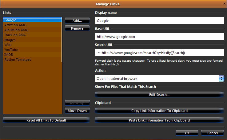

Search Wizard


Consider adding a background image to the frame area, replace that dark grey with something wooden. Perhaps consider a wooden 'default button' image, and also, review the margin settings for the default button, as, as you can see from the customise links image above, the buttons are being stretched at the ends.
Finally, have you considered making your own, wooden, tab images too? Those default tabs look way out place against the wood.

Hopefully, you take my comments as they are meant, ie., constructive criticism. I've only released two skins myself, and in both threads I found the feedback, albeit from only two or three of the hundreds who downloaded, to be invaluable, and the comments and suggestions really helped me.

There's a "skinning tutorial" thread pinned at the top of this forum, if you have any questions, could you possibly ask them in that thread? It would help to keep the tips and tricks in one handy location.

I really like these skins, especially the oak variety, but have to say, the glassy blue stuff, at very least, would have to go before I used it for any great length of time.
Great work so far, keep it up!

regards,
-marko.

I Still Want A Jersey Cow Skin
I've been thinking about this....

MtnBeachBum

  • World Citizen
  • ***
  • Posts: 101
Re: New Yesteryear Wooden skins preview
« Reply #16 on: March 08, 2009, 10:41:06 pm »

Thank you very much for your suggestions Marko. I appreciate your input. I have started working on your suggestions. I was unaware that you could you didn't have to have a playerbar display. That knowledge would have saved me a tremendous headache!
I will post any further questions in the skinning tutorial, thank you.
Teach
Logged
Pages: [1]   Go Up