At risk of sounding patronising, I guess that what you're experiencing is 'just part of the learning curve'.
Don't be afraid to mess around with some of the less obvious options to see what effect they have on the view scheme, something that's helped somewhat by the the fact that changes update in real time behind the options dialogue.
You've probably sussed most of it out by now, but just in case, and for anyone else who may be slightly put off by the customise view system, maybe the following will help:
Adding a new view to the treeTo add a new view scheme to the tree, click on
View in the top toolbar, hover over "Add View", and then click on 'Add library view...'. You will then be presented with the following dialogue:
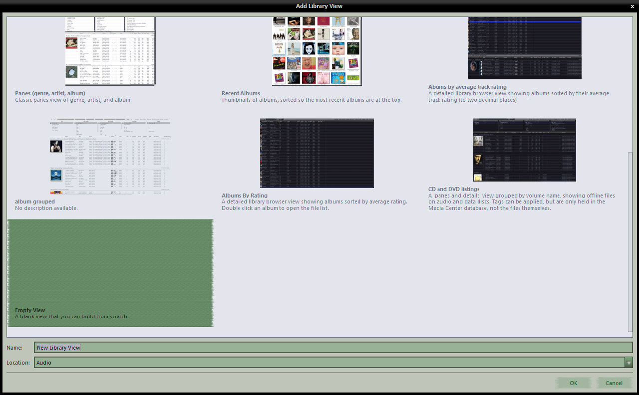
This is a list of preset view schemes, with a thumbnail image and description. If you see one there that fits the bill for you, the quickest way to add it is to double click on the thumbnail of choice.
The view will be added to the tree using the name as shown below the thumbnail, in the place on the tree specified in the 'Location' field.
If you wish to change the name, or the location, single click to select the view, make the required changes in the two fields below, and press the OK button.
For the purposes of this guide, I have chosen the 'Empty View'. When you choose this option, remember to give it a name, otherwise it will get added as "New library view" and you'll need to rename that in the tree directly after the view has been created. The view is added and you are immediately shown the "Customise View" dialogue.
Customise Current ViewThe customise current view dialogue for our new 'empty' view looks like so:
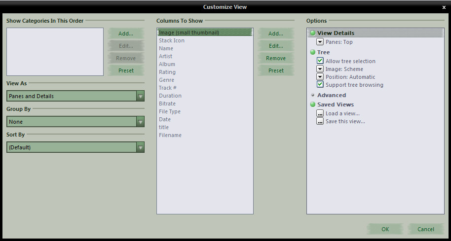
Here, we can see from the "View as" field that the view scheme is set to use the classic MC "panes on top, details at the bottom" layout, also, note that the "Show Categories In This Order" box is empty.
Try clicking in the "View As" field and notice that the options presented here quite limited. Leave this set to 'Panes and Details' for now, and return to the categories box.
Categories (panes)Categories are panes. To add new panes to your view, click the add button, and you will see a new dialogue that looks like so:
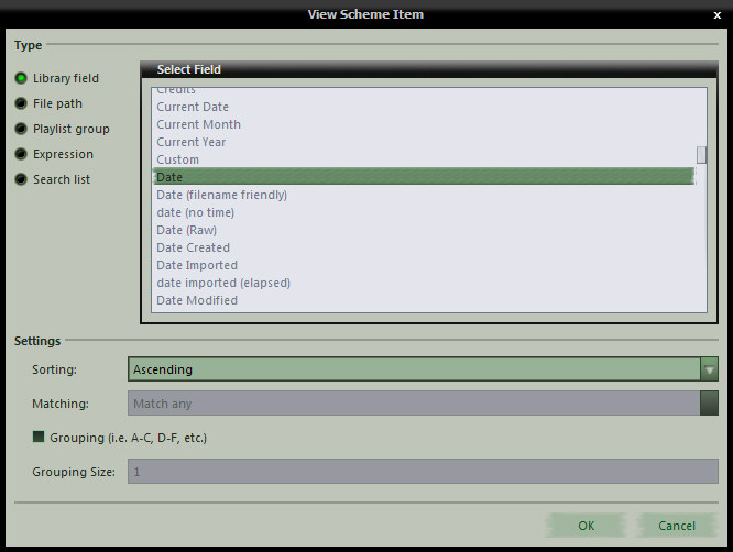
- Library Field: The library field is the most used and easiest to explain. With a few exceptions, any field you have in your database, be it a bog standard, regular field or a custom, calculated data field, is present in the 'Select Field' list, so, you find it, select it, choose the sort order you desire, and if you would like grouping, specify that also, and press OK to return to the main customise view dialogue. 'Matching' is used for Playlist group and Search list type categories, and specifies how you want MC to treat multiple selections in the pane. If any of the settings options do not apply to a given field, they are disabled. In setting up this view scheme, we will be using the Library field option exclusively, but before moving on, I'll skim over the other options.
- File Path: This option allows you to add a pane that effectively contains a folder tree of the files in the list. If you leave the path field empty, then the tree is built using the drive letter(s) as the root, or starting point, otherwise, any folder you specify here becomes the 'virtual root' or starting point, and only files contained within that folder and it's subfolders will be listed.
- Playlist Group: This option allows you to select a playlist group from the tree, and all playlists and smartlists contained within that group will be listed in the pane. Only files that exist in the playlists and smartlists will be shown in this case.
- Expression: Expressions are a powerful and polarising option, and too much to get into in this post. If you're interested, there's a brief introduction here, an example here and a full list of functions here.
- Search list: This option allows you to add a pane that contains several search rules, each one being selectable in it's own right and the file list will adapt accordingly. For audio, imagine a pane with things such as 'Recently Imported', 'Most Played' 'Never Played' etc. etc.. You give each search a name as you would like it to appear in the pane and specify the rule you'd like the pane to apply. The beauty of these is, that you can specify different sort rules in the searches and when selected, they override the sorting specified in the "Customise Current View" dialogue
So, getting back to our view scheme building, the first pane we want is the [Date] field. Select that, press OK, we are returned to the Customise view dialogue, and a second or so later the [Date] field shows up in the categories box. Go through these steps another two times to add the [album artist (auto)] field and the [album] field. If you are not happy with the order of the categories, you can drag and drop them into the order you desire.
You should now find that that there are many new choices in the "View As" menu...
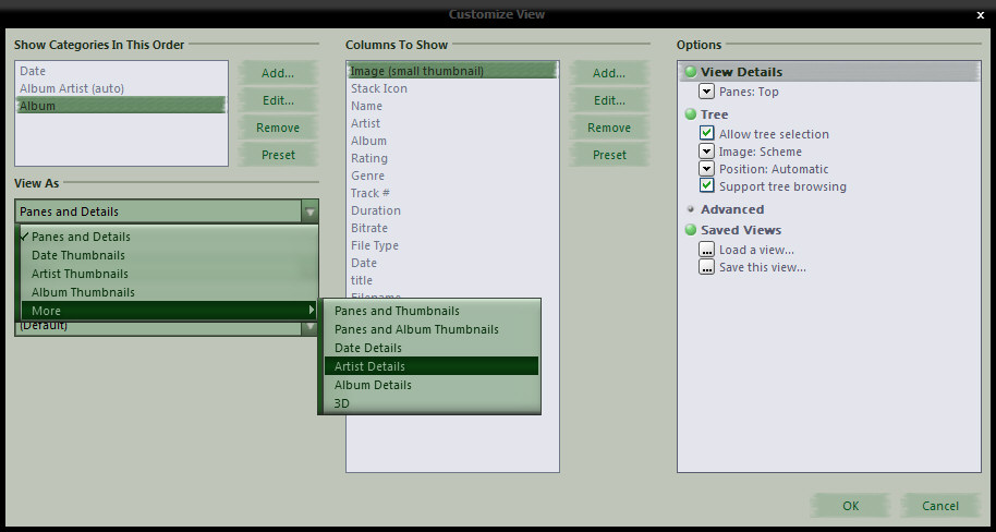
We are going to choose the "Date Thumbnails" option for our view scheme. Having done that, you will notice the view behind the dialogue change, the panes have now gone, and in their place, there are thumbnail fans representing each year...
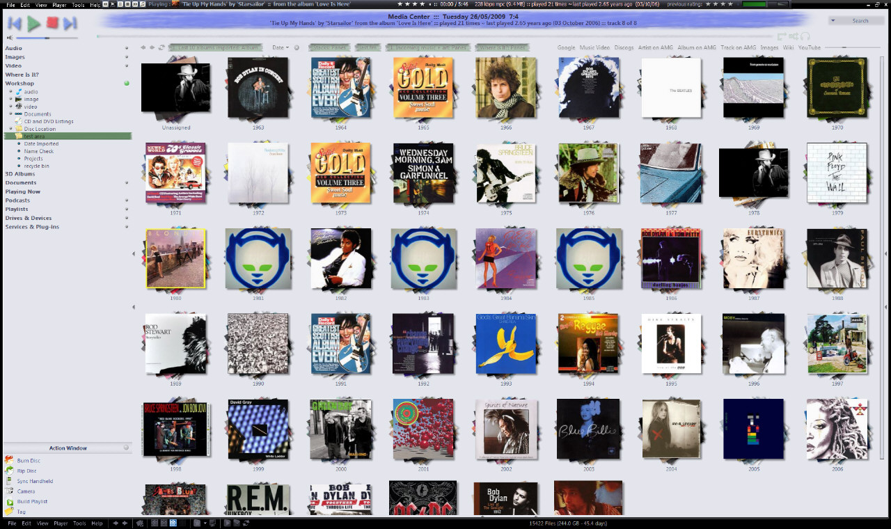 (click image to view full size)
Everything else in the customise view dialogue will be at default settings, press the OK button and click around in the view scheme for a bit....
Each category (or pane if you prefer) now becomes a view in its own right. In a pane view, you would select a year in the year pane, and the artist and album panes to the right of the date pane will filter according to the date selection, as will the file list below the panes. This "Date Thumbnails" view works in the same way, it just displays the information differently. Double click on a year, and the view will change to show thumbnails of artists with music in that year; double click on an artist, and the view will change to show thumbnails of that artist's albums from that year. We are now in our third and final pane; if you double click on an album, the file list will open up to show the tracks on that album, double click on the album a second time, and the file list will close. Note that as you progress through the view, a breadcrumb trail builds up at the top of the view and you can click on these stages to return directly to that part of the view. When you're done clicking around, return to the date thumbnail view, hover the mouse over the word "Date" at the top of the view (the 'view header') and when the drop menu appears, choose 'Customise View' to open the customise view dialogue once more...
Fine tuning the viewYou will have noticed that when we chose to use the 'Date thumbnails' view options earlier, the customise view dialogue changed a bit. The "Columns to show" options have been removed, and a new option, "Select location to change" has been added above the category picker. This option always defaults to "Top" and is a little misleading as the file list (the bottom) defaults to hidden.
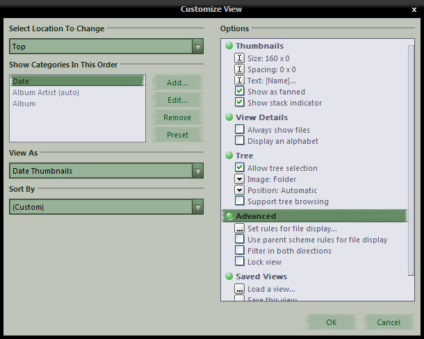 Start at the top
Contrary to my screenshots above, leave the sorting option at 'Default' for best results, and move over to the options on the right...
thumbnails- Size and Spacing: These are purely down to individual preference. I always leave spacing set at zero, and find it easier to use the thumbnail slider in the view header to set the size the way I want.
- Text: Here, you can specify the text shown beneath the thumbnails. Again, this is a little confusing to begin with as you'll notice that it defaults to "[Name]". When setting up any library view that is not 'Panes & Details', [Name] in the thumbnail text refers to the the name of the category itself, not the actual [name] field in the MC database. As an example, try adding this expression as a second line beneath [Name] in the text options: if(isequal([name],[date]),,[date]) (It asks MC to check if [name] and [date] are the same, and if so, to do nothing, but if different, show the date. In the date view, you will only see the date, but in the other views, you will see the artist or album name, with the date underneath. We used to be able to set different thumb sizes and different thumb texts on a per level basis, but sadly, that is no longer possible and these settings apply to the entire view.
- 'Show as fanned' and 'Show stack indicator': Again, these are down to personal preference. With regards to the stack indicator, you'll know what that is if you use stacks, and if you don't use them, it won't matter to you which way this is set.
View Details- Always show files: When selected, the file list is always visible, just like a traditional 'panes & details' view.
- Display an alphabet: With this option selected, an alphabet is displayed at the top of the view, and clicking a letter, L for example, will select the first item beginning with L, clicking L again will select the next item beginning with L, and so on. Again, purely personal choice, personally, I never use it.
Tree- Allow tree selection: This option only applies to views that contain sub-views. For example, you may have an 'Artist/Album' view as a sub-view of audio. When selected, you will be able to select this view in the tree and it will display to the right of the tree as expected. If this is unchecked, MC will never load this view, instead, when selected, it will expand the view and select the last used sub-view contained within, just like the default behaviour for MC13 when you click on "Audio" in the tree.
- Image: Use this option to set an icon to be displayed beside the view entry in the tree. The list is limited, but adequate, and non-configurable.
- Position: This option allows minimalistic control over the view scheme position in the tree. You get to choose from top, bottom or automatic. Automatic sets the scheme alphabetically within its chosen group, the other two are self explanatory.
- Support tree browsing: Enable this option and as well as having the 'click through' thumbnail view, you will also be able to drill through the view using the tree. When selecting a drilled to item in the tree, the view automatically switches to list view to display the selected files. Click back on the main view entry in the tree, and the view reverts back to the thumbnail system. The best of both worlds? You will have to try it and decide for yourself how you would like this set. I don't use it much, but apparently, it makes tagging via drag and drop a bit of a breeze.
<
cont...>
