INTERACT FORUM

Please login or register.

Login with username, password and session length
Advanced search  
Pages: [1]   Go Down

Author Topic: Customise Current View Expounded  (Read 29413 times)

marko

  • MC Beta Team
  • Citizen of the Universe
  • *****
  • Posts: 9139
Customise Current View Expounded
« on: January 06, 2012, 06:11:01 am »

As promised, here's the update. It took longer than expected. The idea is that you build the view as you move through the article, getting a feel for what everything does.
The original tutorial from 2009 can be found here.

Also note, that although old, all of this tutorial is still current at this time, MC28, December 2021.

Adding a new view to the tree
We are going to add an "Audio" view, click on "Audio" in the tree before starting.
To add a new view scheme to the tree, click on View in the top toolbar, hover over "Add View", and then click on 'Add library view...'. You will then be presented with the following dialogue:
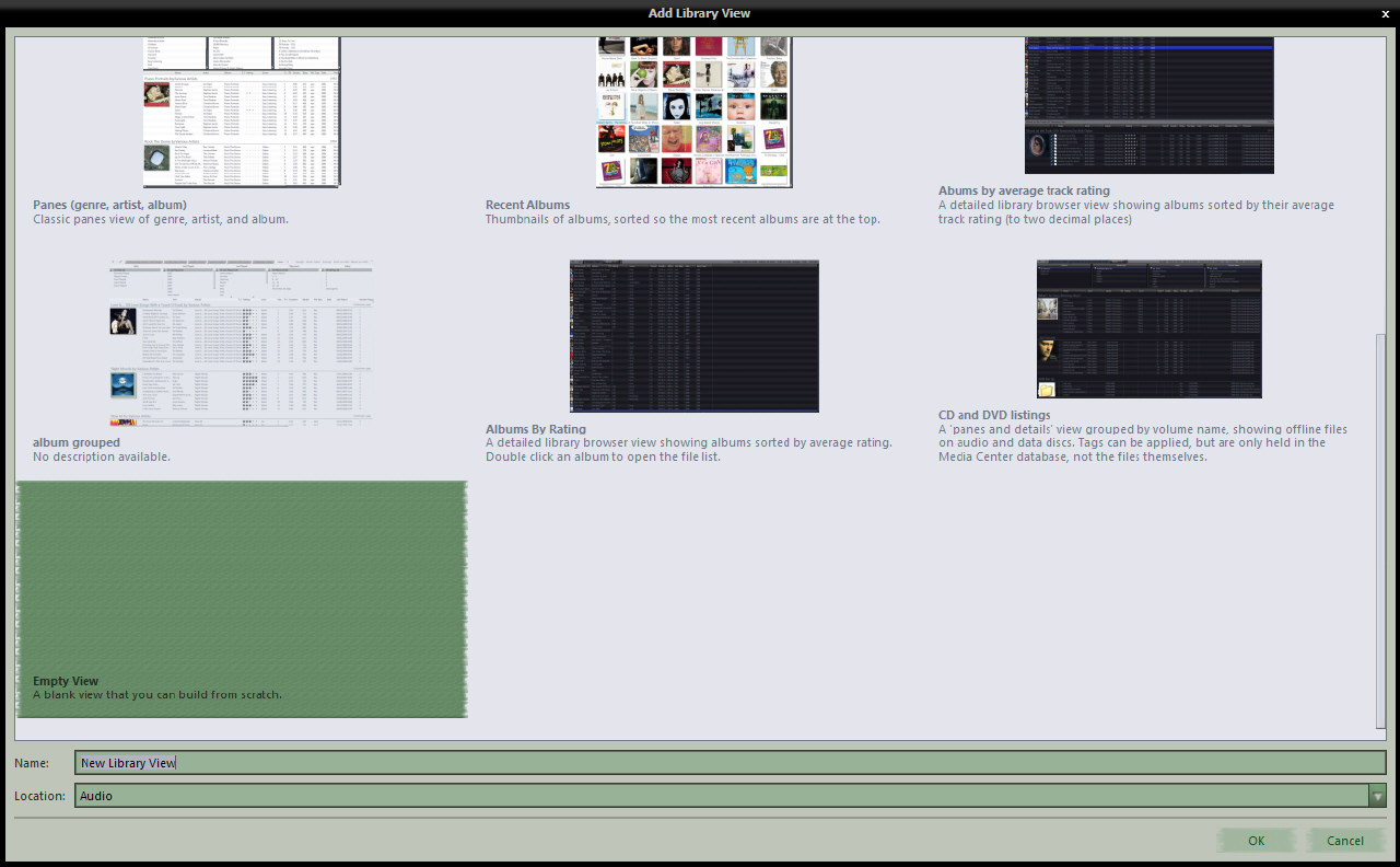
This is a list of preset view schemes, with a thumbnail image and description. If you see one there that fits the bill for you, the quickest way to add it is to double click on the thumbnail of choice.
The view will be added to the tree using the name as shown below the thumbnail, in the place on the tree specified in the 'Location' field.
If you wish to change the name, or the location, single click to select the view, make the required changes in the two fields below, and press the OK button.
For the purposes of this guide, I have chosen the 'Empty View'. When you choose this option, remember to give it a name, otherwise it will get added as "New library view" and you'll need to rename that in the tree directly after the view has been created. The view is added and you are immediately shown the "Customise View" dialogue.
Before we continue, a few more points about this "View Picker" mght be useful.
  • If you wish to change the "Location" field, do so before deciding on a view to add, as changing "Location" resets the view choice, and reverts any change you may have made to the "Name" field. A bit counter intuitive to have to work from the bottom up, but that's what we have at the moment.
  • If one of the predefined views is chosen, that view is added to the tree and selected for viewing. "Customise View" dialogue is only shown in the next step when the "Empty View" is chosen. To further customise a predefined view, right click the new view in the tree and choose the "Customise" option.
  • The "View Picker" attempts to be intelligent regarding the choices of predefined views it presents. For example, if "Location" is set to "Audio", it will not present any views that contain images or video files, and so on.
Now, getting back to our new view....


Customise Current View
The customise current view dialogue for our new 'empty' view looks like so:
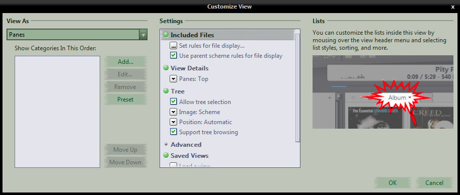
Here, we can see from the "View as" field that the view scheme is set to use the classic MC "panes" layout, also, note that the "Show Categories In This Order" box is empty. Leaving the view set to "Panes" for now, the next step is to add some "Categories"...

Categories (panes)
Categories are panes. To add new panes to your view, click the add button, and you will see a new dialogue that looks like so:
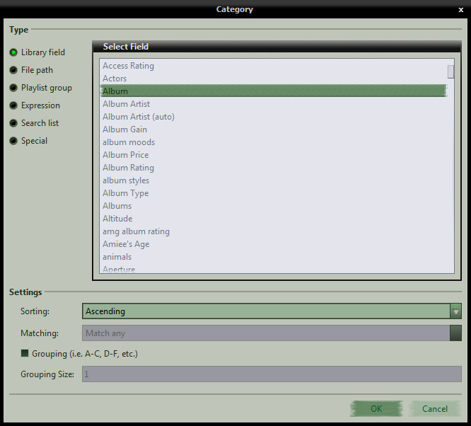
  • Library Field: The library field is the most used and easiest to explain. With a few exceptions, any field you have in your database, be it a bog standard, regular field or a custom, calculated data field, is present in the 'Select Field' list, so, you find it, select it, choose the sort order you desire, and if you would like grouping, specify that also, and press OK to return to the main customise view dialogue. 'Matching' is used for Playlist group and Search list type categories, and specifies how you want MC to treat multiple selections in the pane. If any of the settings options do not apply to a given field, they are disabled. In setting up this view scheme, we will be using the Library field option exclusively, but before moving on, I'll skim over the other options.
  • File Path: This option allows you to add a pane that effectively contains a folder tree of the files in the list. If you leave the path field empty, then the tree is built using the drive letter(s) as the root, or starting point, otherwise, any folder you specify here becomes the 'virtual root' or starting point, and only files contained within that folder and it's subfolders will be listed.
  • Playlist Group: This option allows you to select a playlist group from the tree, and all playlists and smartlists contained within that group will be listed in the pane. Only files that exist in the playlists and smartlists will be shown in this case.
  • Expression: Expressions are a powerful and polarising option, and too much to get into in this post. If you're interested, there's a brief introduction here, an example here and a full list of functions here.
  • Search list: This option allows you to add a pane that contains several search rules, each one being selectable in it's own right and the file list will adapt accordingly. For audio, imagine a pane with things such as 'Recently Imported', 'Most Played' 'Never Played' etc. etc.. You give each search a name as you would like it to appear in the pane and specify the rule you'd like the pane to apply. The beauty of these is, that you can specify different sort rules in the searches and when selected, they override the sorting specified in the "Customise Current View" dialogue

So, getting back to our view scheme building, the first pane we want is the [Album Artist (auto)] field. Select that, press OK, we are returned to the Customise view dialogue, and a second or so later the [Album Artist (auto)] field shows up in the categories box. Go through these steps once more to add the [album] field. If you are not happy with the order of the categories, you can drag and drop them into the order you desire, or if you prefer, use the "Move Up"/"Move Down" buttons.

For now, accept the default settings as they are and press the OK button to close the cutomise view dialogue and see your new "Artist/Album" panes view...
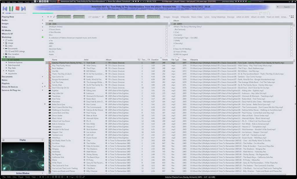
(click image to view full size)
Click around in the view scheme for a bit... This is a very basic view. Simple audio only, two pane affair, but much can be learned from it. Let's start with the panes first:
  • Select an artist in the left pane, see the album pane on the right adjust to list only that artists' albums, and the file list below adjust to list only those tracks.
  • Select an album in the album pane, and the artist pane filters down to show the artist for that album. In this particular view scheme, that might not be 'all that', but imagine a more complex view with four or five panes? It filters in the same way and can be very impressive indeed. If you ever get lost, note that as soon as you begin filtering, a "reset selection" option becomes available in the view header, which does exactly as expected and resets the selection in all panes at once. This same option, as well as one designed to reset a single pane, is available on the right click menu from inside any pane. If you don't like or desire this behaviour, it can be turned off, and that is covered later on in this article
  • If you need to add a pane, you can do so directly from here, without the need to open the full 'Customise' dialogue, by clicking on a pane header. Doing so, produces an intuitive menu...
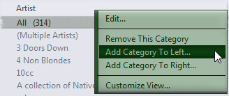
    • Edit: Allows you to change the selected pane completely.
    • The middle three really don't require any explanation
    • Cutomise View...: Opens the Customise view dialogue
    • While we are in this area, click on the artist pane header, choose "Add category to left" and add a "Media Type" pane. For now, it will only list "Audio", but that will change later!
  • The View Header Menu

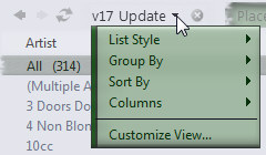
    Use the view header menu to fine tune the view scheme. Spend some time experimenting with these options to see their effect and learn what suits the view's purpose best. Note that the menu changes if you choose a 'thumbnail' list style, removing the then redundant 'Columns' entry, replacing it with options that allow control over thumbnail related stuff such as text and spacing. Personally, I've never used the column picker in the view header menu, as my preference is to use the same menu available when right clicking on a column header.
  • Also note the View's entry in the tree. See that it is expandable, and that if you drill down into the tree and select something, the panes are removed, leaving just the file list in view. Re-select the main view entry in the tree to return to pane browsing mode.

=================================================================================================================================
When you are ready, the next job is to go back into the 'Customise View' tool and go through the view options and settings that were left at default earlier...

To refresh, here is that tool again, now showing the "Media Type" category we added earlier:
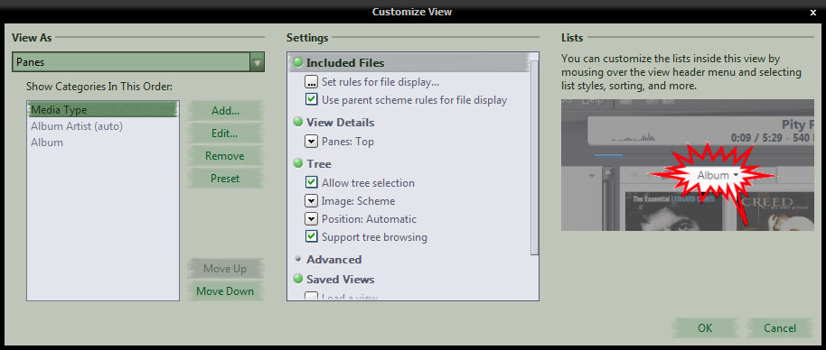

Staying with panes for now, let's start at the top and work down...
Set rules for file display & Use parent scheme rules for file display
  • "Use parent rules" is set as default. It makes sense too. We added a view as a child of the main "Audio" entry in the tree. That entry is configured to list all audio files that exist in the library, and as this view inherits that configuration, that's what it lists too. Take the tick out of there by clicking on it, read the next section, then press OK to see it in action.
  • There are now no filters in place at all, and the view is listing every file, of every type, that you have in your library. If you are an "Audio only" user, this will be an extremely boring exercise for you as you will see no difference whatsoever! The "Media Type" pane that we added earlier should now show all the different media types that are in the file list below.
    • Tip: Right click on tool bar, up where it says File, Edit etc. and add the button called "List Style: Automatic", then click on it to activate it. See what happens in the list when you switch between Audio and Image or Video?

Once you're bored playing with that, go back into "Customise View" and we'll talk some more about "Rules for file display"...

  • Clicking on the "Set rules" entry will launch Media Center's "Search Editor" tool
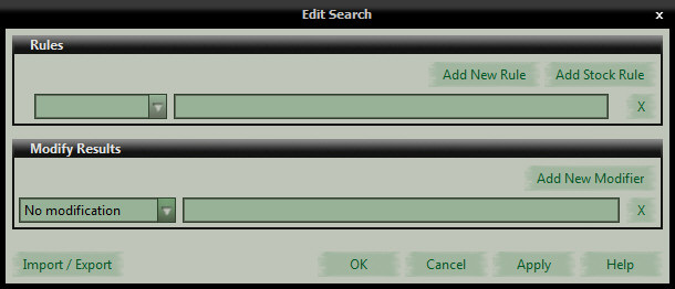
    As expected, it is completely empty. Let's apply a  couple of simple rules that will exclude Multiple Artist albums and video files...
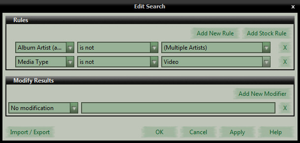
  • OK out of there, all the way out of the "Customise" tool, and see the effect the new rules have had. While not functionally useful, this should demonstrate two things...
    • The default settings are extremely well chosen, meaning that most often, you won't need to be concerned with them, and,
    • should you want something a little different, such as all your media in a view under "Audio"!!, you have the means at your fingertips to make it happen.
    Let's return to the Customise View tool...

Continued--->

marko

  • MC Beta Team
  • Citizen of the Universe
  • *****
  • Posts: 9139
Re: Customise Current View v17 Expounded
« Reply #1 on: January 06, 2012, 06:11:25 am »

  • View Details: Click on that, and you are presented with four choices for positioning the panes. Experiment with these to get a feel for what works and what does not. I have never used "Panes: Right", my brain just can't work that way! "Panes: Left" on the other hand, is used in the majority of my image views, though this works so well for me as I do all my image tagging in a single nested keyword pane. Dropdown panes are great for freeing up screen real estate, but are not as fluid an experience as regular panes are.
  • Tree:
    • Allow Tree Selection: This option only makes sense when dealing with the parent view of a view scheme group. You will have noticed that when you select Audio, for example, in the tree, the group expands and the last viewed view under audio is selected. This happens because this option is unchecked in the default Audio view. For child views such as the one we are playing with, this should remain checked.
    • Image: Each view entry in the tree has an icon to its left, and here's where you can choose one for your view. Your choice here does affect how the view orders itself in the tree relative to other views though, so bear that in mind when choosing and the result is unexpected
    • Position: Choices here are top, bottom, or automatic. I tend to leave mine at automatic and use numbers at the start of the view name to order the most important views at the top
    • Support tree browsing: Earlier on, I pointed out that the tree entry for this view was expandable. This is why! Now, I was there when panes were first introduced, and boy, did that stir things up or what!! It's really all down to personal preference... I never use tree browsing and have it turned off in all my views, but that's just me, and kudos to J River for finding a solution, as always, that kept both camps happy
  • Advanced:
    • Filter in both directions: Again, earlier on I talked about bi-directional filtering, and here's where you turn it off. With this option unchecked, selecting something in a pane will cause the contents of panes on the right to filter as normal, but those to the left will not filter. It can be a bit confusing, try it out to actually see the difference in action.
    • Lock View: When this option is selected, it does not actually prevent you from making changes to the view setup, but if you do try to edit a locked view, you will be presented with the following warning, with choices:

      What you do from there is entirely up to you. Some (All?) of the default views provided with Media Center are locked. Again, this is purely down to personal preference, I don't use it.
  • Saved Views: Right at the start of this exercise, there was the "View Picker" with its little thumbnails and descriptions of predefined views that could be loaded with a double click. The theory here is that if you hit "Load view" that same view picker opens and you would pick a saved view to load. In practice, most often the view you want isn't there because it does not match the media types of the location you want to add it to. Similarly, the "Save view" option is fraught with issues. For example, there is a browse button in the save dialogue, but, if you save the view anywhere other than the default location offered, it will not be presented as a "Load view" option, ever, and there is no way to browse for a saved view from the "Load View" tool. Views are saved as jvi files, but these are not associated with Media Center, and when forced, Media Center does not know what to do with saved view files when opening them from the hard drive. In my experience, best practice is to forego these two altogether and rely on library backups to preserve the view layout, and when you want to have a view copied, just drag and drop it where you want it in tree, and when you drop, you will get a "Move / Copy?" option. Minor tweaking after copying is a breeze compared to fighting with the "Save / Load" views options.

Next up... "View As"...

Having reached the bottom of the "Settings" options, turn your attention back to the left side of the customise tool, and click where it says "Panes" to see a drop menu with four choices:


  • View As:
    • Panes: Covered extensively above :)
    • Categories: Categories are a wonderful option, right up there on a par with panes. If you have grasped the concept of the panes view, dealing primarily with moving from pane to pane, left to right, filtering as you go, you will 'get' this. Each category (or pane if you prefer) now becomes a view in its own right. In a pane view, you would select a Media Type in the first pane, and the Artist and Album panes to the right of the Media Type pane will filter according to the Media Type selection, as will the file list below the panes. This "Category" view works in the same way, it just displays the information differently. Double click on a Media Type, and the view will change to show thumbnails of Artists associated with that Media Type; double click on an artist, and the view will change to show thumbnails of that artist's albums. We are now in our third and final pane; if you double click on an album, the file list will open up to show the tracks on that album, double click on the album a second time, and the file list will close. When arriving at the last level, if there is only a single line of thumbnails present, the file list will open automatically for you.
      When hovering the mouse over a category grouping, the thumbnail will roll up a little to reveal some useful options.
      Note that as you progress through the view, a breadcrumb trail builds up at the top of the view and you can click on these stages to return directly to that part of the view. Here's how the view looks in "Category" mode:

      (click image to view full size)

      When the file list is open in a category view, it has its own view header menu, located on the far left end of the list header, where you can specify grouping, sorting etc. etc. for the list. This is independent of the options applied to the category view above, but applies to the lists in all levels of the category view.

      Having switched the view from Panes to Category mode, note that in the settings on the right, the "Pane" options shown under View Details have been replaced by category specific options:
      • View Details:
        • Always Show Files: By default, the file list is always closed in category views. Select this option to have the list always open.
        • Show Alphabet: When selected, an alphabet will display in the view header, and clicking a letter will jump you to the first occurrence of that letter at the start of the name.
    • 3D: This takes every file returned by the view and presents them as a wall of tiles that slide left or right with a touch of 3D animation.
    • File List: Just a list of files! Only useful when used in conjunction with tree browsing

    And there you have it... Customise Views v17. Hope you found it useful. Any questions, omissions or howling mistakes, just shout :)
    This view won't really be of any practical use other than demonstrating what's possible, and why. Once you've finished with it, just right click on it in the tree and click on "Delete" to remove it. No files will be deleted, only the view itself.

    -marko.

wig

  • MC Beta Team
  • Citizen of the Universe
  • *****
  • Posts: 750
Re: Customise Current View v17 Expounded
« Reply #2 on: January 06, 2012, 12:02:21 pm »

Very cool primer, marko. Thanks for the effort. I'd never worked with categories before, but after setting up a genre Category view I can definitely see the possibilities.

One question: I'd love to add Panes to my Playing Now screen for tagging purposes, so that I have these three elements stacked top to bottom: Cover Art, Panes, and Playing Now Queue.

Is there any way to achieve this sort of view scheme? I've tried a few things including using Split View, but I can't get it right. Any ideas?
Logged

vagskal

  • Citizen of the Universe
  • *****
  • Posts: 1227
Re: Customise Current View v17 Expounded
« Reply #3 on: January 06, 2012, 12:34:22 pm »

Great post, as always! When I was new to MC I learned a lot from your previous view configuration post (and other well composed posts). Thanks!

One small caveat: Bi-directional filtering is (for good reasons) not set as the default when creating a new empty view.

What do you mean by this? Can there be a file list in a category view on other levels than the last?
Quote
When the file list is open in a category view, it has its own view header menu, located on the far left end of the list header, where you can specify grouping, sorting etc. etc. for the list. This is independent of the options applied to the category view above, but applies to the lists in all levels of the category view.
Logged

marko

  • MC Beta Team
  • Citizen of the Universe
  • *****
  • Posts: 9139
Re: Customise Current View v17 Expounded
« Reply #4 on: January 06, 2012, 12:50:41 pm »

wig, Panes in playing now are not possible, there may be other solutions though...

vagskal, re. Bi-Directional filtering... I think it depends on the parent setting, adding under my "Test View", it is enabled by default, so I just tried adding a new audio view and sure enough, there, it is not enabled.

Have a look at your category views, down the bottom of every one there is a horizontal splitter... drag that up to reveal the file list, also, in thumbnail view, you can hover over the thumbnail and choose "File" from the choices that are revealed to bring the list into view.

-marko

vagskal

  • Citizen of the Universe
  • *****
  • Posts: 1227
Re: Customise Current View v17 Expounded
« Reply #5 on: January 06, 2012, 12:59:54 pm »

Have a look at your category views, down the bottom of every one there is a horizontal splitter... drag that up to reveal the file list, also, in thumbnail view, you can hover over the thumbnail and choose "File" from the choices that are revealed to bring the list into view.

And right you are, of course. I always learn something...

PS. It is probably the same with the List Style => Details. Only one set of columns for the details list style seems possible within one category view. (But there can be a different List Style for each level.)
Logged

wig

  • MC Beta Team
  • Citizen of the Universe
  • *****
  • Posts: 750
Re: Customise Current View v17 Expounded
« Reply #6 on: January 07, 2012, 03:54:16 pm »

wig, Panes in playing now are not possible, there may be other solutions though...

Gotcha. I started looking through the expressions, and came across IsPlaying(). Now I'm wondering if it's possible to construct a view that would show the currently playing track, followed by recently played tracks. I must investigate  :)

Logged

wig

  • MC Beta Team
  • Citizen of the Universe
  • *****
  • Posts: 750
Re: Customise Current View v17 Expounded
« Reply #7 on: January 08, 2012, 09:41:45 am »

Thanks to mark_h's excellent thread, I was able to get a lot closer to my ideal setup.

Following mark_h's lead, I created an IsPlayingNow custom field. Next I created a custom Panes view and set the following rule for view display:

([IsPlayingNow]=[1] or -[Canon]=[No]) ~sort=[IsPlayingNow]-d,[Last Played]-d

Canon is another custom field I use to segregate my 'regular' music catalog from the junk that I can't bring myself to delete  ;)

Then I set up a Split Navigation view with two rows. I set the top view up to display Playing Now, expanded the Cover to full and then locked it.

The bottom view is my new custom view, named Recently Played. I set it to Position:Top and Voila!


It's not perfect (I'll detail the issues below) but it's an encouraging start to the project. I have cover art, panes for tagging, and a list of my recently played tracks, including the current playing track. Extremely handy.  :)

Remaining issues:
  • Only shows the Playing Now track on local zones
  • The view doesn't auto refresh (F5 works, but tedious)
  • Too much extraneous info in the panes (the 'all', 'new ___', and 'unassigned' rows)
  • I can't limit the selection or else linkable columns and searches aren't useful. It does load those 26,000 tracks pretty darn quick though!
  • The linkable columns result are sorted by last played

Thanks again the community support!

- wig
Logged

rumos

  • Recent member
  • *
  • Posts: 7
Re: Customise Current View v17 Expounded
« Reply #8 on: January 10, 2012, 08:53:18 am »

Hello Marko,

thank you for your great introduction of customizing the libary view!!
I'm using the categories as I like the thumbnail view of my Albums most. Now my problem :)

I would like to add a seperate libary view with only one single folder of my HDD. 
What I did is adding "File Path" as first entry in the "Show Categories In This Order" box.
This works so far, but there is one problem. Instead of showing only the albums of the folder I entered, there is a single thumbnail showing up with all albums of my music libary - it's called unassigned. If I double click on it, all my libary files are shown.

A second problem is, when I'm adding any further sorting entry there is no effect visible.
For example if my second entry in the "Show Categories In This Order" box is "Album", then there is nothing happening.

Is there any workaround? Thank you very much in advance!
Logged

wig

  • MC Beta Team
  • Citizen of the Universe
  • *****
  • Posts: 750
Re: Customise Current View v17 Expounded
« Reply #9 on: January 10, 2012, 01:50:41 pm »

thank you for your great introduction of customizing the libary view!!
I'm using the categories as I like the thumbnail view of my Albums most. Now my problem :)

I would like to add a seperate libary view with only one single folder of my HDD.  
What I did is adding "File Path" as first entry in the "Show Categories In This Order" box.

Instead of adding the File Path as a category, how about adding it as a display rule instead?

Click the 'Set rules for File Display' button in the Settings screen.

Under Rules, set up one that read File (path) - contains - [path to the folder]

This should restrict the view to just albums in the folder. Now you can set up the categories as you like.


Logged

rumos

  • Recent member
  • *
  • Posts: 7
Re: Customise Current View v17 Expounded
« Reply #10 on: January 10, 2012, 02:35:57 pm »

Hello Wig,

1000x thank you - it worked :)
Now I have a better understanding of what to do & the possibilities given.

Greetings
Logged

drmimosa

  • MC Beta Team
  • Citizen of the Universe
  • *****
  • Posts: 690
Re: Customise Current View v17 Expounded
« Reply #11 on: January 20, 2012, 03:02:53 pm »

This guide is fantastic! Many thanks to Marko for putting the effort to compile and explain this information in such a clear, straightforward tutorial. I have picked up several of these concepts over the past year of using MC15-17 through trail and error, but still found a lot of new information here.

Very helpful information for new and intermediate users!!
Logged

helefanndt

  • Member
  • *
  • Posts: 4
Re: Customise Current View v17 Expounded
« Reply #12 on: January 29, 2012, 12:52:32 pm »

Thanks for this guide, it helped me quite a bit!

However I'm still having a problem, which I think has also been mentioned in these threads
http://yabb.jriver.com/interact/index.php?topic=67869.0
http://yabb.jriver.com/interact/index.php?topic=66956.0

I'm using pane view with the list style "albums thumbnails". I'm narrowing down the number of albums with a couple of panes (genre, period, style,...) and then browse through the filtered albums using the "albums thumbnails" view because I'm faster that way than if I use the list style "Details".
However if I then click on an album thumbnail I would expect it to open a list of the contained tracks (a file list) - in the same way as in the album category, where you can either double click on an album to open the file list or click on the thumbnail once and then select the appearing "File". Instead the album starts to play from the beginning.

It seems like such an obvious thing, is there no way to do this?

Thanks!

Edited:
On an unrelated note:
Is there a way to customize the width of the individual panes? Eg making the leftmost pane half the width to give the other ones more screen space.

Logged

spiggytopes

  • World Citizen
  • ***
  • Posts: 211
Re: Customise Current View v17 Expounded
« Reply #13 on: May 24, 2012, 02:05:15 am »

Hi All,

Just joined and about to try v 17 in place of WMC and Media Browser.

I can already see that V 17 is in a different league to WMC, but please, a fundamental question so I don't get stressed over the weekend setting it up .....

Can I simply get v17 to set my folders, eg "TV" and "TV-DVD" as one display?

That is, run v 17 and one click to see all TV shows?

From reading above I think yes, but would be very happy to get confirmation.

thanks in advance.
Logged
Pages: [1]   Go Up