First of all, I think I speak for more than a few when I say that I am grateful for the fixing of the
subtitle overlap issue. Fansubbed anime is now a bit easier to watch.
I just wanted to bring up an aesthetic issue:
While overlapping has been fixed, Red October (Standard or HQ) does not yet appear to be capable of rendering complex soft subpicture arrangements correctly. This is a common problem regarding fansubs because the groups that undertake these projects have altogether moved away from top-fed TL notes in favour of colourful karaoke stints and professional-looking text renders. It's difficult for me to explain in words, but I'll provide an example.
Let's take a look at an obvious instance from the anime,
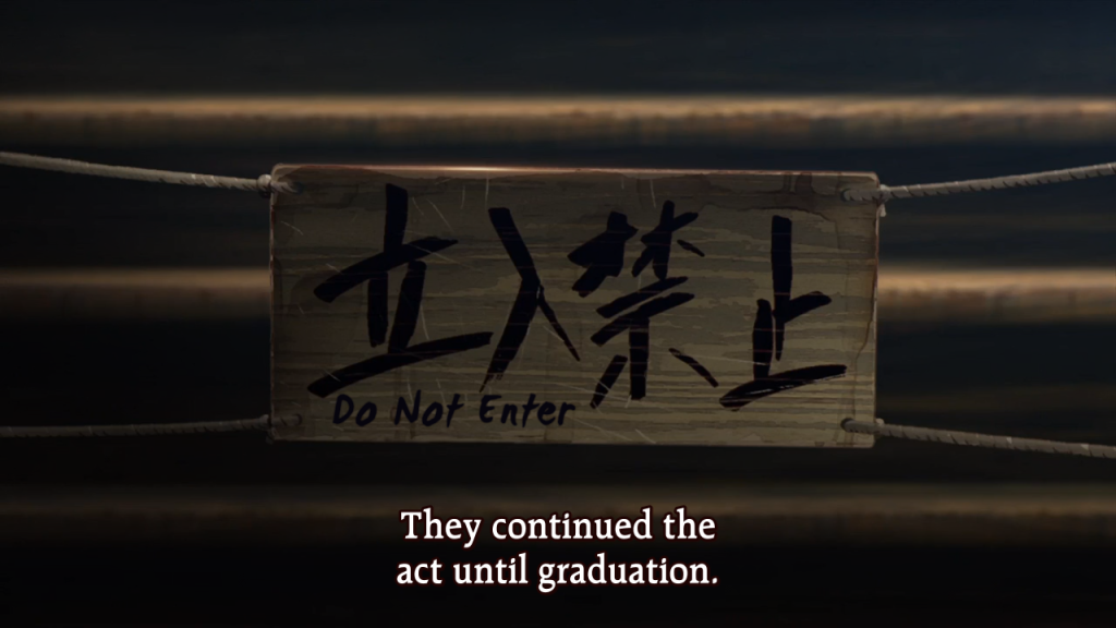
Another, which is currently airing in Japan and being simulcast by licensor and fansubber alike. In the scene below, a sign with Japanese characters is displayed, which is translated by Underwater Subs into English as "Do Not Enter" in a stylised manner, with the intent that the English characters compliment the Japanese, without requiring that it be hardsubbed. It appears correctly with the usual CCCP or K-Lite Codec Pack configuration:

However, the same scene in the same release by the same group, when played in MC via Red October HQ, will not do this, and will instead look like this:

Note also the strange placement at the left side of the video. Why this happened, I am not sure, but I can tell you that it happens somewhat frequently: lines that were meant to appear at the top of the video and/or other places will be to the left instead.
Also, for whatever reason, MC's Red October HQ will not render the standard speech subs in the font chosen by the fansub group. In this case, neither font is particularly extravagant, but it does raise issues if a given group chooses to differentiate two overlapping lines spoken by two different characters via colour outline, which, to my knowledge, is also the preferable method among these groups.
Any chance that this may be addressed in a future build?

 Author
Topic: [17.0.106] Stylised Subtitles & Translations (Read 4635 times)

