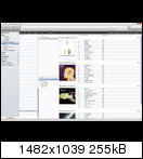
Just wanting to bump this topic again. Library management is getting increasingly difficult for me now that I have multiple versions of the same album imported, and I'm starting to get lists of file
that look like this in the default views. (CD/SACD/SACD Multichannel)
By using increasingly complex grouping methods, it can be brought somewhat under control (including [Description] and [Channels] for example) but
because you can't create groups that have a custom sort order, it looks ugly.
The more I add to my library (recently I have been trying to acquire other versions of some albums which have a better master) the more difficult it has been to manage, and I think I will have to switch over to using the panes view.
But this has the same problem as I demonstrated in the first post - browsing your library, viewing files for the currently selected library item (typically artist or genre) shares the same vertical space, so you don't really get enough for either task, and I find myself constantly resizing them.
Now with the panes view, there is an option to move them over to the left or right, but if you have more than one pane, it becomes useless as it splits vertically (again) and you cannot resize the split.
When using the panes view, at a minimum, I would want to show [Genre], [Album Artist (auto)], and [Album].
Just now when you go to add a pane, even if you are set to the left/right pane view, the context menu gives you the option of
Add Category To Left/Right
, when it really means Above/Below.
I would like to suggest renaming the context menu to Above/Below so that it makes sense, and adding the ability to
actually add panes to the Left & Right of the current item.
For this to work well, you would of course need to enable
Filter in both directionsMockup:

The Genre and Album tags don't need full vertical height, but the Artists section almost requires it.

 Author
Topic: [Request] Move the categories view over to the side. (Read 3090 times)

