If I were you, I'd strongly consider modifying the top-level Video view in the hierarchy to be a Secondary Roller type. This gives you an additional level of views under Video, where you can select "type".
Mine are arranged like so:
Video
- Television
- Movies
- Documentaries
- New Video
- Home Videos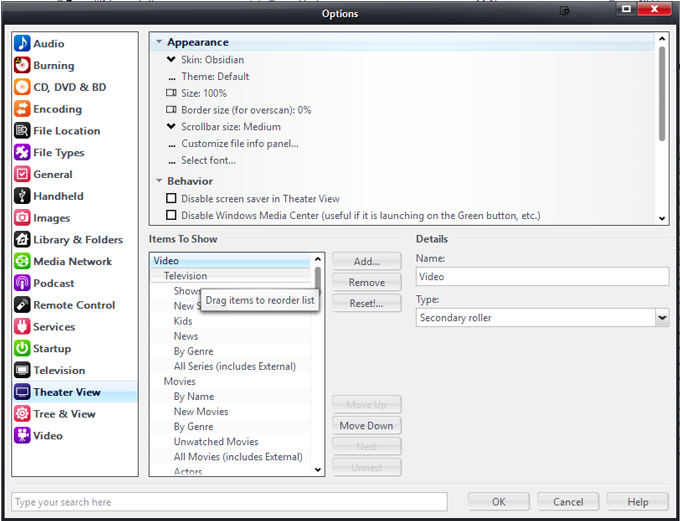
Which results in:
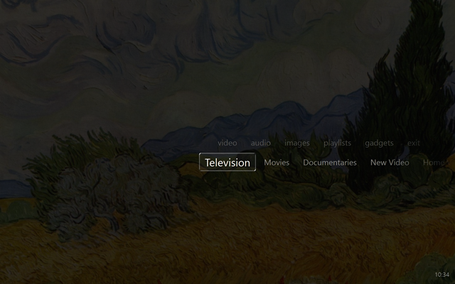
Those second tier views, just have filters that limit which [Media Sub Type] are contained within (or, in the case of New Video and Documentaries, other characteristics), defined via their
Set rules for file display setting.
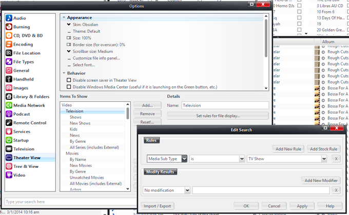
Click to embiggen.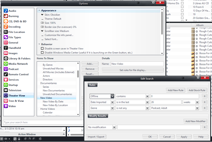
Click to embiggen.Then, the third tier down will be available in the secondary roller once you open up one of these second-tier views. I use this level to select different "sortings and filterings". This allows you to quickly and intuitively navigate to the "type" of video you want, and you are immediately presented with files to choose from (it doesn't make you "pick" something else, it gives you files quickly), but if you want to, you can change the sorting or filtering using the Secondary Roller.
So, underneath my Movies view, I have these options:
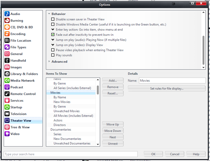
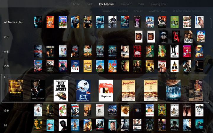
I can choose to view them by Name:
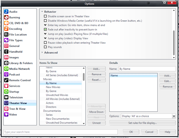 The Name category added here has a Grouping Size of 2, so it shows up with A-B, C-D, E-F, etc in the view.
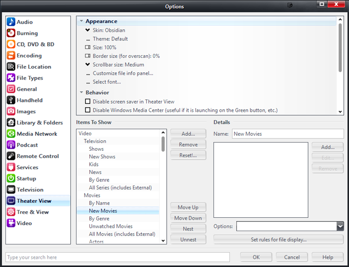
If you don't add any Categories at all to a particular Roller View (useful if it is already pre-filtered and sorted with "likely" choices on top), then it will show you the files immediately. I do this with my New Movies View (and the similar New TV Shows views and other similar ones available in each section)...
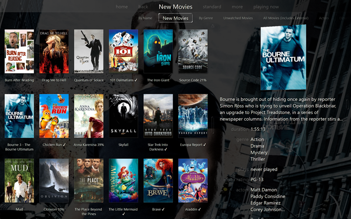
Or by Genre, or filtered to just show the most recent 6 months of new Movies, etc. And all of these are easy to access. Best, it remembers whatever one you last used, so your "most popular" choice in this menu level is immediately accessible and usable. It doesn't "force you" to choose subcategories via the folders, but lets you change sortings easily. But, you can easily change the "sorting or filtering" with that Secondary Roller.
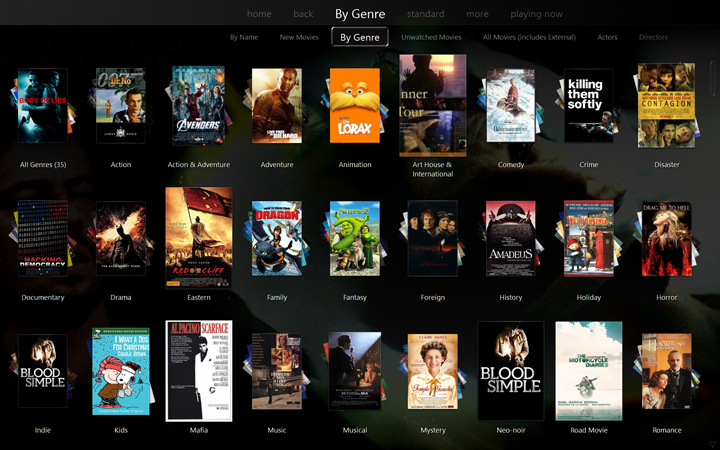
I've found this to be intuitive for my Wife's (and visitor's) usage. They pick Television, and it is probably already "right" for what they want, because what it gets "left on" is the most commonly used choice. It speeds navigation, and doesn't force them to choose between arbitrary categories.
But, if you wanted to make a view that shows only HD movies, or whatever, you can, just add an additional Secondary Roller (third-level) View.
I tried a setup something similar to what connersw recommended before, and I found it was too annoying to always have to navigate through those folders, when often you don't want or need them. And, if you do need them for a particular category, that's okay. You can still add a Fourth Level, and then you'll get those folders for that particular view item.
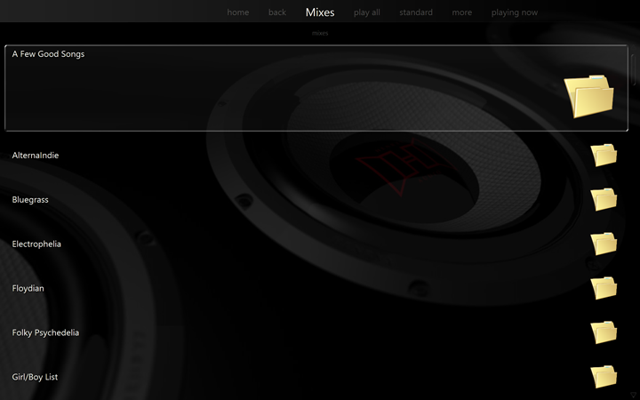
In fact, some of my views do make more sense as folders, instead of secondary rollers. One example is in my Music setup, I have a set of "Mixes". These are like Smartlists (shuffles, built on selected Genres and then run through Play Doctor). But I have them set up in Theater View as Views so that I can browse them from within the Audio section of Theater View. In any case, I
want these to show up as folders, not Secondary Rollers, so I just add a "dummy level" to the view Setup:
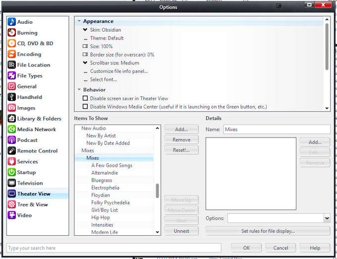 This "level" doesn't actually do anything or add any filters, it is just a "container" for the mix folders below.
There are lots of possible combinations. But try to keep it "quick" and accessible, and you'll probably end up happier. Browsing in Theater View with a remote (or touchscreen) is VERY different from using Standard View. In Standard View, with panes, it is often most useful to break the big library down quickly into manageable hunks to find what you want.
In Theater View, it works best to have pre-defined, most-commonly-used filters, since the alternative forces you to walk large trees of views every time you want to find
anything.
