While I do like Theater View, I often find myself avoiding it because it's simply easier to find what I'm looking for in Standard View.
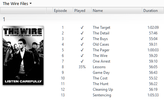
It doesn't get much clearer than this:

I look at this list, and I immediately know what episode I'm up to, and if I have an episode that has only been partially watched.
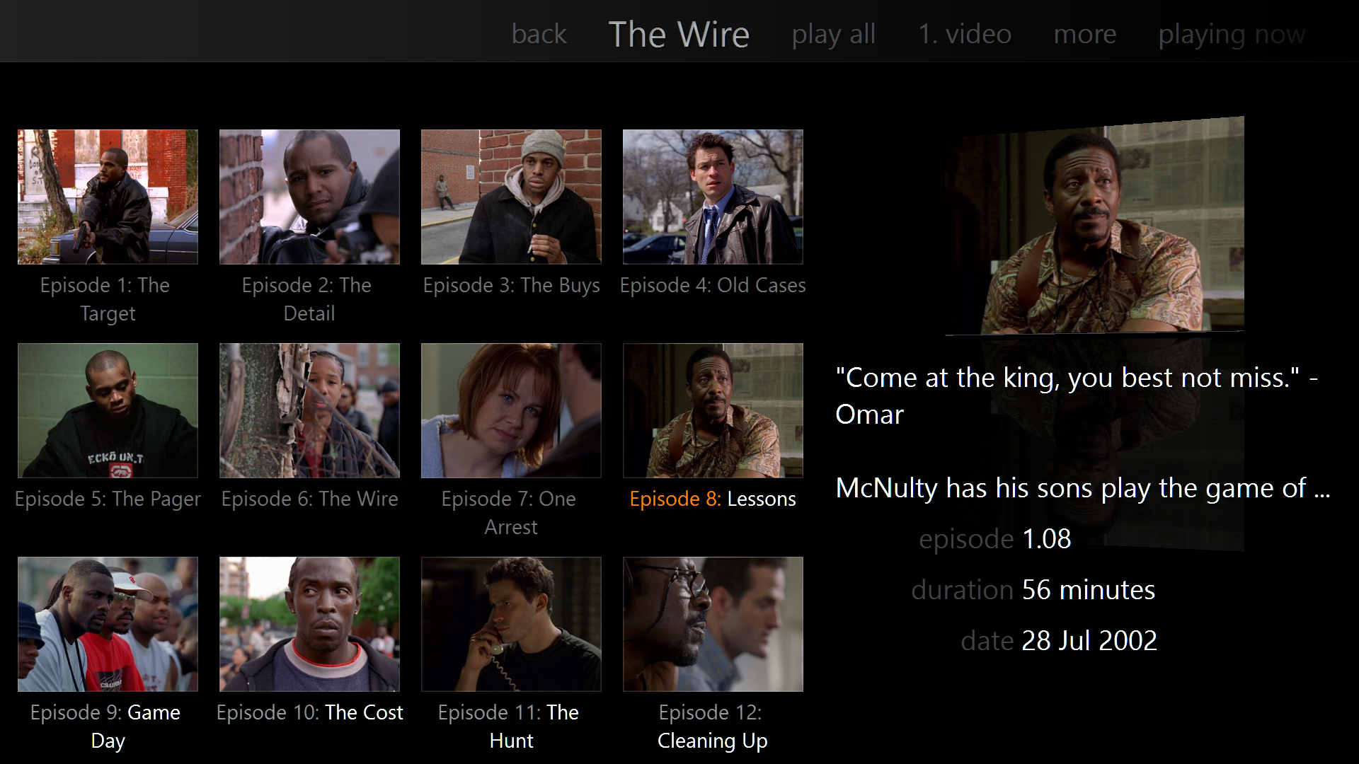
By default, in Theater View you just get a large grid of thumbnails which does not remember your position (a problem when you have shows that have 150 episodes) or indicate your progress at all.
I have customized my view a bit to make this easier, but it can still require a lot of scrolling for some titles, and it's only
really obvious where you last were if you stopped mid-show, rather than finishing an episode:

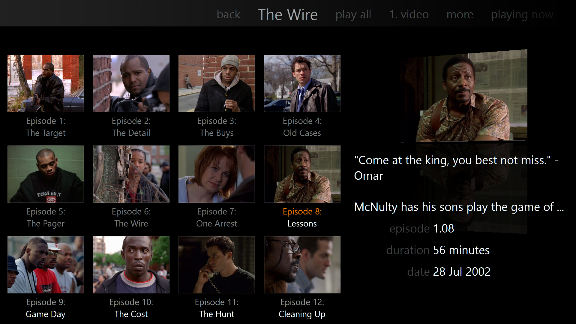
Something which would help make this easier to read, would be the option of using line breaks in your expressions for Theater View.
It currently displays two lines (I might prefer three) but only when text won't fit.
This would really help clean up the presentation:

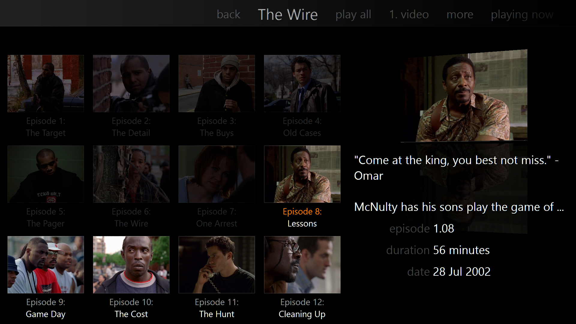
But it doesn't really help solve the problem of navigating through a list of episodes to quickly find the last one that you were up to.
If you could optionally dim episodes which have been watched, it would be a lot easier to find which episodes you haven't seen yet.


 Author
Topic: Improving the display of TV shows in Theater View (Read 6179 times)

