INTERACT FORUM

Please login or register.

Login with username, password and session length
Advanced search  
Pages: [1]   Go Down

Author Topic: Thoughts on the "Car Radio" buttons.  (Read 2074 times)

6233638

  • Regular Member
  • Citizen of the Universe
  • *****
  • Posts: 5353
Thoughts on the "Car Radio" buttons.
« on: May 23, 2014, 06:26:00 am »

OK, the title is maybe a bit of a bait-and-switch.
 
I hate these things:


  • They are tiny - only four pixels tall.
  • They are difficult to see.
  • If you miss them by a pixel or two, it's very easy to hit the car radio buttons and replace the current playlist, or change the sort order for the current view.

I also find it quite annoying that the car radio buttons disappear when you maximize the view.
 
So what I was thinking is that it might be quite nice if the car radio buttons and the divider were combined.
This would give you a larger area that can be used for the minimize/maximize buttons (which you could also drag to resize the view) and mean they could remain visible when maximized.
 
Of course, it's so much easier to do a quick mockup in an image editor than it would be to implement, and this does not take care of the vertical dividers at the sides, but I really think it would make such a difference to usability.
 
Normal:


Maximized:

Logged

marko

  • MC Beta Team
  • Citizen of the Universe
  • *****
  • Posts: 8941
Re: Thoughts on the "Car Radio" buttons.
« Reply #1 on: May 23, 2014, 11:34:47 am »

It's an interesting idea. If this became the default horizontal divider, the radio buttons would then be available wherever one was present, which could be handy, especially for folk like me who are not in "Playing Now" very often.

My reservations are:
The divider is rarely in the same location and may be disorientating when looking for it from view to view.
Many users strongly dislike the radio buttons. They would be very upset about this!
If you set up dual horizontal views, the result would be a lot of radio buttons!
Possibility they could get annoying being in every view. Wouldn't know for sure without testing.

Of course, if you're only talking about a special divider for the Playing Now view, all of the above is irrelevant except for the fact that it's an interesting idea.

-marko

6233638

  • Regular Member
  • Citizen of the Universe
  • *****
  • Posts: 5353
Re: Thoughts on the "Car Radio" buttons.
« Reply #2 on: May 23, 2014, 01:05:45 pm »

Of course, if you're only talking about a special divider for the Playing Now view, all of the above is irrelevant except for the fact that it's an interesting idea.
Well my suggestion was only meant for the Playing Now view, where the Radio buttons are already displayed - unless you have disabled them.
 
I still have problems with the buttons used on the vertical dividers, but I don't know how you would solve that without making the dividers thicker, which would be undesirable.
It just seemed that there was already a gap at the sides of the Car Radio buttons which could be put to better use.
 
Edit: like this, though it's a less flexible solution that keeps the radio buttons above the divider:


Your comment did make me realize I had overlooked the fact that many other views also use a horizontal divider though.
I suppose the reason I overlooked that is because I don't think I have ever used the minimize buttons there - I have always used the "close" button on the right. (which does the same thing)
 
In the Playing Now views though, I often switch between maximized (playing music, to see the full tracklist) minimized (watching a video) and the split view. (queuing up more videos or editing the playlist)
Logged

MrC

  • Citizen of the Universe
  • *****
  • Posts: 10462
  • Your life is short. Give me your money.
Re: Thoughts on the "Car Radio" buttons.
« Reply #3 on: May 23, 2014, 01:11:47 pm »

The Radio Bars scream out to be a movable ToolBar.  MC is kinda lacking in this area.  Generalize the current Top and Bottom toolbars so they can be positioned elsewhere, and make the Radio buttons likewise.  Then users can enable, disable, or reposition them.  That they are stuck inside Play Now seems sub-optimal.
Logged
The opinions I express represent my own folly.

6233638

  • Regular Member
  • Citizen of the Universe
  • *****
  • Posts: 5353
Re: Thoughts on the "Car Radio" buttons.
« Reply #4 on: May 23, 2014, 01:57:09 pm »

The Radio Bars scream out to be a movable ToolBar.  MC is kinda lacking in this area.  Generalize the current Top and Bottom toolbars so they can be positioned elsewhere, and make the Radio buttons likewise.  Then users can enable, disable, or reposition them.  That they are stuck inside Play Now seems sub-optimal.
I somewhat agree. They feel tacked-on right now, but I also don't know what else you would do with them.
Logged

MrC

  • Citizen of the Universe
  • *****
  • Posts: 10462
  • Your life is short. Give me your money.
Re: Thoughts on the "Car Radio" buttons.
« Reply #5 on: May 23, 2014, 02:03:33 pm »

I liked your proposal and mockups.

My only addition to yours was to make them so they could be dragged to various locations, like between the view tabs and upper player bar, or between the panes/categories and file list, below the file list, or even on the main title bar or bottom status bar.
Logged
The opinions I express represent my own folly.

glynor

  • MC Beta Team
  • Citizen of the Universe
  • *****
  • Posts: 19608
Re: Thoughts on the "Car Radio" buttons.
« Reply #6 on: May 23, 2014, 02:07:33 pm »

I also feel the divider arrows are too small and fiddly.

But they are everywhere (also divides the Tree from the left-hand part of the UI for example), so I'm not sure combining them with the Radio buttons makes sense.

But... I wanted to comment that, generally, I also rage at them a bit.  One tip: You can just drag the bar to collapse the divider section.  You don't need to use the arrows at all (though they're often more convenient, if they weren't so small that is).
Logged
"Some cultures are defined by their relationship to cheese."

Visit me on the Interweb Thingie: http://glynor.com/

6233638

  • Regular Member
  • Citizen of the Universe
  • *****
  • Posts: 5353
Re: Thoughts on the "Car Radio" buttons.
« Reply #7 on: May 24, 2014, 12:16:54 am »

I also feel the divider arrows are too small and fiddly.
But they are everywhere (also divides the Tree from the left-hand part of the UI for example), so I'm not sure combining them with the Radio buttons makes sense.
Well as I said, I really only intended for the change to be applied to the Now Playing view, but I think I might have a better solution.

But... I wanted to comment that, generally, I also rage at them a bit.  One tip: You can just drag the bar to collapse the divider section.  You don't need to use the arrows at all (though they're often more convenient, if they weren't so small that is).
The way I typically use things is that I like to keep the split at the height which displays videos at maximum size (i.e. full width) while displaying as many items in the upcoming list as possible. It would actually be really nice if there was an option for Media Center to calculate this automatically. Most content is 16:9 so it generally stays in a fixed position.


This way it's easy to manage the upcoming playlist, and I can use Aero Snap and have a browser or something else open on the right while Media Center is playing video.
But for music, I often have more tracks queued up than this will display, so I'm frequently toggling between split and maximized view. It would be nice if the position was saved on a per-view basis, rather than globally for each pane, as my music tabs could then stay full height, and the video ones could stay in the split view.
 
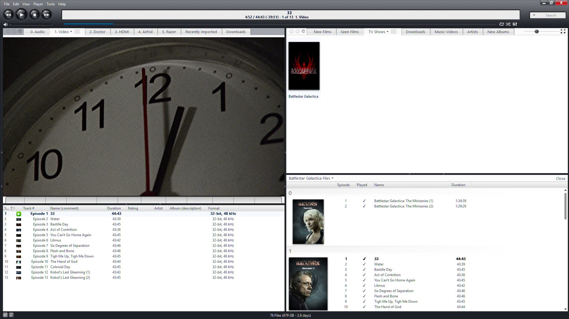
What did just occur to me though, is that every split view except the Playing Now view has this bar below the divider:


So here's a mockup using the same space as that toolbar:

 
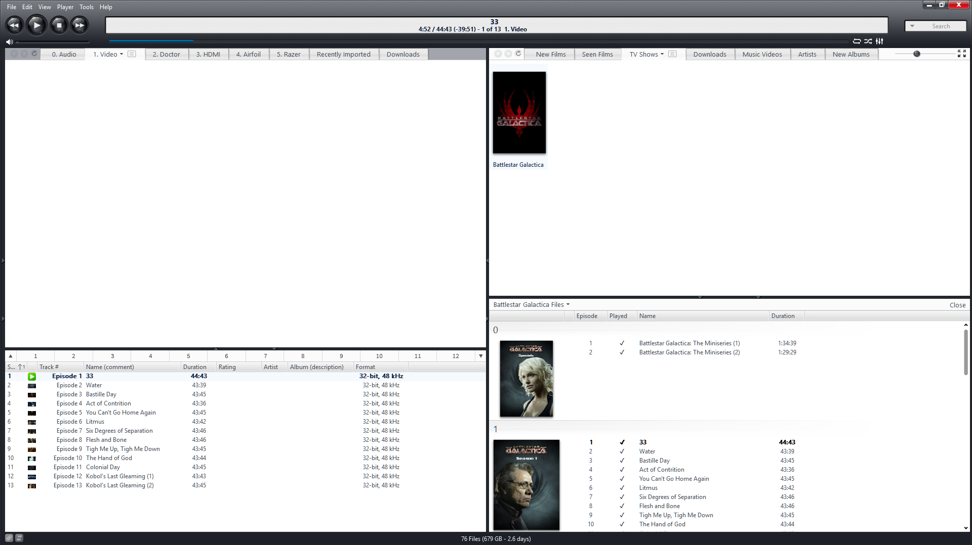
Aesthetically, I think it fits in better with the current look of Media Center, it's utilizing a pre-existing UI element - so I'd like to think that would make it an easier change to implement, and it solves the issue of the radio buttons disappearing in the maximized view. (assuming you consider that a problem)
It also doesn't remove or replace the existing dividers, so it wouldn't cause problems for people that disable the Car Radio buttons.
Logged
Pages: [1]   Go Up