INTERACT FORUM

Please login or register.

Login with username, password and session length
Advanced search  
Pages: [1]   Go Down

Author Topic: Skinnable frames & borders introduced in build 171  (Read 1601 times)

marko

  • MC Beta Team
  • Citizen of the Universe
  • *****
  • Posts: 9139
Skinnable frames & borders introduced in build 171
« on: June 12, 2012, 03:40:17 am »

The history behind the introduction of this system can be read here.

Matt,
Thank you for trying something completely different.

I'm still exploring the possibilities here, but here are my initial observations.

The system is using the "GlowShadow" file for tool tips which is giving those produced by hovering over truncated text in panes and columns an odd look.

Theater View is applying "Border_Frame" to all photos and artist images. Is this a bug?

Where is "Frame_ThumbnailBorder" used? I made a temporary all cyan version, but could not see it anywhere?

Initial feeling here is really positive. I've created a drop shadow file here that is more akin to what we had in build 161, using a zero margin left and top, and a 10 pixel margin right and bottom for the drop shadow.
I have to run, but will post screens and "Border_DropShadow" file when I get back in.

-marko

Matt

  • Administrator
  • Citizen of the Universe
  • *****
  • Posts: 42373
  • Shoes gone again!
Re: Skinnable frames & borders introduced in build 171
« Reply #1 on: June 12, 2012, 09:59:08 am »

Thanks for the feedback.

Next build:
Changed: Build 171 would unintentionally show frames on images in Theater View.
Fixed: List truncation tool tips would look incorrect with build 171.

"Frame_ThumbnailBorder.png" is obsolete (it was used for one or two beta builds), and can be deleted.
Logged
Matt Ashland, JRiver Media Center

marko

  • MC Beta Team
  • Citizen of the Universe
  • *****
  • Posts: 9139
Re: Skinnable frames & borders introduced in build 171
« Reply #2 on: June 12, 2012, 01:08:47 pm »

Cheers Matt.

Having spent an hour or two on this, I have to say that the default drop shadow is really quite clever in the way it transitions between light and dark backgrounds.

After much switching back and forth though, I decided that I like mine better. Truthfully though, there's not a lot in it.

So, build 161 had the old drop shadow effect that served us all so well for so long...
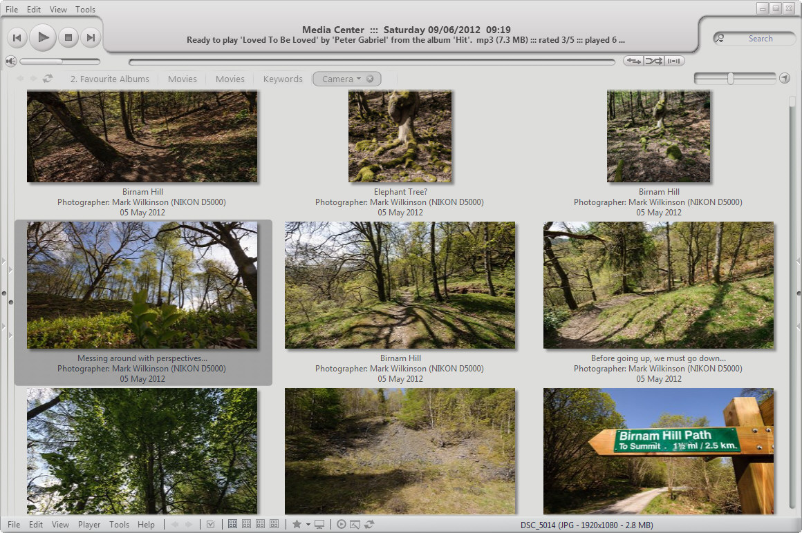

The default from build 171 onwards looks like so...
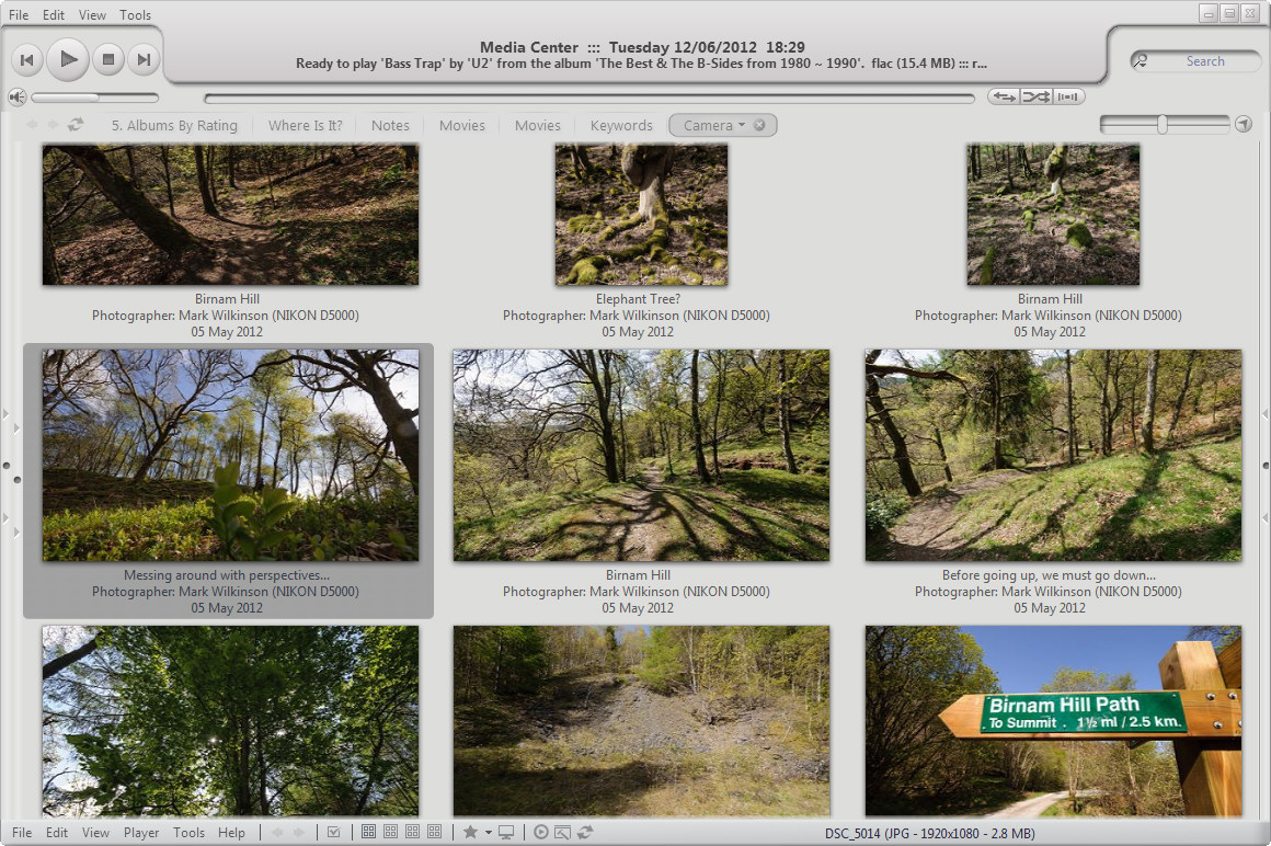

Build 171 also allows us to modify the shadow effect via skinning. I like this, which is more like build 161, keeping the edges crisp and clean...
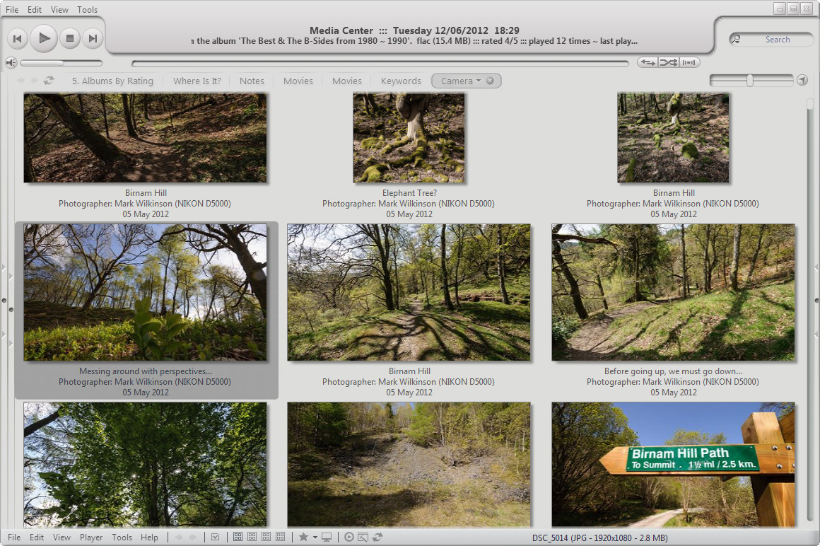

As I said, there's not a lot in it.

The only things left now are really minor...
  • The new system has a larger minimum thumbnail space. Build 161 allowed the thumbs to get really close, which was quite nice, will be missed, but in no way a deal breaker.
  • When selecting a thumbnail, the selected thumb does not sit in the center of the selection outline. It sits almost right-justified, and is a little off-putting. I've been scrutinising these things for hours now though, so quite possibly, no-one else will notice this. Again, nothing even approaching deal breaker for me.


Thank you again for coming up with an innovative solution to the problem.

If anyone wants a copy of the Border_DropShadow file I've used above, save this...

add it to your skin folder, and finally, add the following code to your skin xml file...
Code: [Select]
<BORDER>
  <Entry Name="DropShadow" Bitmap="Border_DropShadow.png" Rows="1,?-Flex,9" Columns="1,?-Flex,9" Cells="B2-Skip">
    <Data InternalMarginLeft="1" InternalMarginTop="1" InternalMarginRight="9" InternalMarginBottom="9"></Data>
  </Entry>
</BORDER>

-marko

Scolex

  • MC Beta Team
  • Citizen of the Universe
  • *****
  • Posts: 1116
  • Cheers
Re: Skinnable frames & borders introduced in build 171
« Reply #3 on: June 13, 2012, 12:45:09 am »

Matt,
Thank you for implementing this change.

Marko,
Thank you for doing the leg work on what is required in the skin to make use of the change.

I am quite happy with my new NO border skin.
Logged
Sean

marko

  • MC Beta Team
  • Citizen of the Universe
  • *****
  • Posts: 9139
Re: Skinnable frames & borders introduced in build 171
« Reply #4 on: June 17, 2012, 04:54:11 am »

Matt,
Is there any chance that the "Custom" system could be extended to include the skin items folder?

We could then set a "Custom Skin Items" folder to hold these shadow files and have every skin use them. I did try, but MC ignored it!!

-marko

Matt

  • Administrator
  • Citizen of the Universe
  • *****
  • Posts: 42373
  • Shoes gone again!
Re: Skinnable frames & borders introduced in build 171
« Reply #5 on: June 18, 2012, 06:54:12 am »

That's an interesting idea.

Did you know that you can put the borders into an individual skin as well?  Since you use a custom skin, this might solve it for you.
Logged
Matt Ashland, JRiver Media Center

marko

  • MC Beta Team
  • Citizen of the Universe
  • *****
  • Posts: 9139
Re: Skinnable frames & borders introduced in build 171
« Reply #6 on: June 18, 2012, 10:47:12 am »

Afternoon Matt,

That's exactly what I've done. What this means however, is that for every skin I switch to, I will also need to copy the shadow files and edit the xml.

We already have the ability to create "Custom Art", "Custom Resources" and "Custom Webpages" that when present, are used in place of the "Default" folders.
If that same approach could be applied to a "Custom Skin Items" folder too, then my shadow files would be used regardless of the skin I choose to load, saving the hassle of copying files and editing xml every time.

-marko
Pages: [1]   Go Up