INTERACT FORUM

Please login or register.

Login with username, password and session length
Advanced search  
Pages: [1]   Go Down

Author Topic: Menu bar suggestions  (Read 1111 times)

tyler69

  • Citizen of the Universe
  • *****
  • Posts: 946
Menu bar suggestions
« on: April 28, 2018, 04:24:18 am »

Can some optimizations to the menu bar be implemented?

1. Highlight the background of a selected drop-down
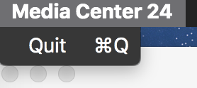
Currently only the "Media Center 24" drop-down is being highlighted, not the other options in the menu bar. This shows how all other macOS applications handle this:
image host

2. Use the same design on all dropdowns (default macOS font?). Currently "Media Center 24" uses the macOS design, all other dropdowns do not:
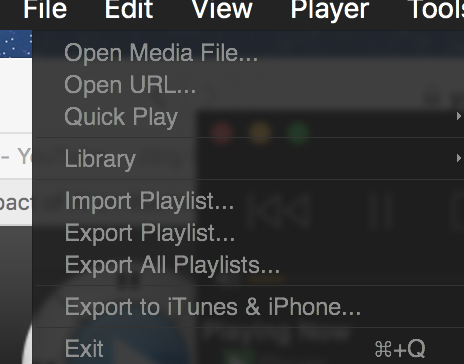
image host

vs.

image host

3. Use macOS naming (e.g. CMD(symbol)Q instead of CMD(symbol)+Q)

4. Open up dropdowns when the mouse hovers over them without the need to click:
This is inconsistent until now. Hovering from "Media Center 24" to "File" opens up "File" but then the user needs to click on any other dropdown to get it to open. The windows version and all other macOS applications already do this (opening up a drop-down when hovering the mouse over them).
Logged

danfl75

  • Junior Woodchuck
  • **
  • Posts: 69
Re: Menu bar suggestions
« Reply #1 on: May 05, 2018, 02:24:13 pm »

I may be misunderstanding you, but it works the way it always has for me, Mac OS 10.9.7. Hovering over File does nothing, but if I click that, then when hovering over other menu options like Library, it opens sub-menus. Everything in menus that I hover over will highlight according to my skin: Black on Black. RE your other feedback, others have asked in the past for more native Mac OS commands and menu support, but that doesn't seem to be in the cards for MC24.
Logged

tyler69

  • Citizen of the Universe
  • *****
  • Posts: 946
Re: Menu bar suggestions
« Reply #2 on: May 06, 2018, 04:48:17 am »

Thanks for replying.
Yes, I mean something else: I mean the horizontal menus in the menu bar on top ("File", "Edit", "View", ...). These should open and be highlighted when hovering over them (after one menu has been clicked on).
Logged

danfl75

  • Junior Woodchuck
  • **
  • Posts: 69
Re: Menu bar suggestions
« Reply #3 on: May 20, 2018, 11:20:18 am »

I see. I think this may fall under the larger request to make MC Mac use more of the Mac UI more consistently. That was requested by several a few versions ago, but I think they had reasons for not doing it. Maybe something to do with the way they run as much common code as possible between all OSes, and do as much as possible within MC without relying on OS features.
Logged

tyler69

  • Citizen of the Universe
  • *****
  • Posts: 946
Re: Menu bar suggestions
« Reply #4 on: May 20, 2018, 12:47:48 pm »

Maybe something to do with the way they run as much common code as possible between all OSes, and do as much as possible within MC without relying on OS features.

I think so.
Logged

tyler69

  • Citizen of the Universe
  • *****
  • Posts: 946
Re: Menu bar suggestions
« Reply #5 on: June 25, 2018, 04:00:41 pm »

One other thing I just noticed (24.0.37):
The drop-down menus jump around, depending on where I click on the category in the top bar. For example, when I click on the "T" in "Tools", the menu opens in a different position than when I click on "s" in the "Tools" category. Again: This does not happen by clicking on "Media Center 24" which seems to be the only macOS native implementation with regard to the top bar.
Logged
Pages: [1]   Go Up