I described my basic situation in this post:
http://yabb.jriver.com/interact/index.php?topic=52123.0. To summerize, I am basically limited to a 1024x768 display 90% of the time and am somewhat irked by the "jumping" behaviour whenever I select a category that only has one artist/album. I just upgraded to the latest version of MC13, as JimH suggested.
Let me explain what happens:
I have one view scheme with Artist (grouped) > Artist > Album. This works fine, unless I only have one artist under one letter, and only one album under that artist. My example from before was that the only "K" I have is Kaiser Cheifs, and I only have one of their albums. When in theater view, if I scroll to "K" and select it, it skips directly to the song listing. I'd prefer to have to explicity go though each category so you know what artist/album you are selecting, instead of having it jump, but can't figure out a way to do this.
This brings me to my other idea. For the first category (Artist (grouped)), I could display the number of artists for each letter. So if I have 5 artists in A and 10 in B, the list would look like: A (5 Artists), B (10 Artists), etc. Then with an if statement I could make it so that if there is only one artist in the group, it will display that artist, e.g. K (1 Artist, Kaiser Chiefs). Unfortunatly I am not too familiar with the logic when creating a custom expression for view schemes and haven't been able to get this so far. Does anyone have suggestions on how to do this, or if it is even possible?
There are a few other things I am working on. I am trying to customize the obsidian view right now, and shifted the PIP in the playing now to take up approx. the bottom third of the screen. I also made a custom visualization That just displays Artist/Album/Track/Time remaining with a spectrum analyzer behind that. My first problem is that I can't seem to get the spectrum analyzer to take up the whole width of the screen, it just seems to resize itself to take up a chunk in the middle. Can I stretch this to take up the full width?
Another issue I have is that the PIP section seems to overlap the song list in the playing now section, so if you scroll down, you can never really see the last selection. I am guessing there is a way to change where the bottom of the song list box in the main.xml or base.xml, but I can't seem to find where.
Finally, is there a way to customize the left hand display (where it gives you the play/add/etc menu and then below that is artist/album/year/etc info)? Basically I want to get rid of that artist/album/year/etc info at the bottom. Yea, you could call me a little anal

.
I will try to get some screenshots of the various issues when I get a chance.
Oh, and one more thing. There seems to be a few bugs when creating visualizations. Like I said before, my current vizualization has Text and then a spectrum analyzer. If I hit the save button once, the spectrum analyzer disappears entirely from the vizualization. If I hit save again, it will reappear. This also seems to happen with the screen refresh element (I forgot what it was called). Hit save once, it stops working, hit it again and it works again.
Anyways, sorry for the wall of text!
*Update* Added pictures below....
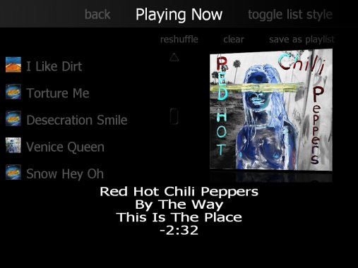
This shows the PIP overlapping the song list. Does anyone know the parameter that changes where the end of the list box is in the xml file?
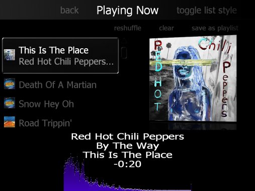
Here is the squashed spectrum analyzer. I would like it to stretch across the entire screen like the text does if it is long enough, even though it isn't shown well in this image.
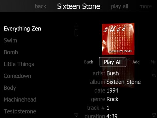
The date/genre/track info on the right is what I would like to remove. Some of that info could stay, but I don't need all of it. I'm trying to make this skin look clean and simple.
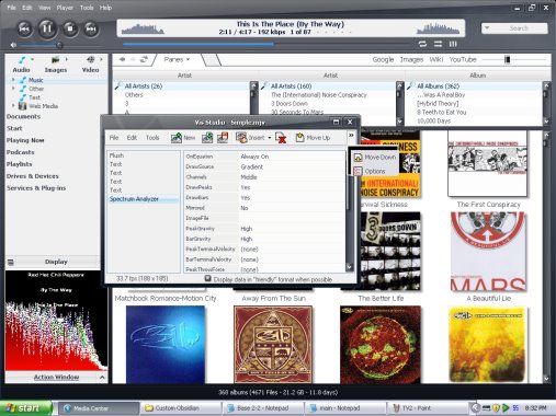
If you look at the lower left, this you can see that the visualization isn't 'flushing' even though flush is listed in the Vis Studio. This happened right after I hit the save button. If I hit it again, the Vis will flush, but then the spectrum analyzer will disappear. I have to play around with it to get it to sync back up so that when I hit save, the Vis will flush and the spectrum analyzer will appear.
Also, if you look in the Vis Studio window, the options on the left only appear if I hold the mouse button down. If I click normally, they appear and disappear really fast. Even when I hold down the button to select move down....nothing happens. This seems like another bug.
Also, I am currently running WinXP SP2, 32 bit.
Any suggestions on any of these issues?
Thanks in advance!


 Author
Topic: Working on aesthetic touches *Update* (Read 3189 times)
Author
Topic: Working on aesthetic touches *Update* (Read 3189 times)