Recently I have noticed that adding tracks to the current playlist (via JRemote) is not showing up in the app.
The count in the lower-left increases, but the Playlist or Now Playing views are not being updated. I have to switch zones to force them to update.
It seems to happen when I add tracks to the current playlist, rather than replacing the current playlist. If I replace the current playlist, it updates correctly.
Perhaps there is some use-case for it that I'm not aware of, but when I swipe from the right to bring up the playlist, I'm not sure why the rest of the view is interactive.
I instinctively tap on the left space to dismiss the playlist every time and either end up viewing a list of tracks, or worse, adding a number of tracks or replacing the current playlist.
If it is intended to be interactive, it would be good if the view resized to display all items rather than covering up the right half.
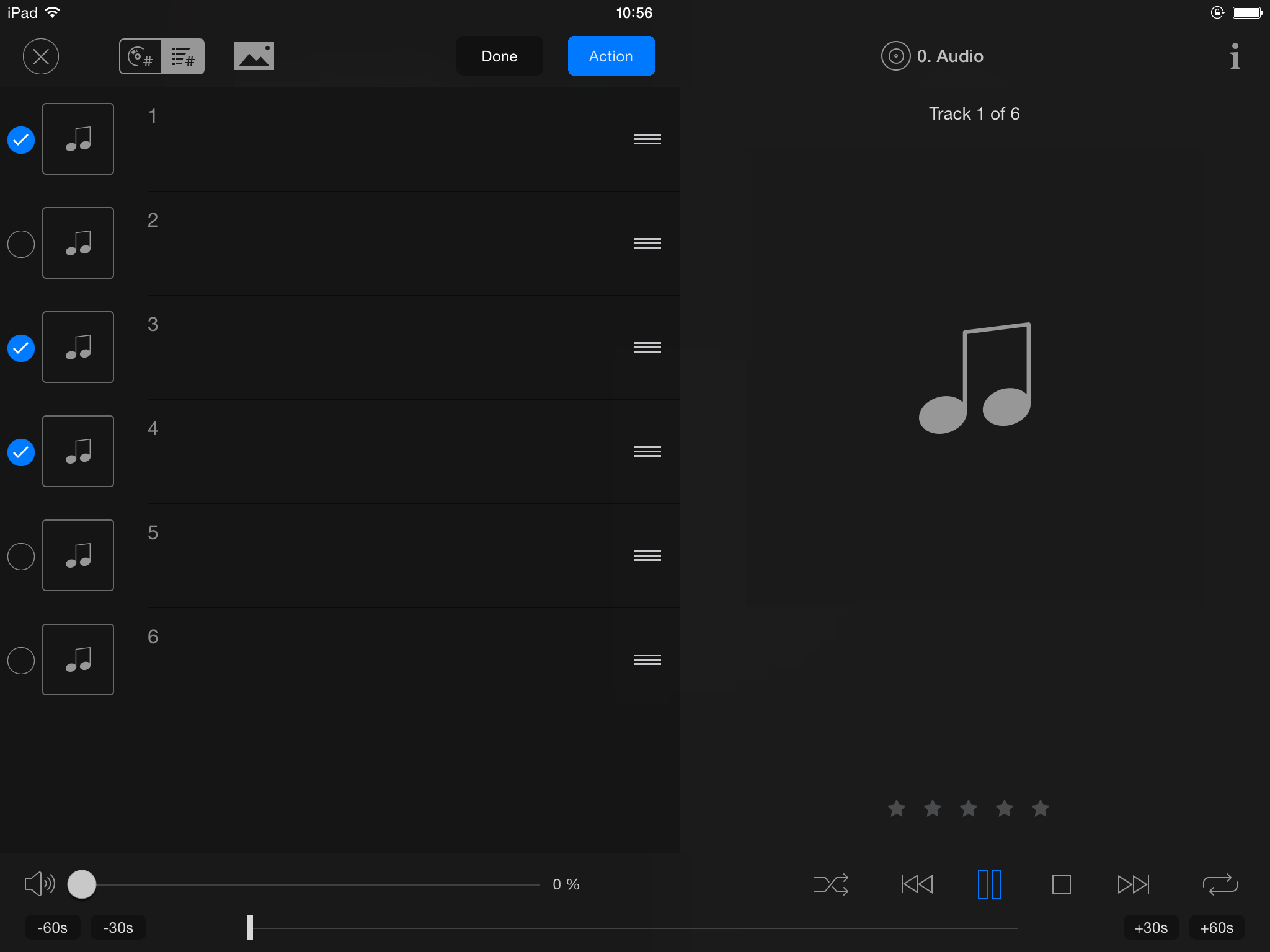
In the Now Playing View, if you hit edit then exit and return to it, the "edit" button still reads "done" but the edit controls are no longer being displayed.
Related to that, shifting the "delete" button over 12px to the left so that it is centered would be nice.
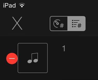
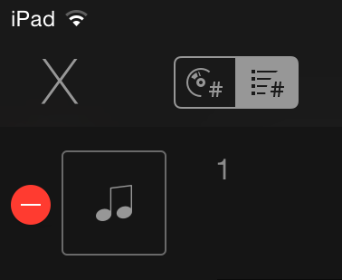
I'd also lose the drop-shadow on that control too.
But rather than making that change, I think it would be
much more useful if the delete buttons were replaced with selection buttons instead, similar to Mail.
There doesn't seem to be any way to remove multiple tracks at once via JRemote short of clearing the entire playlist.
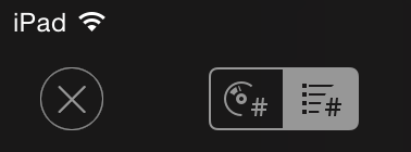
And nitpicking, the 68pt Helvetica Neue UltraLight upper-case X in Now Playing really bothers me.

It would be nice if the close button could be replaced with either a 90pt multiplication sign; ×
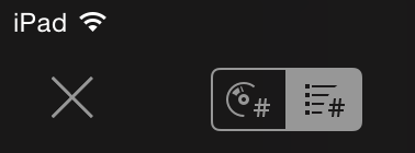
A 60pt circled lower-case x; ⓧ
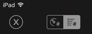
Or a custom drawn icon which encircles a 60pt multiplication sign, if you're using images rather than text for this control:
I'd also add that I'm not keen on the fact that Now Playing is opened in the upper-right, but closed in the upper-left.
As I mentioned previously, something that really helps usability with touchscreen apps like this is if the controls stay in a fixed position as much as possible. (my
proposed changes for the playback control layout is an example of that)
It would be nice if, when viewing cover art full-screen, there was nothing displayed but the cover art.
No status bar or controls, just the artwork. Tapping the screen anywhere should close the view, rather than requiring an "X" control. (which is different from the Now Playing "X")
2. Longer-Running Smartlists/Views Take Multiple Tries to Load
...
http://glynor.com/img/screenshots/JRemote/JRemote3-Loading_Fancy_View-small.png
http://glynor.com/img/screenshots/JRemote/JRemote3-Loading_Fancy_View_Failed-small.png
...
I assume it is just timing out a little quicker than I'd like.
I've experienced this a lot recently as well - it seemed to be very frequent when my CPU was busy analyzing a number of new albums.
Though it was not with smart lists or anything like that, just regular artist/album navigation.
