INTERACT FORUM

Please login or register.

Login with username, password and session length
Advanced search  
Pages: 1 [2]   Go Down

Author Topic: Television guide in Theater View [feedback welcome]  (Read 30575 times)

rpalmer68

  • MC Beta Team
  • Citizen of the Universe
  • *****
  • Posts: 2639
Re: Television guide in Theater View [feedback welcome]
« Reply #50 on: October 05, 2011, 07:27:10 am »

Have you tried the existing logging under Help?

I have and it's very hard to work out why a recording from two days ago didn't record when it should have.   
Logged

glynor

  • MC Beta Team
  • Citizen of the Universe
  • *****
  • Posts: 19608
Re: Television guide in Theater View [feedback welcome]
« Reply #51 on: October 05, 2011, 10:48:45 am »

Here in OZ, each channel broadcasts multiple streams (with unique video and audio IDs) on the same frequency. My current PVR software uses a "producer" and "consumer" approach to allow better sharing of devices. A producer process "tunes" into a channel and presents all possible video/audio streams and a consumer (the process doing the recording) consumes a single stream. When subsequent recordings are started, the software first checks to see if there's already a producer process started for the channel/frequency in question. If yes, it spawns another consumer process and hooks into the existing producer, avoiding the need for another tuner.

Thanks.

So, yes, you were talking about something other than what I was thinking, but it sounds like Matt got it.

As I said before... That would certainly be a good feature, but I don't know that I'd call it a high-priority item.  Of course, I'm biased by the fact that they don't broadcast much of use on the "sub channels" here across the pond in most cases.  Here, you almost always just have 2 or 3 different "copies" of the same programming (one 480i, one 480p, one 720p, etc) or the same programming with different audio tracks (spanish vs english vs french, etc).

There are exceptions.... Our Public Broadcasting System (PBS) broadcasts similar to what you described (they actually use the sub-channels for different content), but since that only applies to OTA broadcasts, and not even QAM (Time Warner breaks those different feeds up and puts them on different channels for me), I suspect most people never even see it here.

Also... Can most commercially available ATSC Tuners actually do this (record multiple streams on the same channel simultaneously), or would this feature also be hardware dependent?  It seems like it might require a fast disk if nothing else...
Logged
"Some cultures are defined by their relationship to cheese."

Visit me on the Interweb Thingie: http://glynor.com/

Matt

  • Administrator
  • Citizen of the Universe
  • *****
  • Posts: 42372
  • Shoes gone again!
Re: Television guide in Theater View [feedback welcome]
« Reply #52 on: October 05, 2011, 11:09:33 am »

For me I don't want MC to use three tuners when for example I am watching ABC1 live, and recording two sequential shows on ABC2, during this MC uses two tuners to record one show and watch one show, but then during the overlap period between the shows on ABC2 MC uses three tuners!

Recording overlapping segments of the same channel should already use a single tuner.  This is part of the reason we use JTV -- so that two programs can share the same chunks of a recording.
Logged
Matt Ashland, JRiver Media Center

glynor

  • MC Beta Team
  • Citizen of the Universe
  • *****
  • Posts: 19608
Re: Television guide in Theater View [feedback welcome]
« Reply #53 on: October 05, 2011, 12:24:29 pm »

Recording overlapping segments of the same channel should already use a single tuner.  This is part of the reason we use JTV -- so that two programs can share the same chunks of a recording.

Good to hear.
Logged
"Some cultures are defined by their relationship to cheese."

Visit me on the Interweb Thingie: http://glynor.com/

rpalmer68

  • MC Beta Team
  • Citizen of the Universe
  • *****
  • Posts: 2639
Re: Television guide in Theater View [feedback welcome]
« Reply #54 on: October 05, 2011, 07:06:06 pm »

Recording overlapping segments of the same channel should already use a single tuner.  This is part of the reason we use JTV -- so that two programs can share the same chunks of a recording.

"should" yes I agree, but doesn't.

I tested this today to make sure.

I set two overlapping programs to record on the same channel and when the second recording started it was on a seperate tuner.

Show status shows program 1 on Device 0 and program 2 on device 1.

Richard
Logged

jmone

  • Administrator
  • Citizen of the Universe
  • *****
  • Posts: 14463
  • I won! I won!
Re: Television guide in Theater View [feedback welcome]
« Reply #55 on: October 07, 2011, 05:51:31 pm »

Quick run though of the EPG Grid looks good (thanks 1 and 2 of 5)!
Logged
JRiver CEO Elect

rpalmer68

  • MC Beta Team
  • Citizen of the Universe
  • *****
  • Posts: 2639
Re: Television guide in Theater View [feedback welcome]
« Reply #56 on: October 08, 2011, 01:44:38 am »

I agree, the new grid guide looks very pomising.

A couple of things so far....

1) There needs to be a visual indication on the grid of programs that are one off scheduled recordings, subscriptions and ideally also those currently recording, maybe just different background or font colours?

2) The pre-post buffer time of 1 minute is never enough over here, so I always change mine to 5 pre and 10 post, could we please have these configurable in the TV options?  So when creating a subscription (especially in Theater View) they will be set without me having to go back in and change them from 1 minute every time?

Thanks
Richard 
Logged

Matt

  • Administrator
  • Citizen of the Universe
  • *****
  • Posts: 42372
  • Shoes gone again!
Re: Television guide in Theater View [feedback welcome]
« Reply #57 on: October 08, 2011, 09:55:46 am »

1) There needs to be a visual indication on the grid of programs that are one off scheduled recordings, subscriptions and ideally also those currently recording, maybe just different background or font colours?

I agree, and it's on my list.

There are also some navigation issues (like handling back, etc.) that need work.

Finally, the list needs some sort of "there are no guide programs" message when it's empty.


Quote
2) The pre-post buffer time of 1 minute is never enough over here, so I always change mine to 5 pre and 10 post, could we please have these configurable in the TV options?  So when creating a subscription (especially in Theater View) they will be set without me having to go back in and change them from 1 minute every time?

Good idea.
Logged
Matt Ashland, JRiver Media Center

glynor

  • MC Beta Team
  • Citizen of the Universe
  • *****
  • Posts: 19608
Re: Television guide in Theater View [feedback welcome]
« Reply #58 on: October 14, 2011, 11:29:58 pm »

So... I've been thinking about the new Grid view style for Theater View, and how handy it could be for a wide variety of other types of View Schemes.

For example, what about this:  A View that shows the last 10 days or so of your recently recorded/imported media, organized by [Date Created]-d.  The Y axis (where the "channel listing" would be in a normal TV-Guide grid) represents days of the week.  The X axis (where you'd have the days/time normally) would represent time (say 1 hour wide columns).  When you open this view up at first, it "centers" on the current day and time in the upper-left corner.  Inside the grid, you'd have blocks filled (just like a TV guide shows) showing the shows you have recorded.  As you scroll down in the list from the "home position" you'd go back in time through the days, left and right through the time of the day.

It would be really nice for those times when you want to sit and choose something to watch, and you want to look back at what you have from the past week or so.  You could just set the time axis at primetime, and then scroll up and down through the days (but really you'd probably be able to see at least a few days all at once that way - even with duplicate "day" rows here and there for overlapping recordings), and left and right a little to go earlier in the day or later.

But that would require a pretty large left-right scroll space (24 columns for 1 hour blocks).  So, that'd be a problem for "escaping" from those views.  But that is really a problem for the normal Program Guide Grid too.  Limiting the size arbitrarily feels like a hack solution.  It doesn't scale well.

What about the Green Button?  I mean, keep it like it is, so that if you do reach the "edge" of the Grid (top or left) it will let you "out" (and don't allow infinite edge grid views).  But what if when a Grid-View control has the focus the first press of the Green Button serves to jump you immediately back to the roller?  Like a shortcut, if you know it is there.  After jumping back to the Roller, the Green Button would resume "normal" (current) functionality.  So a second (or third or fourth) press of the Green Button would not "re-enter" the Grid View ever, just cycle through using the system it now uses (jumping back to the Roller when it hits the still-open Grid View).

And then we can just make a demo movie for Theater View and include that tip.  But people might try it anyway.  The Green Button "jumps" back to home in Theater View already, so it feels like a "get me out of here" button anyway.

I think that would work nicely and cleanly, and not require any new "required" buttons for the remote.

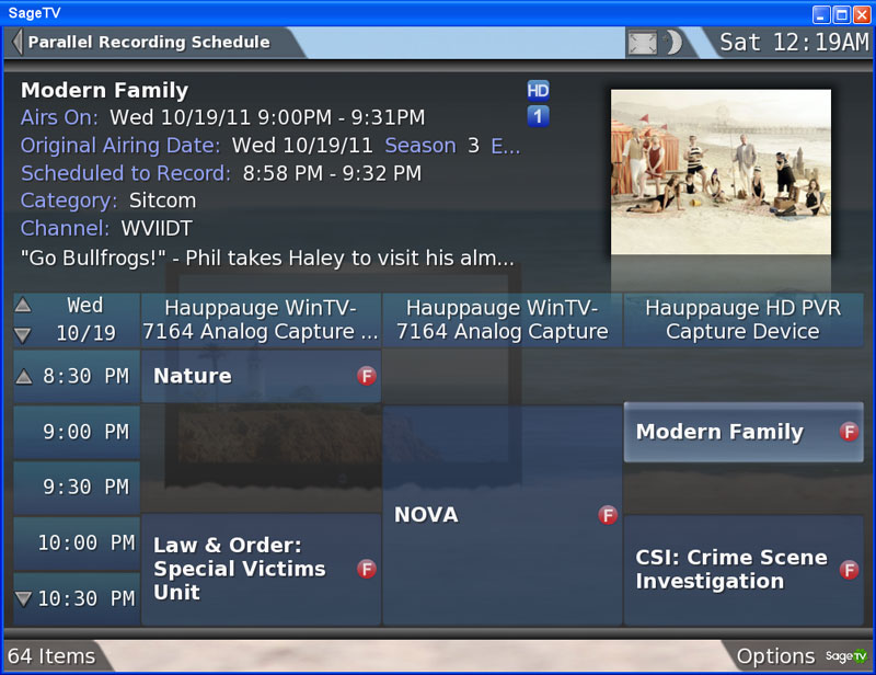
PS. I have other ideas for the grid control too.  Eventually, a scheduling view something like Sage's would be very handy:
Logged
"Some cultures are defined by their relationship to cheese."

Visit me on the Interweb Thingie: http://glynor.com/

imugli

  • MC Beta Team
  • Citizen of the Universe
  • *****
  • Posts: 1598
Re: Television guide in Theater View [feedback welcome]
« Reply #59 on: October 20, 2011, 04:53:48 pm »

First of all, my wife will love this, so I love you  ;D

Second - any chance of implementing the ability to save logos for the channels? I know the discussion regarding 'eye candy' has been had to death, but in this case I think it would add something to the experience.

Third - any chance of adding the ability to add IPTV streams as channels on the guide (and allocate channel numbers). For instance, here in Oz Telstra Bigpond ISP provides a number of IPTV channels - an AFL channel, a music video channel, a 24hr news channel etc that I would love to integrate into the overall Television view. There would be no guide data per se, but you could select it from the guide or by entering a channel number on your remote.

You guys never cease to amaze me with the willingness you have to listen to your customers. And I'll never stop raving about you :-)

jmone

  • Administrator
  • Citizen of the Universe
  • *****
  • Posts: 14463
  • I won! I won!
Re: Television guide in Theater View [feedback welcome]
« Reply #60 on: October 20, 2011, 05:01:27 pm »

Yes the basic grid as made it!  Now a couple of tweaks (more than Eye Candy IMO) to add to its usability would include stuff like follows (and Matt has indicated that such things are on his list...but it is a long list!)
- Channel Logos (this is the same concept as Coverart that we have everywhere else in MC)
- Recording Indicators (Red Dot for recording, Chain Link for Lined recording etc)
Logged
JRiver CEO Elect

pauly139

  • World Citizen
  • ***
  • Posts: 161
Re: Television guide in Theater View [feedback welcome]
« Reply #61 on: October 20, 2011, 06:35:53 pm »

How about colour coding according to the type of program (movie, sport, documentary etc). I found this a nice feature in WMC.

Paul.
Logged

Z0001

  • Citizen of the Universe
  • *****
  • Posts: 541
Re: Television guide in Theater View [feedback welcome]
« Reply #62 on: October 20, 2011, 08:31:06 pm »

I like the idea of a reworked Theatre View TV EPG - very valuable to make MC a (the?) cornerstone HTPC application.

Will MC17 offer EPG OTA for DVB-T signals like WMC does? I've scanned the threads but can't immediately find anything.  I know an EPG can be achieved outside MC for DVB-T signals, but an integrated OTA EPG would be very helpful and increase the value of the TV and PVR capability of MC to those less comfortable "looking under the hood". 

Also any scope for a web based TV recording scheduler so we can remotely control our PVR, whether on a PC or a smartphone or a tablet or iPad?

And just to mention a big thanks to Yaobing for all his efforts to get TV working for me on MC16 - I really appreciate your responsiveness.  I'm not quite there, but we removed a number of possible MC related causes and I'm now going to refocus on signal and driver issues.  Thanks again Yaobing.

Zeno
Logged

pauly139

  • World Citizen
  • ***
  • Posts: 161
Re: Television guide in Theater View [feedback welcome]
« Reply #63 on: October 21, 2011, 12:47:10 am »

Matt said earlier that the grid used in theatre view was created as a generic component - as such it would be great if the grid format EPG could also be available in the Standard View. Is that possible?
Logged

fabien44

  • Recent member
  • *
  • Posts: 30
Re: Television guide in Theater View [feedback welcome]
« Reply #64 on: October 21, 2011, 03:09:43 am »

Grid is necessary.

2 main Features for TV recording should be implemented:
- Select a program to the grid and record it as a delayed program (through windows task in order to wake up PC)
- Live TV -> Instant recording wich displays a pop-up to set time duration and action ending (stand-by windows, stop windows, close program, nothing to do)
Logged

imugli

  • MC Beta Team
  • Citizen of the Universe
  • *****
  • Posts: 1598
Re: Television guide in Theater View [feedback welcome]
« Reply #65 on: October 21, 2011, 05:16:35 am »

- Select a program to the grid and record it as a delayed program (through windows task in order to wake up PC)

You can do this. As long as you have server running, MC will wake from standby to record, then return to standby when finished.

Quote
- Live TV -> Instant recording wich displays a pop-up to set time duration and action ending (stand-by windows, stop windows, close program, nothing to do)

You can use the OSD (Up/Down/Left/Right arrows) while watching a program to record current program or set durations, though you cannot select the action to perform when completed.

JimH

  • Administrator
  • Citizen of the Universe
  • *****
  • Posts: 72438
  • Where did I put my teeth?
Re: Television guide in Theater View [feedback welcome]
« Reply #66 on: October 21, 2011, 07:17:38 am »

Grid is necessary.

2 main Features for TV recording should be implemented:
- Select a program to the grid and record it as a delayed program (through windows task in order to wake up PC)
- Live TV -> Instant recording wich displays a pop-up to set time duration and action ending (stand-by windows, stop windows, close program, nothing to do)
MC will wake a PC now, record, and put it back to sleep.  That has been there a couple of years.
Logged

perpetual98

  • Junior Woodchuck
  • **
  • Posts: 73
Re: Television guide in Theater View [feedback welcome]
« Reply #67 on: October 21, 2011, 10:16:09 am »

I didn't have much time to play with 17 last night due to the fact that I had recordings coming up on tuners and didn't want to miss things being taped, but I had a couple issues with the guide.  The grid view looked great but it didn't display all of my channels.  When I would scroll down when I got to the bottom it wouldn't continue scrolling.  I also got a lot of text stacking artifacts on the top line of the guide.  I couldn't tell what it was because it was so jumbled, so I don't know if it was guide listings, or error messages or other stuff.  I will try to play with 17 on my test rig today.
Logged

perpetual98

  • Junior Woodchuck
  • **
  • Posts: 73
Re: Television guide in Theater View [feedback welcome]
« Reply #68 on: October 21, 2011, 10:30:14 am »

Installed 17 on my test-rig and it does scroll down through channels.  Still have the junk in the top line though.  Here's a screenshot.

I also never noticed the transparency of Theater View in 16, but maybe it was there and I just noticed it now in 17.  Will look more into it...

Logged

Matt

  • Administrator
  • Citizen of the Universe
  • *****
  • Posts: 42372
  • Shoes gone again!
Re: Television guide in Theater View [feedback welcome]
« Reply #69 on: October 21, 2011, 11:17:05 am »

Installed 17 on my test-rig and it does scroll down through channels.  Still have the junk in the top line though.  Here's a screenshot.

I also never noticed the transparency of Theater View in 16, but maybe it was there and I just noticed it now in 17.  Will look more into it...

Could you send a library backup to matt at jriver dot com?  Hopefully using that I'll be able to reproduce the channel list missing channels.

Thanks.
Logged
Matt Ashland, JRiver Media Center

perpetual98

  • Junior Woodchuck
  • **
  • Posts: 73
Re: Television guide in Theater View [feedback welcome]
« Reply #70 on: October 21, 2011, 11:28:10 am »

I figured out the transparency thing with theater view, I had the Noire Glass or whatever on Standard view.  Changing that fixed Theater View.

I'm not missing channels on my test rig at work, so it's probably something simple on my home computer.  If I can't get it sorted out, I will send the email to you.
Logged

perpetual98

  • Junior Woodchuck
  • **
  • Posts: 73
Re: Television guide in Theater View [feedback welcome]
« Reply #71 on: October 25, 2011, 02:00:04 pm »

Just installed the latest build and it seems to have taken care of the text-artifacting on the top row.

Nice work!
Logged

rpalmer68

  • MC Beta Team
  • Citizen of the Universe
  • *****
  • Posts: 2639
Re: Television guide in Theater View [feedback welcome]
« Reply #72 on: October 26, 2011, 02:02:32 am »

Other than the color coding for schedules and recorded programs which I ko is on the way eventually, can we also add the following.

1) If a program is recorded, allow us to "watch" it from the guide.
2) Show a vertical marker down the grid, or some other indication of what the time is NOW.  I keep selecting something in the grid and gettin told the program is in the past, very frustrating!

Cheers
Richard
Logged

JustinChase

  • MC Beta Team
  • Citizen of the Universe
  • *****
  • Posts: 3276
  • Getting older every day
Re: Television guide in Theater View [feedback welcome]
« Reply #73 on: October 26, 2011, 04:26:22 pm »

Other than the color coding for schedules and recorded programs which I ko is on the way eventually, can we also add the following.

1) If a program is recorded, allow us to "watch" it from the guide.
2) Show a vertical marker down the grid, or some other indication of what the time is NOW.  I keep selecting something in the grid and gettin told the program is in the past, very frustrating!

Cheers
Richard

I understand that the guide has to go back far enough to show programs that are still playing, but if it's playing a 2 hour movie, started 100 minutes ago, much of the programs that have started since that show started are now over and would give the "in the past" message.

I'd like to see the name of the show displayed (and be selectable) only if it's still actually showing.

In other words, once the end of a show has passed, make the box in the guide blank, so I'm not tempted to select it.

Also, can you please change the mouse scroll wheel to go up/down thru the guide, and not left/right; it's counter-intuitive and I don't see any other way to scroll down thru the channels.
Logged
pretend this is something funny

gtgray

  • Galactic Citizen
  • ****
  • Posts: 261
Re: Television guide in Theater View [feedback welcome]
« Reply #74 on: October 26, 2011, 04:57:51 pm »

The guide need a clock in the corner somewhere giving the current time. Also if you look at the guide in WMC the earlies time in the guide is the current guide. Now if the guide allows you to go back in time that is nice, but there needs to be a current time marker in the guide. Look at the way the WMC guide does it.
Logged

MrHaugen

  • Regular Member
  • Citizen of the Universe
  • *****
  • Posts: 3774
Re: Television guide in Theater View [feedback welcome]
« Reply #75 on: October 27, 2011, 02:27:09 am »

The guide need a clock in the corner somewhere giving the current time.

My suggestion was to move the clock globally. Away from the lower right corner on the main menu, and up to the right corner for ALL views that has rollers visible. This would help more than television people. I think it was considered, but there was some concerns that the clock on the OSD was at the bottom. A concern I don't quite share btw.
Logged
- I may not always believe what I'm saying

struct

  • Galactic Citizen
  • ****
  • Posts: 380
Re: Television guide in Theater View [feedback welcome]
« Reply #76 on: October 27, 2011, 02:46:53 am »


A clock in theatre view.  No!!!.  That will mean I have no excuse for not realizing all the time I wasted in front of the box  :)  Ignorance is bliss.
Logged

Mars

  • World Citizen
  • ***
  • Posts: 199
Re: Television guide in Theater View [feedback welcome]
« Reply #77 on: October 27, 2011, 04:16:22 am »

My suggestion was to move the clock globally. Away from the lower right corner on the main menu, and up to the right corner for ALL views that has rollers visible. This would help more than television people. I think it was considered, but there was some concerns that the clock on the OSD was at the bottom. A concern I don't quite share btw.

Here are some directions on how to display Time and Zone in the upper left side by creating a new Skin based on Obsidian and tweaking the main.xml file. You can leave only "[Time]" (ignoring the ★ [Zone] part): http://yabb.jriver.com/interact/index.php?topic=59351.0
Logged

gtgray

  • Galactic Citizen
  • ****
  • Posts: 261
Re: Television guide in Theater View [feedback welcome]
« Reply #78 on: October 27, 2011, 06:38:29 pm »

Here are some directions on how to display Time and Zone in the upper left side by creating a new Skin based on Obsidian and tweaking the main.xml file. You can leave only "[Time]" (ignoring the ★ [Zone] part): http://yabb.jriver.com/interact/index.php?topic=59351.0

I think the point is a TV guide needs a clock as a default not some way of tweaking the file. If you don't want a clock in EPG then you perhaps you should have some way to disable it. This is especially true of an EPG that shows the past as if it was the present.
Logged

struct

  • Galactic Citizen
  • ****
  • Posts: 380
Re: Television guide in Theater View [feedback welcome]
« Reply #79 on: October 28, 2011, 03:25:01 am »


Very glad to see this new view, it was much needed, thanks.

I am finding it very difficult to understand what the scroller on the mouse is doing.  At first it seemed to scroll down through the list of channels, but then it seemed to scroll sideways quite randomly.  I was at 7pm, few scrolls later I am at 2am on a different channel.  Is there a bug or some logic I can't see?

Getting the images from the internet is quite nice (as it is for tv on the hdd), but again it is far to slow to be useful, you have navigated off a show well before the image is fetched.  Why can't these images be cached as many shows are repeated from week to week?  It would be worth having the option of swapping out a full background image with a banner image fetched from thetvdb and put at the bottom of the screen where the show description is.  If this was cached you are getting a very fast image at the base that may not be too distracting??


Craig
Logged

perpetual98

  • Junior Woodchuck
  • **
  • Posts: 73
Re: Television guide in Theater View [feedback welcome]
« Reply #80 on: October 28, 2011, 08:26:45 am »

Getting the images from the internet is quite nice (as it is for tv on the hdd), but again it is far to slow to be useful, you have navigated off a show well before the image is fetched.  Why can't these images be cached as many shows are repeated from week to week?  It would be worth having the option of swapping out a full background image with a banner image fetched from thetvdb and put at the bottom of the screen where the show description is.  If this was cached you are getting a very fast image at the base that may not be too distracting??

I'm wondering if after a while your cached images are just going to take up a huge chunk of hard drive space, although I do agree, it would be some nice bling.  Heck, I'd even settle for caching prime-time only images as I don't really care for 99% of the stuff that isn't on between 7PM and 10PM  :)
Logged

bunglemebaby

  • Galactic Citizen
  • ****
  • Posts: 469
Re: Television guide in Theater View [feedback welcome]
« Reply #81 on: October 28, 2011, 11:05:05 am »

Quote
Getting the images from the internet is quite nice (as it is for tv on the hdd), but again it is far to slow to be useful, you have navigated off a show well before the image is fetched.  Why can't these images be cached as many shows are repeated from week to week?
It might not even be a matter of caching. It seems like there is a default speed for switching between images and all image switching is set to that rate. For instance if you drill down into a give show it takes say 5 seconds for a show related image to appear, but then the next image for the show cycles in at 5 seconds also. I can't imagine that the delay for the images is wholly due to the download time at any rate. Anyway, I'm rambling and guessing here.
What I really mean to say, is that I agree that it would be nice if the related artwork were switched to instantly or as quickly as is reasonably possible to do.
Logged

JustinChase

  • MC Beta Team
  • Citizen of the Universe
  • *****
  • Posts: 3276
  • Getting older every day
Re: Television guide in Theater View [feedback welcome]
« Reply #82 on: October 28, 2011, 11:22:50 am »

I am finding it very difficult to understand what the scroller on the mouse is doing.  At first it seemed to scroll down through the list of channels, but then it seemed to scroll sideways quite randomly.  I was at 7pm, few scrolls later I am at 2am on a different channel.  Is there a bug or some logic I can't see?

Getting the images from the internet is quite nice (as it is for tv on the hdd), but again it is far to slow to be useful, you have navigated off a show well before the image is fetched.  Why can't these images be cached as many shows are repeated from week to week?  It would be worth having the option of swapping out a full background image with a banner image fetched from thetvdb and put at the bottom of the screen where the show description is.  If this was cached you are getting a very fast image at the base that may not be too distracting??

The mouse seems to scroll to the bottom thru the channels, then without pause, to the right thru the times.  I had the same experience.  I'd like to see the scroll wheel only scroll vertically (channels) and some other method (click scroll wheel right/left??) to to thru the times.

As for caching the images that are repeated, or the prime time only images:  how about only caching the shows I have set to record (when set to record), then find the rest if I bring them into the library outside of the recording mechanism?

That assures me I'll get images for at least what I record instantly.
Logged
pretend this is something funny

mkloharry

  • Recent member
  • *
  • Posts: 16
Re: Re: Re: Television guide in Theater View [feedback welcome]
« Reply #83 on: October 30, 2011, 12:59:34 am »

I didn't have much time to play with 17 last night due to the fact that I had recordings coming up on tuners and didn't want to miss things being taped, but I had a couple issues with the guide.  The grid view looked great but it didn't display all of my channels.  When I would scroll down when I got to the bottom it wouldn't continue scrolling.  I also got a lot of text stacking artifacts on the top line of the guide.  I couldn't tell what it was because it was so jumbled, so I don't know if it was guide listings, or error messages or other stuff.  I will try to play with 17 on my test rig today.
I am having the same issues. Not all channels listed and missing the time on the grid.
Logged

cncb

  • MC Beta Team
  • Citizen of the Universe
  • *****
  • Posts: 3105
Re: Television guide in Theater View [feedback welcome]
« Reply #84 on: November 02, 2011, 03:42:59 pm »

Channel logos (images) next to the channel numbers and names on the left side of the guide would also be nice.
Logged
-Craig    MO 4Media remote and player:  Android/TV/Auto | iOS | Windows 10/UWP

BrianD

  • Junior Woodchuck
  • **
  • Posts: 68
Re: Television guide in Theater View [feedback welcome]
« Reply #85 on: November 10, 2011, 11:34:58 pm »

Grid view look great,  I have grabbed the latest MC17.0.31 version which doesn't seem to have it.  Is there a later versionavailable with the grid in it so I can have a play?
Logged

Matt

  • Administrator
  • Citizen of the Universe
  • *****
  • Posts: 42372
  • Shoes gone again!
Re: Television guide in Theater View [feedback welcome]
« Reply #86 on: November 10, 2011, 11:38:42 pm »

Grid view look great,  I have grabbed the latest MC17.0.31 version which doesn't seem to have it.  Is there a later versionavailable with the grid in it so I can have a play?

It should be there in Theater View > Video > Guide > Guide (far left roller item).

You can reset Theater View views in Options > Theater View if necessary.
Logged
Matt Ashland, JRiver Media Center

pauly139

  • World Citizen
  • ***
  • Posts: 161
Re: Television guide in Theater View [feedback welcome]
« Reply #87 on: November 10, 2011, 11:46:25 pm »

Can we expect colour coding of programs in the Television Guide grid according to Genre (Documentary, Movie etc) any time soon?

Paul.
Logged

WayneM

  • Member
  • *
  • Posts: 4
Re: Television guide in Theater View [feedback welcome]
« Reply #88 on: April 05, 2012, 06:32:13 am »

Installed 17 on my test-rig and it does scroll down through channels.  Still have the junk in the top line though.  Here's a screenshot.

I also never noticed the transparency of Theater View in 16, but maybe it was there and I just noticed it now in 17.  Will look more into it...


I'm getting the same "junk" at the top line of the guide.  I have the most recent build (17.0.115).  Any suggestions how to fix this?  Thanks
Logged

JimH

  • Administrator
  • Citizen of the Universe
  • *****
  • Posts: 72438
  • Where did I put my teeth?
Re: Television guide in Theater View [feedback welcome]
« Reply #89 on: April 05, 2012, 06:35:04 am »

Try a different skin.  Try updating your video driver.
Logged

eapool

  • Galactic Citizen
  • ****
  • Posts: 266
Re: Television guide in Theater View [feedback welcome]
« Reply #90 on: April 05, 2012, 08:06:18 am »

I'm getting the same "junk" at the top line of the guide.  I have the most recent build (17.0.115).  Any suggestions how to fix this?  Thanks

This has happened to me when I remove channels from my line up.  It appears that the listings for the removed channels are still preserved, but MC doesn't show the removed channels, so the listings has no place to go and ends up at the top.  I have not found a way to remove it, but since most listing no more than two weeks, it should clear up in a couple weeks.

Basically, when I have seen this it is related to guide data that has no place to be displayed because the channel it is associated with is not being shown in theater view.  You can modify the data shown in theater view to remove this info, but I have not found a good way to determine which channel to filter.

Alex
Logged

mojave

  • MC Beta Team
  • Citizen of the Universe
  • *****
  • Posts: 3732
  • Requires "iTunes or better" so I installed JRiver
Re: Television guide in Theater View [feedback welcome]
« Reply #91 on: April 05, 2012, 08:54:29 am »

I'm getting the same "junk" at the top line of the guide.  I have the most recent build (17.0.115).  Any suggestions how to fix this?  Thanks
I had the same "junk" and reported it a few weeks ago in the beta forum. The issue just went away for me and I'm not sure why. The most recent beta builds may have fixed the issue so you may need to wait until the next public release.

I also recently deleted my channels, scanned for QAM (I have no QAM), and then rescanned for OTA antenna. I wasn't trying to fix the issue when I did this so I didn't check my lineup to see if it fixed the issue. I don't watch live TV and just recently started to record a show.
Logged

WayneM

  • Member
  • *
  • Posts: 4
Re: Television guide in Theater View [feedback welcome]
« Reply #92 on: April 05, 2012, 01:16:53 pm »

I've tried every available skin.  And my video card and drivers are all brand new (this week).

I'll try waiting to see if it clears on its own in the next couple of weeks, since that seems to have worked for mojave and eapool. 

Thanks.
Logged

BrianD

  • Junior Woodchuck
  • **
  • Posts: 68
Re: Television guide in Theater View [feedback welcome]
« Reply #93 on: June 05, 2012, 07:56:49 am »

Hi, I love this Grid view & use it all the time.

Is there any indication of when we may see a "record" indicator on the programs (in the Grid) so I can visually see what I have selected to be recorded?
I only have a single tuner in my PC but MC allowed me to select programs on multiple channels for the same time to record (which I believe it should have warned me about) and doesn't give me any indication of what I currently have selected.

Also, would it be possible to add the "Date" (or Day) to the time display (or above it) so that when scrolling through the guide for the current (or next week) I can see what Day of the Week I am looking at.

Thanks
Logged

CountryBumkin

  • Citizen of the Universe
  • *****
  • Posts: 3352
Re: Television guide in Theater View [feedback welcome]
« Reply #94 on: June 05, 2012, 11:12:14 am »

Hi, I love this Grid view & use it all the time.

Is there any indication of when we may see a "record" indicator on the programs (in the Grid) so I can visually see what I have selected to be recorded?
I only have a single tuner in my PC but MC allowed me to select programs on multiple channels for the same time to record (which I believe it should have warned me about) and doesn't give me any indication of what I currently have selected.

Also, would it be possible to add the "Date" (or Day) to the time display (or above it) so that when scrolling through the guide for the current (or next week) I can see what Day of the Week I am looking at.

Thanks

+1

The current time of day shown in lower right corner would work nicely on my screen.
Logged
Pages: 1 [2]   Go Up