INTERACT FORUM

Please login or register.

Login with username, password and session length
Advanced search  
Pages: [1]   Go Down

Author Topic: Setting the Sort Order of Views In the Tree  (Read 20689 times)

glynor

  • MC Beta Team
  • Citizen of the Universe
  • *****
  • Posts: 19608
Setting the Sort Order of Views In the Tree
« on: November 05, 2013, 10:48:03 pm »

Someone asked about the Sort Order in the tree, and I lost the thread and I'm not going to both look for it and answer the question tonight, so here... You get a separate thread.  This one has a better name anyway for future people to find it via search.

The mechanism that the Tree uses to sort your views (and Playlists) can seem a bit baffling at first, but there is a logic to the madness.

MC uses three pieces of information to decide where to place a particular view in any "tier" of the tree:

1. The View's Position setting.
2. The View's Image.
3. The View's name.

These interact, in basically that order.  This is much like how you can pick different fields to sort your files by, and it "groups and sorts" by each of those in order, but with these, you can't pick which things come first and second.  There is a pre-defined order to them.  We'll take them in reverse order...

Names:

In any particular part of the Tree, if all of the child views have the same Position Setting and the same Image, then they will be sorted alphabetically by View Name.  So, this part of my tree under Music sorts Alphabetically:


Underneath the Music View, the All Music View sorts first because it starts with an A, and the rest follow.  They all have the same Image and they all have Position set to Automatic, so they just go Alphabetical.  Here's a more explicit example I made for illustration:
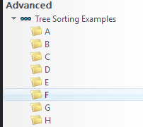


Images:

But what if the Images aren't all the same?  Well, the View Images have an order too.  And this is the esoteric part... Those different images have a particular "sort order" themselves.  I'm sure there is some long-since-buried historical reason for why the individual images sort the way they do (and the options that are available), but here's the order used in any case, from top (sorts to the top of the tree) to bottom:

1. Scheme Group
2. Audio
3. Image
4. Video
5. CD
6. Folder
7. TV
8. Scheme

So, if you change my test views to have different Image settings, then they'll sort first using those Images (grouping them together) and then it will sort alphabetically within those "groupings of views" with matching images.  Like so:
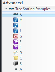


See how H, I, J is in order, but K is above them?  That's because Views that use the Scheme Group image (the one with three dots) sort first (for some reason).  Views using the Scheme image (the single dot) sort last, so the A goes at the bottom.

Position:

Now, say you want to force a particular View to go to the Top or the Bottom of a particular section?  You can switch the View's Position setting from Automatic to Top, and it'll "force" it up to the top (or bottom), regardless of the Image being used.  Like so:


Here, View B sorts to the top, even though it has the TV image, because I've set the Position setting to Top.

That works simply enough if you just want to force a particular view of a set to the top or bottom manually, but it can seem confusing when you have more than one view in a group set with Top or Bottom.  That's actually simple enough, but it isn't always immediately clear...

It really has three separate "sections" based on the Position setting:  Top, Automatic, and Bottom, and then it sorts within those sections using the rules I described above.  When everything is set to Automatic (you can think of this as "middle") then they follow the rules I described above, but if you have a few set to Top, a few set to Auto, and a few set to Bottom, then it sorts each of those "sections" separately.
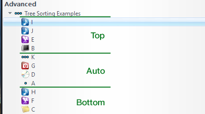


Here, I've set a few of each of these views to either Top, Automatic, or Bottom, and you can see how they still follow the "normal" sort order (or the previously described one anyway), but within these Top, Middle (called Automatic), and Bottom "sections".

Tree Tiers:

Each "tier" of the entire Tree follows this sort order.  So, if you make a view inside Audio, and put views inside that view (as I've done in the very first screenshot), then each "level" sorts itself by these rules separately (and then their children sort separately, and their children, and so on ad infinitum).

This includes (mostly) the very top tier, where Playing Now, Audio, Images, and the rest of them are in the tree.  Even though they don't actually display them, the default Audio top-level view has the Image set to Audio, Images is set to Image, Video is set to Video, and Documents (if displayed) is set to Folder.  If you make your own Top Level views, you can still use these Image settings to impact sort order, even though MC doesn't actually show the images on the top tier.

However, there are a few "special" things about the top tier.  Playing Now is special, isn't really a "View", and it always sorts to the top.  Likewise, the Notes, Performer Store, and on down are all special and sort to the bottom.  But everything else in there, has an Image assigned and therefore gets a particular sort order.  You can check them out (even though you can't "select" the Audio, Images, or other top level Views in the tree) by right-clicking on one, and choosing Customize View for it.

And, of course, you can make your own top-level Tree items, and put whatever you want in there.  Like my Advanced item (where I stash Library Maintenance Views and other similar "utility" things):
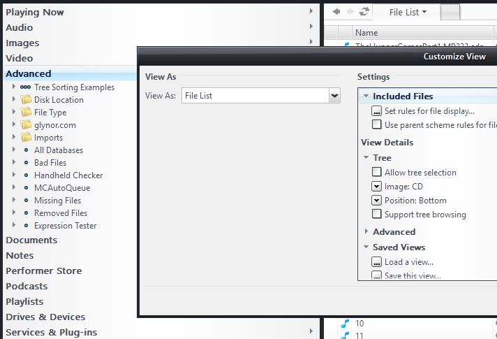


Just to make it ever so slightly more esoteric, for whatever reason, the Audio, Images, and Video top level views are also a bit "special" and always sort to the top, just under Playing Now.  It is almost like they have a super-secret "really on top" Position Section (even though the setting in Customize View says Automatic).  You can move them around by changing their Image setting, but those three always show up on top of any custom Top Level views you create.


Here I've moved Video up to the top of the Tree by changing its Image setting to Scheme Group.  Since it is one of the three "special" top level Views, it doesn't matter what Position is set to, as it will always sort to the top just under Playing Now, and then sort within those three using the Image logic.

I hope this helps!
Logged
"Some cultures are defined by their relationship to cheese."

Visit me on the Interweb Thingie: http://glynor.com/

Gl3nn

  • Galactic Citizen
  • ****
  • Posts: 384
Re: Setting the Sort Order of Views In the Tree
« Reply #1 on: November 05, 2013, 11:30:33 pm »

Thanks glynor!  I didn't ask the original question but I certainly appreciate the excellent explanation!  Very useful.
Logged

crisnee

  • World Citizen
  • ***
  • Posts: 179
Re: Setting the Sort Order of Views In the Tree
« Reply #2 on: November 06, 2013, 01:59:55 am »

You have got to be kidding!

I asked originally. Thanks for the time you took to produce this episode glynor.

-Chris
Logged

InflatableMouse

  • MC Beta Team
  • Citizen of the Universe
  • *****
  • Posts: 3978
Re: Setting the Sort Order of Views In the Tree
« Reply #3 on: November 06, 2013, 04:42:45 am »

I see a new 'Tip of the Week' contributeur  ;D.

Thanks Glynor!
Logged

DangerJP

  • World Citizen
  • ***
  • Posts: 129
Re: Setting the Sort Order of Views In the Tree
« Reply #4 on: November 06, 2013, 07:12:53 am »

Thanks a lot for your detailed explanations !
Logged

rjm

  • Regular Member
  • Citizen of the Universe
  • *****
  • Posts: 2699
Re: Setting the Sort Order of Views In the Tree
« Reply #5 on: November 06, 2013, 09:21:07 pm »

Perhaps someone who knows how to put this in the wiki could kindly do so.
Logged

glynor

  • MC Beta Team
  • Citizen of the Universe
  • *****
  • Posts: 19608
Re: Setting the Sort Order of Views In the Tree
« Reply #6 on: November 06, 2013, 11:48:44 pm »

I've been thinking about this a bit since I started writing that up...

If the JRiver folks are looking for a place to simplify the UI, this might be a good target.  First of all, you can tell from my convoluted description above that the current system is more than a bit... creaky.  Maintaining it also requires a couple funky options (checkbox bloat) in the Customize View dialog.  It is rigid and requires some oddball "special cases" (like the "super position" of the Audio, Images, and Video top-level views).  And, frankly, it could use a little refresh anyway.  Case in point: 1992 called and wants its TV icon back (sweet Sony Trinitron there, man).*

I think there could be a better way...

- Add a new View Menu Command called "Edit Tree Sorting" (or something like that).

- When engaged, most of MC's controls dim, and the user-editable parts of the tree remain highlighted.  You can expand and collapse different parts of the tree (the non-dimmed parts), but not really do anything else.

- You might even add an obvious "Done Editing" button in one of these dimmed areas.

- In this mode, you can rearrange the order of the items via the typical drag-drop with the insertion line metaphor.  You can also right-click on any node of the tree and choose "alphabetize child views" (a-z and z-a versions).  Maybe some kind of "reset all" button too that just resets them all back to default/alphabetical would be good too.

- MC would track, behind the scenes, if any child of a particular node have been rearranged manually.  If not (probably the most common case) then newly added Views and those moved or copied into the node would just automatically alphabetize themselves.  If a node has a "manually repositioned" child, then you add to the bottom instead.

It seems like this would be much less esoteric, and you could remove a bunch of options, without losing any functionality (and maybe gaining a few things).  I'm pretty sure based on the MCC's you can use to programatically jump to different parts of the tree, that you're actually storing an Int key of some kind for each view and then the views actually sort according to this Int.  But you're generating the Int based on these esoteric rules (maybe not, but it seems like its something along those lines).

With the new thing, when the user finishes editing, you could just write out the keys then and really do a simple sort.  You can throw away all of the whiz-bang tree-sorting logic.

In the Customize View dialog, you could remove at least one, and maybe as much as the entire Tree section of the dialog.  There are tons of "functional copies" of this dialog in a running MC Library, so that's a pretty essential dialog, and every bit helps there I think.  You could certainly dispose of the (probably confusing to most everyone who hasn't read my treatise above) Position option.

And, I think you could also get away with removing the Image option.  Since the Images selected wouldn't impact sort order (which is my main reason to ever not choose the obvious choice), you could just decide on this yourself automatically based on the files that the View's search will contain.  If the View is filtered to only show Audio files, use the Audio icon.  Video, use the Video icon.  If a mixture, use the Folder.  If Allow Tree Selection is disabled, use Scheme dots.  For those, you could even add hierarchies: three dots for the more top-level instances, one for ones "deeper" in the tree.  Or maybe even combine them and have an Audio icon overlayed with dots or a folder or something to indicate that it is an Audio-filtered view, but that it acts like a "folder".  And so on and so forth.  I think it would probably open you up to be a little more creative with the little view icons, and make it cleaner and easier for the users to boot.

Conceivably, you could even move the options for Support tree browsing and Allow tree selection into this new "editing the tree" mode, though I probably would recommend against going that far.  But still, you got rid of two options, cleaned up the Customize View dialog and made it a little less intimidating, and you've excised a confusing and creaky system without seriously impacting functionality for those of us screamers who like to scream when you break things.

* I may have been a bit harsh on the TV icon, but the CD icon is almost just as bad, and none of them really completely fit-in with Noire as it looks now.  They feel like a tweaked left-over from Blue Steel.
Logged
"Some cultures are defined by their relationship to cheese."

Visit me on the Interweb Thingie: http://glynor.com/

magnust

  • Galactic Citizen
  • ****
  • Posts: 380
Re: Setting the Sort Order of Views In the Tree
« Reply #7 on: November 07, 2013, 12:52:37 am »

Manual sorting would be much nicer.

Just like all views are already manually sorted to any liking in DLNA & Gizmo.

Using the same UI for sorting would be preferable IMHO.


PS:
(and some copying possibilities of views between them all would be nice too ;-) )
Logged

glynor

  • MC Beta Team
  • Citizen of the Universe
  • *****
  • Posts: 19608
Re: Setting the Sort Order of Views In the Tree
« Reply #8 on: November 07, 2013, 01:30:43 am »

Using the same UI for sorting would be preferable IMHO.

You can't use the same UI in the Tree as they use for sorting the Theater View and Media Network views, though.

Drag and drop in the Tree already does something.  A pretty essential something to boot!  And the other method from the Options dialog is essentially up/down/nest buttons which is both annoying and slow to use, ugly, and not really possible with the design of the tree.  Where would you put the buttons?

I thought about holding a key while you drag to reorder, but that doesn't match the other behavior, and it isn't very discoverable.  Using the "mode" is much more discoverable, it allows you to make obvious the parts of the UI where it is allowed/disallowed, and you can use the left-over dimmed UI real estate for any other needed UI elements like the Done button.

(and some copying possibilities of views between them all would be nice too ;-) )

You can copy views from Standard View into both Theater View and Media Network (I know, because I whined incessantly until they added it).  I use this a lot.  All of my more complex Theater Views are either based on one from Standard View, or they have a "clone" buried in my Advanced View.  When I modify them, I modify the Standard View version (which is usually easier to test too) and then copy it into Theater View and tweak it as needed.

You can't copy back out of Theater View or Media Network, which is part of why I do my modifications that way.

Frankly, I am way more on board with the change now than I was back then, but I'm still not entirely on-board with the way they decided to separate Theater's views from Standard's views.  It has given them additional flexibility to make changes to Theater View (and eventually Media Network) that don't correspond to Standard View.  And, I've gotten on board with the idea that you usually don't want these two view paradigms to work quite the same: separating Standard View from Theater View allows me to load my Standard Views up with lots of panes and category "tiers" that I'd never want to navigate through with my remote on the TV.

So, there's been a bunch of good.  But I'm not entirely convinced that the way they went about it was the right choice.  I still think having a section of the tree (under Services & Plugins would be my suggestion) where you configure these views would be a better system.  You could drag them around to reorder and nest them, and drag-copy/paste them to and from other sections of the tree like you can elsewhere, and you'd modify them by a mode-specific version of the Customize View dialog (so this would be familiar territory and you wouldn't have to learn a whole different paradigm to deal with the Standard Views versus the others.
Logged
"Some cultures are defined by their relationship to cheese."

Visit me on the Interweb Thingie: http://glynor.com/

MrC

  • Citizen of the Universe
  • *****
  • Posts: 10462
  • Your life is short. Give me your money.
Re: Setting the Sort Order of Views In the Tree
« Reply #9 on: November 07, 2013, 02:12:06 am »

Drag and drop in the Tree already does something.  A pretty essential something to boot!

Yes, but it is weak.  Dragging a tree item should show a placement marker and move the item in the tree (there's your Move).  Copy should be accomplished via right-click > Duplicate View.

Why not just default the sub views to alphabetic, and items can then be manually drag-moved after that (where they retain their position)?  New items created via right-click > Add Library View would be created immediately above the selected item, or as item 1 if the top-level tree item is selected.

I agree that the tree position and tree icons should be removed from the Customize dialog, since they are not apropos in other contexts.  Right-click > Customize Icon seems easy enough.
Logged
The opinions I express represent my own folly.

magnust

  • Galactic Citizen
  • ****
  • Posts: 380
Re: Setting the Sort Order of Views In the Tree
« Reply #10 on: November 07, 2013, 06:13:19 am »

Using the same UI for sorting would be preferable IMHO.

I was a bit muddy in how I wrote that. I meant they preferably be similar, not necessarily as the current way in DLNA/Gizmo. New thinking is welcome. But IMHO having the same "paradigm" or whatever it's called (English is not my native language :-)) to do the manual sorting. So not to confuse.

---

And copying, Yep, currently possible one view by one view which is a pain when you want to copy one or multiple whole "trees". And also you can't copy between DLNA and Gizmo and so on as you already mentioned.


I live happily with the current way of things. But it could be improved  :)
Logged

glynor

  • MC Beta Team
  • Citizen of the Universe
  • *****
  • Posts: 19608
Re: Setting the Sort Order of Views In the Tree
« Reply #11 on: November 07, 2013, 06:28:51 am »

Yes, but it is weak.  Dragging a tree item should show a placement marker and move the item in the tree (there's your Move).

I have a few applications that work this way (Girder comes to mind) and it is fiddly.  Exceedingly often when I'm trying to move something, I accidentally drop it into another node (last second mouse twitch as I let go of the button).  Worse, the result is that the item you were dragging "vanishes" and sometimes it isn't clear at all where it went.  I also sometimes move things unintentionally when just trying to use them, even with MC as it is now.  But with MC, at least, I get a pop-up and I can pick cancel.  I suspect that late-night MC browsing with a glass or four of wine in me would mean my views are all now rearranged out of order.

Not an impossible UI design to get right, I think, but very, very difficult.

Right-click Duplicate in place (which would add the (1) I assume) would work fine, but it does add an extra step, and sometimes two (if you want to preserve the existing name).  That's not great but it would be acceptable if the moving worked right.

That could work.  But I worry.
Logged
"Some cultures are defined by their relationship to cheese."

Visit me on the Interweb Thingie: http://glynor.com/
Pages: [1]   Go Up