Possible bugs:
1) when you remove a track from a playlist there is sometimes a significant delay between the gesture and the action happening. So much so that I've repeated the gesture and managed to delete 2 or 3 tracks. Is it possible to fail safe this so that the next gesture isn't recognised until the last one has been actioned
I find that the playlist just doesn't update for me at all unless you use a command that clears or replaces the entire list, or switch zones after making the change.
Definitely seems like a bug introduced in this version.
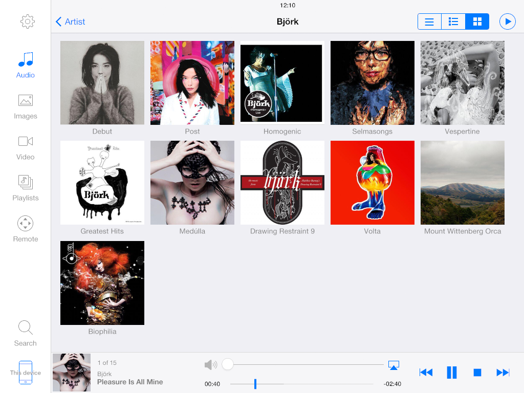
3) When I navigate between playlists and audio the main screen occasionally doesn't show the correct icons and instead shows top-level navigation icons which are not consistent with the rest of the app.
I find that this happens when resuming JRemote after it being in the background for a while. Reconnecting to the server fixes it.
This bug has been there for as long as I've been using the app, and is not new to the current version.
4) when I navigate to either artist level or album level occasionally I get an empty view with a 'no content' error message. If I back out and then go back and then in again 2-3 times I eventually get it to show me the content. Sometimes the app crashes at this point.
Yes, this has been happening a lot recently. It doesn't seem specific to any type of view.
I'm not sure what the cause is, but it's very frustrating. It seems like the new version is timing out requests too soon, if the server is slow to respond.
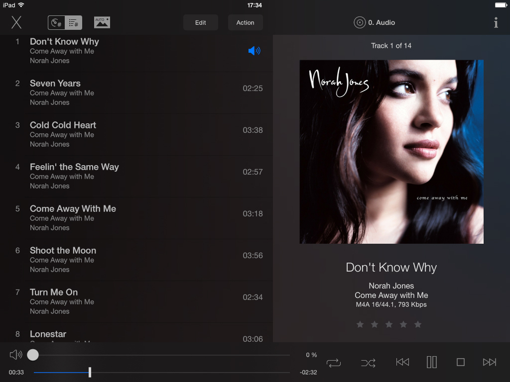
5) in the playing now window if you touch your finger in top-left of screen (where it says ipad with the wifi logo on by ipad) the playlist scrolls up.
That is standard iOS behavior when viewing any content that scrolls beyond the current view.
1) can we have an option to switch off the volume control if we don't need it (or better still if it's switched off in JR). It's a small thing but it confuses almost everyone who tried out jremote here.
I agree, it would be nice if the volume control was removed rather than staying at 0%.
I ended up just enabling Internal Volume on my server and leaving it at 100%.
I always use my DAC for volume control, but if someone else unfamiliar with my setup is using it, they prefer to control volume via the app.
2) can we have an option to switch off the +/- seconds buttons as they are just no use for an audio-only setup.
No use for video either - video is controlled via the regular iOS controls.
I find they clutter the display and are too easy to hit accidentally.
Here are a couple of mockups I posted a while back, showing how I'd prefer the app to look, using the native iOS colorscheme, and removing unnecessary controls:


I'm not saying it has to look exactly like that, but it would simplify the controls and make the app easier to use.
