INTERACT FORUM

Please login or register.

Login with username, password and session length
Advanced search  
Pages: [1] 2   Go Down

Author Topic: Re: Direction for MC Image Management  (Read 8455 times)

marko

  • MC Beta Team
  • Citizen of the Universe
  • *****
  • Posts: 9119
Re: Direction for MC Image Management
« on: January 12, 2008, 10:36:22 am »

image library all the way baby!!
we waited a long time for MC to get serious about our pictures, and with version 12, we got that, with bells on...
I very rarely reach for external management tools these days, which, I guess, serves to focus the pain when I need to do so...

imported another batch of photos this morning....

The new keywords nesting and preview tooltips really are a pleasure to work with, but seriously, MC has me reaching for that infamous "alternative program" at least twice in the process...

right from the off, I use its photo downloader to acquire the images in the first place because it allows me to set the copyright and author fields at time of download.
OK, I can set the image  [artist] from inside MC afterwards, but MC makes no provision at all for me to set my own copyright on my own photos, though it does read the tags set by other software just fine...

later on, after doing initial tagging, I turn my attention to candidates for "stacking". I need to decide what to keep and stack, and what to just delete, and by far the best way to do this is to use another program's "side by side compare" feature....


from here, I can delete photos or apply keyword tags and the whole thing is a breeze. The neat thing is that when I'm done, MC picks up the new keywords and cleans up the deleted photos, but still, I'd much rather not have to reach for an external tool at all.

-marko.

Matt

  • Administrator
  • Citizen of the Universe
  • *****
  • Posts: 42323
  • Shoes gone again!
Re: Direction for MC Image Management
« Reply #1 on: January 13, 2008, 07:18:52 pm »

I don't understand how side-by-side image compare is better than full-screen flipping.  MC keeps the previous and next image in memory so flipping is instant.  If you hold shift, it preserves zoom and scroll.

Even with a big monitor, you often need it all and then some to pick the sharpest image.  Trying to show two or more images at once just waters this down.
Logged
Matt Ashland, JRiver Media Center

johnnyboy

  • Regular Member
  • Citizen of the Universe
  • *****
  • Posts: 626
Re: Direction for MC Image Management
« Reply #2 on: January 13, 2008, 08:45:32 pm »

Its being able to compare them both at the same time to see which you prefer.
I find the side by side method easier as well personally.
Logged

marko

  • MC Beta Team
  • Citizen of the Universe
  • *****
  • Posts: 9119
Re: Direction for MC Image Management
« Reply #3 on: January 14, 2008, 02:41:36 am »

Its being able to compare them both at the same time to see which you prefer.
Simple as that for me too. When using this tool, I also make use of the fact that I can press ctrl+F to show/hide the filmstrip, and I can press F11 or F12 to switch between single or dual view. I can also lock the zoom slider that both images on view have the same level of zoom applied. After deciding what to do with an image, I can either delete it or tag it directly from this view.

I think that if MC would allow this (set tags on images showing in display view), I might be able to get by without 'side by side', though it's a big 'might'.
The thing that grinds with MC right now is, sure, we can double click an image to see it big, full screen even, and page up/down moves to the previous/next image, but there's no way to tag the currently viewed image from here...
We double click again to return to the view from whence we came, and the file selected is still the one we started with, so, we need to keep in mind what tags we want to set, then track through the list to find and select that image, then tag it, then double click again to go back to the big picture view and pick up the workflow thread again.
All in all, it has a rather disjointed feel about it.

-marko.

Doof

  • MC Beta Team
  • Citizen of the Universe
  • *****
  • Posts: 5908
  • Farm Animal Stupid
Re: Direction for MC Image Management
« Reply #4 on: January 14, 2008, 08:11:42 am »

I have to agree. MC's image handling paradigm "works" but it is in now way the most efficient or easiest way to handle images. MC's insistence on treating images, for the most part, no differently than an audio file is where it breaks down. Images are not audio. There's a lot you can tell about an audio file without even playing it. You can find two duplicate songs and easily tell which one is the higher quality version just by looking at the bitrate, for instance. You can also fill in almost all of an audio file's metatags simply by referring to some other source, like allmusic.com or yadb, so again playback isn't necessary. And even when playback is necessary, like filling in ratings, you can play the file without losing access to any of the other tools you might need. But images don't have this luxury. Looking at a file with a name like DSCN0001.jpg doesn't tell me anything. Even looking at the metatags and seeing when it was taken and with what camera doesn't tell me much. Who's in it? Who took it? Where was it taken? Does it pass muster to be placed in an online album? Of the 5 attempted groups shots, which one is the best? All of these (and many more) questions can only be answered by looking at it. And if the best way to look at it is one image at a time, in full screen, with no way of comparing it to other similar images, and no way of filling in metatags while we're viewing it fullscreen, then it should become obvious why this paradigm breaks down.
Logged

JimH

  • Administrator
  • Citizen of the Universe
  • *****
  • Posts: 72367
  • Where did I put my teeth?
Re: Direction for MC Image Management
« Reply #5 on: January 14, 2008, 08:28:00 am »

... All of these (and many more) questions can only be answered by looking at it. And if the best way to look at it is one image at a time, in full screen, with no way of comparing it to other similar images, and no way of filling in metatags while we're viewing it fullscreen, then it should become obvious why this paradigm breaks down.
I use MC as much for images as for music, and I don't see the problem you describe.  If I have several that are similar, I step through them at full screen until I find the one I want, hit escape, and remove the similar ones that don't have a play button.

If I had to have four on the screen at a time, they would be 1/4 size.  Since focus is one of the most common attributes I'm looking for, this would be a worse way to decide.

But, if we had to do what you want, would allowing the thumbnail slider to expand even more (displaying the original image) work for you?
Logged

dcwebman

  • Citizen of the Universe
  • *****
  • Posts: 2154
Re: Direction for MC Image Management
« Reply #6 on: January 14, 2008, 08:46:23 am »

But, if we had to do what you want, would allowing the thumbnail slider to expand even more (displaying the original image) work for you?
It's funny but that's what I attempted to do with my last batch of imports. I went to the largest size thumbnail I could to try and compare but still couldn't do it successfully.

I'm in agreement with the other folks that image management is the key thing that needs to be improved. I haven't imported my photos into my other programs in anticipation of finally doing it in MC but I just can't get to the easy way to do it yet in MC.

BTW, this part of the thread might want to break off into its own thread because I think it's breaking the first rule put in the first message.  ;)
Logged
Jeff

jgreen

  • Citizen of the Universe
  • *****
  • Posts: 2419
Re: Direction for MC Image Management
« Reply #7 on: January 14, 2008, 10:07:29 am »

FWIW, I always thought that expanding the thumbnail size slider was the way to go.  It solves the comparison question, and it gives the user more choices without creating more options.  I'm wondering how the performance would be at, say, 4-panel thumbnails.  If it was even reasonably interactive, it would be a stunning new feature, IMO.
Logged

johnnyboy

  • Regular Member
  • Citizen of the Universe
  • *****
  • Posts: 626
Re: Re: Direction for MC Image Management
« Reply #8 on: January 14, 2008, 05:26:43 pm »

I whole heartedly agree with the above.
Right now it feels like MC is trying to get us to treat and use all Media in the same way.
Images are a totally seperate ball game to music and trying to interact with them in the same way, using the same options and tools as music just doesn't work for me.
I still haven't tagged all my images yet, every time I decide I'm going to and load up MC, start tagging them, its 'flow' just feels totally off to me and I dont like how it works with them so although it would let me tag them, I dont want to because I dont like how it handles my pictures.

Again, for me, one of the biggest things is double clicking images and not just being able to browse them where they are. The whole idea of 'playing now' for images just doesn't work for me.

If I have 30 images infront of me, I double click one, I expect backwards and forwards to take me through all the pictures right there. I dont expect it to send the one I double click on to 'playing now' or to do anything with it, I just want to preview it.

As Doof pointed out above, with an audio track I look at its tags, decide if its the one I want then double click it to play it - perfectly logical.
With images, I want to look at it and view it full size to decide if its the one I want - its about viewing them, not reading information about them.

Maybe it's just me, although I cant imagine it is, but how it treats images and playing now for me is just a complete show stopper at the least.

MC really needs to let us treat images totally seperately from audio, not just grouped with 'if it has a display do x', I want 'for all my images, do X'.
Logged

Matt

  • Administrator
  • Citizen of the Universe
  • *****
  • Posts: 42323
  • Shoes gone again!
Re: Re: Direction for MC Image Management
« Reply #9 on: January 14, 2008, 05:55:36 pm »

Again, for me, one of the biggest things is double clicking images and not just being able to browse them where they are. The whole idea of 'playing now' for images just doesn't work for me.

If I have 30 images infront of me, I double click one, I expect backwards and forwards to take me through all the pictures right there. I dont expect it to send the one I double click on to 'playing now' or to do anything with it, I just want to preview it.

Have you used MC to play images?  It does exactly what you're describing.  There's no need to use Playing Now if it's not helpful to you.

Double-click plays fullscreen.  Previous and next pages images.  Double-click again brings you back.  Playing Now is not relevant.
Logged
Matt Ashland, JRiver Media Center

darichman

  • MC Beta Team
  • Citizen of the Universe
  • *****
  • Posts: 1362
Re: Re: Direction for MC Image Management
« Reply #10 on: January 14, 2008, 06:05:43 pm »

I agree that images should probably be treated separately. I've never used a side-by-side feature but definitely would if it were available to me. Perhaps the larger thumbnails will offer a compromise here -- will have to try it out.

I posted many of my image handling suggestions here: http://yabb.jriver.com/interact/index.php?topic=43888.msg301182#msg301182

Right now it feels like MC is trying to get us to treat and use all Media in the same way.

I think this is a really important point.

In my honest opinion, one of MC's original strength is now becoming one of it's major weaknesses - MC was marketed as "the one which plays them all". This is a great concept - a single and familiar interface can be used to navigate all your audio, video and image collection. But as media organisation has become more specialised, I think MC has suffered because of this original strength. In my mind, MC still tops the bar in audio. But there are other pure video and audio programs that outdo MC, because that's all they deal with. MC will win out in organisation -- the two areas where this may not be the case are playback and manipulation
Logged

JimH

  • Administrator
  • Citizen of the Universe
  • *****
  • Posts: 72367
  • Where did I put my teeth?
Re: Re: Direction for MC Image Management
« Reply #11 on: January 14, 2008, 06:30:23 pm »

darichman,
I purposely split this out to see what it is that people want for image managment/playback.  Perhaps you could tell us.

You can expand images with the thumb slider in the latest beta build.  I don't know that it's enough. 

But I hope we're in pursuit of the same thing you are. 
Logged

darichman

  • MC Beta Team
  • Citizen of the Universe
  • *****
  • Posts: 1362
Re: Direction for MC Image Management
« Reply #12 on: January 14, 2008, 07:49:57 pm »

Sure thing, Jim. Much of what interests me is in that thread I quoted above. I would be happy to paste it over here as well, but wouldn't want to spam my ideas all over the board :)

But another point worth making... I think when we talk about image playback, there are two situations which are relevant.

The first is pure image playback... Sitting round with family watching a slideshow of images, perhaps with audio in the background. The only real interaction here needs to be "forward" and "previous". In my humble opinion, the way MC does this now is quite good for this purpose-- it could use some refinement, of course. But as johnnyboy mentioned, sometimes it doesn't really seem like I'm browsing images... the interface is exactly the same as for audio and video playback. We even still have the "progress bar" for playback. I think image playback could benefit from a few context-sensitive "image-specific options" available on mouse movement. Options like "rotate", "edit" and "tag" would be really useful. Have a look at the Picasa images below.

In both Picasa and MC, there are no options on the screen during passive slideshow playback. Just the image (+/- caption if enabled). This is good.

In picasa, when I move the mouse, an elegant little overlay comes up with basic image commands:

Click to enlarge.


In MC during image playback, when I move the mouse, the MC interface pops up (this takes up a fair chunk of the screen)... the whole image is resized and it just ends up looking a little messy...
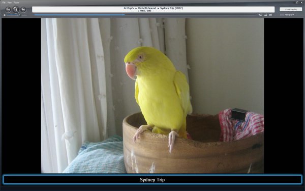
Click to enlarge.


The other area I think is important is manipulation. For me this includes tagging and editing the photo. The main difference here compared to audio and video is that we usually need to be viewing the image while we are doing these things. For an image with six or seven people, I don't like having to open the image in full screen, close it and try to remember which seven people were in it as I enter into the tag AW. Larger thumbnails may make this easier, but I'm not quite convinced yet.

I would like to see a separate image handling mode with all the possible edits and manipulations on the screen with a large image of the photo. No right clicks, just single clicks on a visual icon or tab to do what I want. Have a look at the way picasa does this:
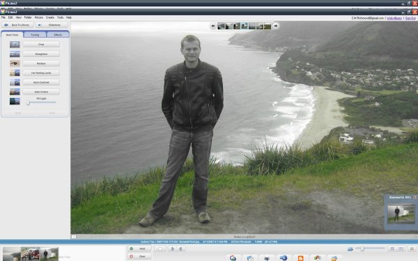

Click to enlarge.


What do we see here:
-A big fat view for our photo
-A small "slideshow" reticule with thumbnails of the next 3 and previous 3 photos (top middle)
-A snazzy "zoom window" which shows where I am in the photo as a whole (bottom right)
-Thumbnails of the most recent few photos I've been working on (bottom left)
-Quick links to "slideshow mode" (see above) and the library (top left)
-Quick links to web album, email, print etc (bottom)
-A little caption bar under the photo (I like this :))
-Basic "rotate", "star" commands (MC could put it's [Rating] stars in here)

And most importantly, the edits on the left.
-Basic Fixes (Crop, Straighten, Red Eye, Contrast, Colour),
-Tuning (Lights and Shadows)
-Effects (B&W, Sepia etc etc). This is all I expect from a simple image editor. Anything more and I will use photoshop.

MC would naturally need a "Tagging" tab as well :)
In this I would like to be able to specify the fields I'd like to show
...and for list entries, have an option to "show all list entries" or "show list entries in this album only" option (this latter one makes tagging people and places a breeze once you have a few photos filled out properly in an album)

Edits should be as "lossless" as possible, and retain all tag info. There has been talk of stacks (versions, edits etc). This would tie in nicely here.

One final small change I would like to see regards image sizing with captions. Currently, the caption covers the bottom part of the photo. Not a big deal with single line captions, but the minute you use two or more, a fair portion of the image is obscured. If we specify to use captions in image playback settings, please allow us to resize the image according to the caption size, not cover up the image with the caption. Or alternatively, have more configurability over the caption - opacity, size, font and position. I'd really like a smaller opaque multi line caption overlay in the bottom left with info like album, year, place and people :)

Long post again, sorry
Logged

johnnyboy

  • Regular Member
  • Citizen of the Universe
  • *****
  • Posts: 626
Re: Re: Direction for MC Image Management
« Reply #13 on: January 14, 2008, 08:07:06 pm »

Just tried the thumb slider and it works great although it still feels a bit crammed as its losing all the space to the panes and tagging window.
'just hide these' I hear you shouting - but I need the panes to be able to tag the photo.

If something like firefox's F11 (full screen) could be added so that when I press it, the side bar and panes all disappear and go into 'auto hide' mode, this would be awesome.
I could then have as many as I wanted, full screen using the thumbnail slider and the panes could auto appear by moving to the top of the screen to let me tag the images.

Even just a more basic letting me put the whole left side (AW and Tree) and Panes into an auto hide mode would make a LOAD of difference for images. I could view the image in a huge size then move my mouse to the top of the screen to make the panes drop down to let me tag.
Again, down to their viewing nature for photos, every inch of viewing space makes a lot of difference! :)


And I did what you said with the page up/page down - it seems to work for me now but yesterday when I was doing it, it most definitely wasn't.
I'm going to have to compare and contrast my laptop and desktop to see why the difference.

I really agree with darichman's comments about the toolbar while in full screen mode as well. I had similar thoughts when I started playing my images and saw that toolbar - its very un-useful.
I dont like the fact it resizes the image - I think it should just appear as an auto hide toolbar that comes down over the image with some image specific options on it (rotate, rate, pause, next, previous and maybe a slider to let us control playback speed)
Logged

johnnyboy

  • Regular Member
  • Citizen of the Universe
  • *****
  • Posts: 626
Re: Re: Direction for MC Image Management
« Reply #14 on: January 14, 2008, 08:10:13 pm »

oh and one other thing, dont know if this has been discussed anywhere or not.

The scroll wheel - I much prefer if this scrolls through the images rather than zooms in and out.
I scroll through images alot and for every 10 or even 100 I scroll through, I might zoom in and out of a couple.
For those ones I obviously want to pay more attention so I dont mind spending the time to do it.
Scrolling through the images is something I want to do quickly while browsing files in the app. Makes alot more sense if I can scroll through them still using the mouse rather than having to move to the keyboard to do it (without using onscreen controls)

Another thing I think would be great would be if the right click recent functions list was specific to the media type.
I dont want to send audio to facebook and dont want to convert a photo (well I do, but not in that way) .
Logged

johnnyboy

  • Regular Member
  • Citizen of the Universe
  • *****
  • Posts: 626
Re: Direction for MC Image Management
« Reply #15 on: January 14, 2008, 10:35:06 pm »

Here's a mock up of what I think would be IDEAL for MC.

http://www.exhibitionpark.co.uk/images/mc.swf

Its animated flash so you can see how it'd act in the app itself (move to top and bottom of the image).
The top would allow you to tag an image while viewing it full size.
The arrow next to 'edit' would allow you to spawn the image into any editor, clicking 'edit' would just spawn it in the default one.

To go one step further, if we 'zoomed out' enough, then it'd show multiple images per page.
Logged

johnnyboy

  • Regular Member
  • Citizen of the Universe
  • *****
  • Posts: 626
Re: Re: Direction for MC Image Management
« Reply #16 on: January 14, 2008, 10:36:28 pm »

The 'tack' at the top lets you pin the panes open if you want them to stay open!
Logged

)p(

  • Citizen of the Universe
  • *****
  • Posts: 579
Re: Direction for MC Image Management
« Reply #17 on: January 15, 2008, 03:39:00 am »


But, if we had to do what you want, would allowing the thumbnail slider to expand even more (displaying the original image) work for you?

Although in my dual monitor setup I will still prefer the flipping that is a very useful feature to have. I often feel limited by the maximum size of the thumbnail when zooming in and out of a list of images.

Personally I don't think mc should make the basic handling of images a lot different from the other media. The strenght of the current interface is that its both flexible and consistent for all media types. I would like to see it developed more like an extension of what is already there. And in a way other media types can also take advantage of when that is useful.

For example in photoshop elements the top level keywords have their own icons. Mc could do something similar and show them beneath the thumbnails. Left Clicking on it could bring up a relevant context menu. This would be useful not only for images but in any thumbnail view. An interactive rating icon would be a nice touch too.

peter
Logged

dcwebman

  • Citizen of the Universe
  • *****
  • Posts: 2154
Re: Re: Direction for MC Image Management
« Reply #18 on: January 15, 2008, 07:24:05 am »

Double-click plays fullscreen.  Previous and next pages images.  Double-click again brings you back.  Playing Now is not relevant.
We've gone through this before but if you have songs in Playing Now and have the player stopped, double-clicking an image will put that image in Playing Now. If a song is playing or paused, it will not put it in Playing Now. Of course the latter is the preferred way for all instances of double-clicking an image.

The only way to play images is to put them in Playing Now and the only way to get non-interference with songs is to use a different zone.

Regarding the thumbnail to make larger images, that works well but as previously mentioned, it would be nice to have a way to quickly turn off the image tooltips because they just get in the way when working with large images. You can turn all the tooltips off but it's still having to go through Options. It would be helpful if at least that was something that could be put on the toolbar if no other way existed. Plus, it's not needed because you can add whatever you want to the thumbnail text in this case.
Logged
Jeff

dcwebman

  • Citizen of the Universe
  • *****
  • Posts: 2154
Re: Direction for MC Image Management
« Reply #19 on: January 15, 2008, 07:44:49 am »

It's great that the JRiver team is willing to listen and most likely implement what's best for image management in MC. I'm sure it's tough because what we are all comparing against are strictly image management/graphic editors whereas MC can do a lot more. But I'm sure the end result will turn heads.

Regarding darichman posts: Yeah, what he said!
Logged
Jeff

park

  • MC Beta Team
  • Citizen of the Universe
  • *****
  • Posts: 2358
  • I wish I had more to say!
Re: Direction for MC Image Management
« Reply #20 on: January 15, 2008, 09:44:02 am »

I'm with everyone else on not like playing now to preview images. Page up/down only go to the next image if you put multiple images into playing now in the first place. I want to work exclusively with my viewscheme list. I dont want to keep having to multiply selecting images and playing them, just to be able to compare them.

Big thumbnails are ok, but not the most eloquant solution. I think that the simplest solution would just be to add a link to the bottom of image thumbnails saying "Preview". It would make the image go full screen. Using arrow keys would allow you to move through the list without having to see the list. A single click would bring you back to the list with the last viewed image selected. Tagging with panes or the tag window would be as effortless as it is now.

That behavior combined with some easy way to create groups (stacks), and nominate an image as the best one, would achieve everything i want in MC's image handling abilities. And the best thing is that it wouldnt break the consistency of MC's overall user interface. It would still be essentially the same way of browsing as when browsing music and movies.

(One final somewhat related point. Arrowing through the list using the right arrow should take you to the next row when you hit the end of the current row. Unless of course there is a way of getting to the leftmost thumbnail of the next row, using just one key, that i dont know about.)
Logged

Matt

  • Administrator
  • Citizen of the Universe
  • *****
  • Posts: 42323
  • Shoes gone again!
Re: Direction for MC Image Management
« Reply #21 on: January 15, 2008, 10:27:07 am »

I'm with everyone else on not like playing now to preview images. Page up/down only go to the next image if you put multiple images into playing now in the first place. I want to work exclusively with my viewscheme list. I dont want to keep having to multiply selecting images and playing them, just to be able to compare them.

Double-clicking a single image always makes the images around that image available with page up / page down. (or as a slideshow)

The only way for this to not happen is to change your double-click behavior from the default.  It's possible that we should remove or ignore this option for images.

Quote
Big thumbnails are ok, but not the most eloquant solution. I think that the simplest solution would just be to add a link to the bottom of image thumbnails saying "Preview". It would make the image go full screen. Using arrow keys would allow you to move through the list without having to see the list.

That's also there.  We use the word "Play".
Logged
Matt Ashland, JRiver Media Center

MrHaugen

  • Regular Member
  • Citizen of the Universe
  • *****
  • Posts: 3774
Re: Direction for MC Image Management
« Reply #22 on: January 15, 2008, 12:09:58 pm »

I am ALL for darichman suggestions. At least what he wrote above his picures examples (two first paragraphs of text).

I agree that it's not always the best way to put pictures in playing now. But if there was a sepearate image list or something, what would happen in theater view? What about playing now? Not sure that all the angles have been thought of here.
Logged
- I may not always believe what I'm saying

Doof

  • MC Beta Team
  • Citizen of the Universe
  • *****
  • Posts: 5908
  • Farm Animal Stupid
Re: Direction for MC Image Management
« Reply #23 on: January 15, 2008, 12:38:05 pm »

I think the zoom slider change is a good step in the right direction. After zooming in on an image and moving the panes to the side, it's actually quite useable for tagging photos.

http://www.pix01.com/gallery/4CA46CC4-86AF-4805-8022-1B16245D801D/Interact/slide0.html#thumb
Logged

darichman

  • MC Beta Team
  • Citizen of the Universe
  • *****
  • Posts: 1362
Re: Direction for MC Image Management
« Reply #24 on: January 15, 2008, 06:34:41 pm »

I think the zoom slider change is a good step in the right direction. After zooming in on an image and moving the panes to the side, it's actually quite useable for tagging photos.

I agree. I find this very usable!
Well done guys.
Logged

park

  • MC Beta Team
  • Citizen of the Universe
  • *****
  • Posts: 2358
  • I wish I had more to say!
Re: Direction for MC Image Management
« Reply #25 on: January 15, 2008, 07:37:21 pm »

Double-clicking a single image always makes the images around that image available with page up / page down. (or as a slideshow)

The only way for this to not happen is to change your double-click behavior from the default.  It's possible that we should remove or ignore this option for images.

That's also there.  We use the word "Play".

Perhaps that would be a good short term solution then. Change the play behavior for images so that you can cycle through the list, even if you only "played" one image. I have never used the default behavior. I'd also recommend having some overlay left/right arrows to make it clear that you can cycle through the images for those that aren't aware of the keyboard shortcuts.
Logged

johnnyboy

  • Regular Member
  • Citizen of the Universe
  • *****
  • Posts: 626
Re: Re: Direction for MC Image Management
« Reply #26 on: January 15, 2008, 07:39:51 pm »

No one like my mockup then :'(
Logged

darichman

  • MC Beta Team
  • Citizen of the Universe
  • *****
  • Posts: 1362
Re: Direction for MC Image Management
« Reply #27 on: January 15, 2008, 07:47:29 pm »

haha it was beautiful :)

To be honest though, I get annoyed with pop-ups which obscure things.
I like the bottom bit, but not a big fan of having the panes pop up like that...
How about if I wanna zoom in on a bit at the top of the photo, and the tag panes come up?
Logged

skeeterfood

  • Citizen of the Universe
  • *****
  • Posts: 779
  • We're all just food for the skeeters.
Re: Direction for MC Image Management
« Reply #28 on: January 15, 2008, 10:14:02 pm »

Another suggestion:

Right now, if I double-click on an image in Windows Explorer it's the only thing that gets loaded into Playing Now and when I pageup/pagedown/double-click I end up in wherever MC is set to start (Audio for me).  Then I have to navigate to Playing Now, right-click->Locate > On Disk (inside Media Center) and finally double-click on one of the images.  Finally, I can browse through all the images in that folder.

Instead, how about if when you double click on an image in Windows Explorer, MC automatically adds the rest of the files in the folder so that you can browse through them.  Then, when you exit browsing (not using the X), MC should go to the folder the double-clicked picture was in within Drives and Devices.  This would allow it to replace the standard XP image viewer.

-John
Logged

darichman

  • MC Beta Team
  • Citizen of the Universe
  • *****
  • Posts: 1362
Re: Direction for MC Image Management
« Reply #29 on: January 16, 2008, 02:05:46 am »

I want MC to scan my photos for me and apply complicated face recognition algorithms to automatically fill out the people tags. Please.
Logged

johnnyboy

  • Regular Member
  • Citizen of the Universe
  • *****
  • Posts: 626
Re: Re: Direction for MC Image Management
« Reply #30 on: January 16, 2008, 03:49:39 am »

Another suggestion:

Right now, if I double-click on an image in Windows Explorer it's the only thing that gets loaded into Playing Now and when I pageup/pagedown/double-click I end up in wherever MC is set to start (Audio for me).  Then I have to navigate to Playing Now, right-click->Locate > On Disk (inside Media Center) and finally double-click on one of the images.  Finally, I can browse through all the images in that folder.

Instead, how about if when you double click on an image in Windows Explorer, MC automatically adds the rest of the files in the folder so that you can browse through them.  Then, when you exit browsing (not using the X), MC should go to the folder the double-clicked picture was in within Drives and Devices.  This would allow it to replace the standard XP image viewer.

-John

I'd prefer if it didn't auto import them on double click but instead opened MC in its 'My Computer' view in the current folder and let me browse them as you suggested instantly from that location using next and previous.

darichman - just have a button next to the 'tack' that was a X to allow you to close the panes - beautiful :)
I use auto-hide in so many app's I guess I'm used to it.
I just LOVE the ability to get maximum working space as well as quick and easy, immediate accessibility to the tasks and actions I need.
Logged

skeeterfood

  • Citizen of the Universe
  • *****
  • Posts: 779
  • We're all just food for the skeeters.
Re: Re: Direction for MC Image Management
« Reply #31 on: January 16, 2008, 07:48:15 am »

I'd prefer if it didn't auto import them on double click but instead opened MC in its 'My Computer' view in the current folder and let me browse them as you suggested instantly from that location using next and previous.

I guess I don't care how MC does it, just let me browse the next/previous pictures when I double-click on a MC supported image file from within Windows Explorer.  And when I exit Display View take me to the double-clicked files location within Drives and Devices.

-John
Logged

park

  • MC Beta Team
  • Citizen of the Universe
  • *****
  • Posts: 2358
  • I wish I had more to say!
Re: Direction for MC Image Management
« Reply #32 on: January 16, 2008, 07:49:55 pm »

I just played with the thumbnail slider. It works surprisingly well. One thing though, it'd be nice if it zoomed into the selected file rather than the center.
Logged

marko

  • MC Beta Team
  • Citizen of the Universe
  • *****
  • Posts: 9119
Re: Re: Direction for MC Image Management
« Reply #33 on: January 17, 2008, 03:54:14 am »

I've been holding off posting as while the recent slider changes are welcome, I'm not convinced they cut it for 'side by side' comparisons. I'm still sitting on the fence until I've had a chance to do a lot more tagging.

The raft of image library/tool changes introduced recently have turned things on their head over here and I'm still trying many different things yet...

Here's a thought though...

I set a viewscheme with a single keywords pane and set that to the left.
I hid the tree.
I resized the thumbs to best fit the viewable area. very nice.
Put the mouse away and grab the keyboard.
I can tab and shift+tab between the file list and the keyword pane.
I think it would be neat if I could tab into the tagging mode tick boxes
then I could use the up/down keys and the space bar to apply different keywords, tab back into the file list, move to the next image, shift+tab back into the keyword pane, and so on...

I should be back with more feedback over the weekend :)
-marko.

dcwebman

  • Citizen of the Universe
  • *****
  • Posts: 2154
Re: Direction for MC Image Management
« Reply #34 on: January 17, 2008, 08:03:54 am »

I like Doof's method of putting the pane to the left and tagging images. One thing that would be nice, and I'm going to refer to a non-graphics program now, is what Acrobat Reader has as an option, and that is to show one image at a time (page in their case). That means when I have an image maxed to size within my view and I go to the next image with keyboard or mouse, the next one only is shown. That eliminates having to use the vertical scroll bar to get the image you're working on back in the center of the page again. Of course this is similar to some other programs' large size view mode too.
Logged
Jeff

marko

  • MC Beta Team
  • Citizen of the Universe
  • *****
  • Posts: 9119
Re: Re: Direction for MC Image Management
« Reply #35 on: January 17, 2008, 11:32:39 am »

dc, that's exactly how it was working for me this morning. one press of the up or down key brought up the image above or below the one currently being shown, I did not need to reach for the scroll bar at all. it was a pleasure to work with.

dcwebman

  • Citizen of the Universe
  • *****
  • Posts: 2154
Re: Re: Direction for MC Image Management
« Reply #36 on: January 17, 2008, 01:08:23 pm »

dc, that's exactly how it was working for me this morning. one press of the up or down key brought up the image above or below the one currently being shown, I did not need to reach for the scroll bar at all. it was a pleasure to work with.
It was doing that for me too for about 5 images and then it would start getting off. I imagine screen resolution, window size, pane size, etc. all play a part in what you saw work perfectly.
Logged
Jeff

marko

  • MC Beta Team
  • Citizen of the Universe
  • *****
  • Posts: 9119
Re: Re: Direction for MC Image Management
« Reply #37 on: January 18, 2008, 03:08:58 am »

As far as I can tell, the trick here is to adjust the size so that the entire 'thumbnail', for want of a better word, is visible. Then, and only then, pressing the up/down keys will move the previous/next image into view in the exact same position as the outgoing image.
If you make the image just a little larger, so that a part of the selection is out of view, the up/down keys move the selection, but the list does move to keep the selected file in view.

I'm assuming this is by design rather than a bug. If it's a bug, consider this a bug report!

-marko.

dcwebman

  • Citizen of the Universe
  • *****
  • Posts: 2154
Re: Re: Direction for MC Image Management
« Reply #38 on: January 18, 2008, 07:25:38 am »

As far as I can tell, the trick here is to adjust the size so that the entire 'thumbnail', for want of a better word, is visible. Then, and only then, pressing the up/down keys will move the previous/next image into view in the exact same position as the outgoing image.
If you make the image just a little larger, so that a part of the selection is out of view, the up/down keys move the selection, but the list does move to keep the selected file in view.
I think the problem is when you have vertical orientation photos mixed in with horizontal orientation ones. Regardless, the one image shown at a time option would solve the problem without trying to adjust the size so that it will work. All that option would need to do is say, align the top of the thumbnail with the top of the screen every time.
Logged
Jeff

fdgsdfg

  • Regular Member
  • World Citizen
  • ***
  • Posts: 151
  • nothing more to say...
Re: Direction for MC Image Management
« Reply #39 on: January 18, 2008, 02:30:35 pm »

image library all the way baby!!
we waited a long time for MC to get serious about our pictures, and with version 12, we got that, with bells on...

Marko,  How did you get your view settings like that?  I can't figure out how to get the split screen (with detached MC controls) and the vertical thumbs on the right hand side.

I have used MC for my primary photo tagger/organizer for a long time.  I've manipulated over 12,000 photos with MC and earlier with MJ.  I batch tag ([Genre]/[Custom 1]), "update library fm tags," and "rename files from properties."

Thanks.
Logged

marko

  • MC Beta Team
  • Citizen of the Universe
  • *****
  • Posts: 9119
Re: Re: Direction for MC Image Management
« Reply #40 on: January 19, 2008, 03:34:36 am »

LaneNem, I only wish MC would allow something like that screenshot, which shows another programs 'side by side compare' feature.

There are changes in the pipeline that allow much larger thumbs in the file list area, and this is close, but it's still a little on the claustrophobic side for my liking when trying to compare one photo with another.

fdgsdfg

  • Regular Member
  • World Citizen
  • ***
  • Posts: 151
  • nothing more to say...
Re: Re: Direction for MC Image Management
« Reply #41 on: January 19, 2008, 05:40:34 am »

LaneNem, I only wish MC would allow something like that screenshot, which shows another programs 'side by side compare' feature.

OK.  Got it.  I thought the skin looked like MC . . .
Logged

Doof

  • MC Beta Team
  • Citizen of the Universe
  • *****
  • Posts: 5908
  • Farm Animal Stupid
Re: Direction for MC Image Management
« Reply #42 on: January 22, 2008, 02:07:35 pm »

After using this for a bit (the max-sized thumbnails and the left-hand panes), I've found just one niggling problem with it.

If you set the panes to be on the left or right, then they're always on the left or right for every other view scheme you have. That's kind of a pain. Some view schemes work well with the panes on the sides, others work best with the panes on the top.

Would it be possible to get this setting seperated on a view scheme basis?
Logged

marko

  • MC Beta Team
  • Citizen of the Universe
  • *****
  • Posts: 9119
Re: Re: Direction for MC Image Management
« Reply #43 on: January 22, 2008, 02:44:03 pm »

I'd like to be able to apply the setting on a "per view scheme" basis.

Like you say, any more than 2, 3 at a push, panes, and it all gets too cramped to be a viable option.
One thing I have noticed if you use tabs and open up several views, you can set the panes in different orientations for each tab and it sticks until you reload the tab. It's not ideal, but can help at times.

johnnyboy

  • Regular Member
  • Citizen of the Universe
  • *****
  • Posts: 626
Re: Re: Direction for MC Image Management
« Reply #44 on: January 22, 2008, 04:58:16 pm »

Doof,
That's what I was suggesting here:
http://yabb.jriver.com/interact/index.php?topic=44481.0

That we can save these type of settings per view scheme as maybe it's just me being lazy but if I have to constantly change these every time I want to do something different in MC (audio vs images for eg), I just find I DONT do it because I'm too lazy to change back and forth each time. I love the different view config options we have now, but I'm not going to change, resize, setup etc these each time I want to do something.

Maybe I should stop being lazy true, but thats just me and how I honestly use the app.
Logged

marko

  • MC Beta Team
  • Citizen of the Universe
  • *****
  • Posts: 9119
Re: Re: Direction for MC Image Management
« Reply #45 on: January 23, 2008, 02:19:54 am »

So that's three aye's for a per view scheme option on pane placement, all made in different threads.

if anyone else feels that this might be useful, say so here, now, or forever hold your peace!!

Johnnyboy, I don't think you're lazy at all, everytime I've finished working in a view scheme with panes on the left and move off to somewhere else, it irks me that before this new location becomes useable, I must first shift the panes up top again. It really is a massive speed bump for me, and surely we can't be the only three to feel it?

-marko.

MrHaugen

  • Regular Member
  • Citizen of the Universe
  • *****
  • Posts: 3774
Re: Re: Direction for MC Image Management
« Reply #46 on: January 23, 2008, 02:29:54 am »

So that's three aye's for a per view scheme option on pane placement, all made in different threads.

if anyone else feels that this might be useful, say so here, now, or forever hold your peace!!

This would be very usefull indeed.
My wishlist for a new build or MC13 starts to get very long   :o
Logged
- I may not always believe what I'm saying

gappie

  • MC Beta Team
  • Citizen of the Universe
  • *****
  • Posts: 4580
Re: Direction for MC Image Management
« Reply #47 on: January 23, 2008, 03:36:48 am »

yes, that would be very usefull. and a possebility to add it to the toolbar.  :)
Logged

)p(

  • Citizen of the Universe
  • *****
  • Posts: 579
Re: Direction for MC Image Management
« Reply #48 on: January 23, 2008, 04:46:52 am »

+1

If it  just remembered the last layout for each view scheme, no new option would even be needed.

peter
Logged

johnnyboy

  • Regular Member
  • Citizen of the Universe
  • *****
  • Posts: 626
Re: Re: Direction for MC Image Management
« Reply #49 on: January 23, 2008, 05:34:04 am »

The other alternative would be allow us to save layouts and have a toolbar button that has a drop down list of layouts so we could easily switch between them.

Quite a few different app's I've used in the past allowed for this type of setup.
Logged
Pages: [1] 2   Go Up