Having kicked this about for a bit, I'm still not convinced enough to introduce any changes, except for maybe to make the inactive tabs a little
darker!!
Yup, darker!!
maybe you should also consider that selected items anywhere else in the interface are darker than unselected ones, so maybe the active tab should be somehow darker then the inactive ones?
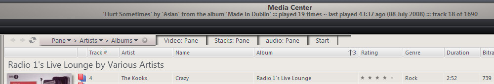
Not quite true. First, witness the default Noire tabs...
Now, there's not a lot in it, but if I was pushed, I'd say the active tab here is lighter than the inactive ones.
So, why are these allegedly easier to target than the current Fly-tabs? I would say that's maybe down to the lines defining the tab edges.
still with me?
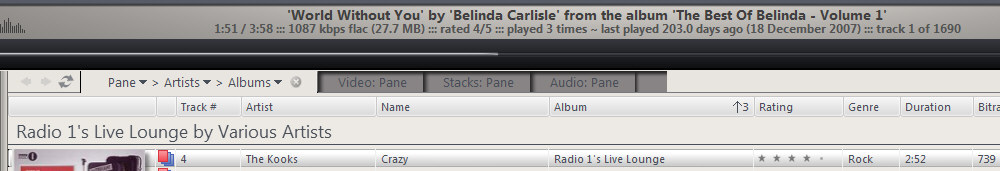
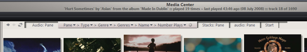
First, MC with no tabs...
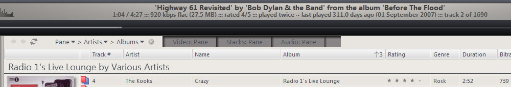
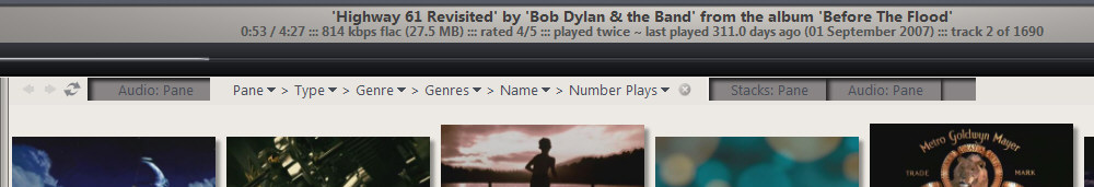
and the current fly tabs...
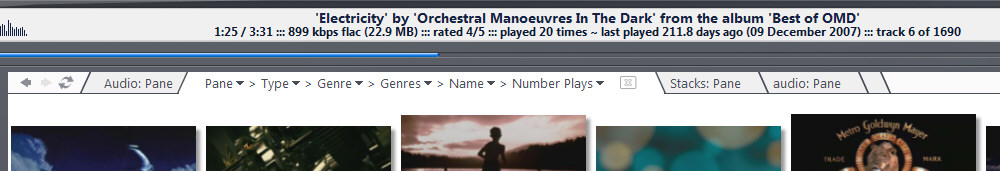
^shows the first tab selected.
^shows second tab selected.
I like to think, especially when compared with 'no tabs', that this view is really quite intuitive. Others don't agree, so, what's the alternative?
Simpy make the inactive tabs darker?
^shows the first tab selected.
^shows the second tab selected.
Maybe add some defining lines?
^shows the first tab selected.

^shows the first tab selected.
I really don't like this.
For kicks, even though I'm not keen, I won't dismiss something without trying it first...
I began messing around with a darker active tab...
How about a 'top-down' tab style?
^shows first tab selected
^shows second tab selected.
I've previewed this post and agree, it's not the easiest to view, but do try to follow it and let me know what you think.
Each varient shows two images, one with the first tab selected, and one with the second selected.
"Top down" is interesting and unique, but I'm not convinced. Using it for a bit to see if it grows on me.


 Author
Topic: Updated 'The Fly' skin... (Read 38576 times)
Author
Topic: Updated 'The Fly' skin... (Read 38576 times)