INTERACT FORUM

Please login or register.

Login with username, password and session length
Advanced search  
Pages: [1] 2   Go Down

Author Topic: A bit of black and blue - a dark skin you might like  (Read 41558 times)

marko

  • MC Beta Team
  • Citizen of the Universe
  • *****
  • Posts: 8932
A bit of black and blue - a dark skin you might like
« on: November 14, 2008, 05:43:53 am »


My aim here was to try and create a skin with elements I quite dislike in a way that I might like them (I was bored, OK)

3 main skin turn-offs for me are dark skins, skins with full width action windows and skins with images for tree backgrounds (there are not many out there because they're hard to do as the background image constantly resizes as the action window expands and collapses)

If you spot anything that's broken or just needing a bit of TLC, please let me know.
Read from here down for current conversation...

Edit: 28/07/2015
I have begun work on trying to get this skin to work correctly with the new scaling/dpi stuff introduced during the MC20 cycle. There is a way to go still, but I think that I have fixed the main UI breaking up when it is moved away from 100%.

Download the attached zip file and extract it somewhere handy. It contains a single mjp file. Double click on that and MC will download and install the skin. When I post an update to the skin, just double click on the same mjp file and it will download and install the updated skin.

Edit: 19/08/2015
I think this is done now...
The whole skin should now scale quite nicely. Some changes have been made, most notably:
  • Background images for the tree, tag window and options windows now tile rather than stretch. I think this works better, but has meant that the "top down" lighting effect in the tree has had to go. This can be put back if it is preferred.
  • The player display window had to be tidied up. I couldn't get the desired effect to scale up without looking awful, so what you see now is the compromise I arrived at.
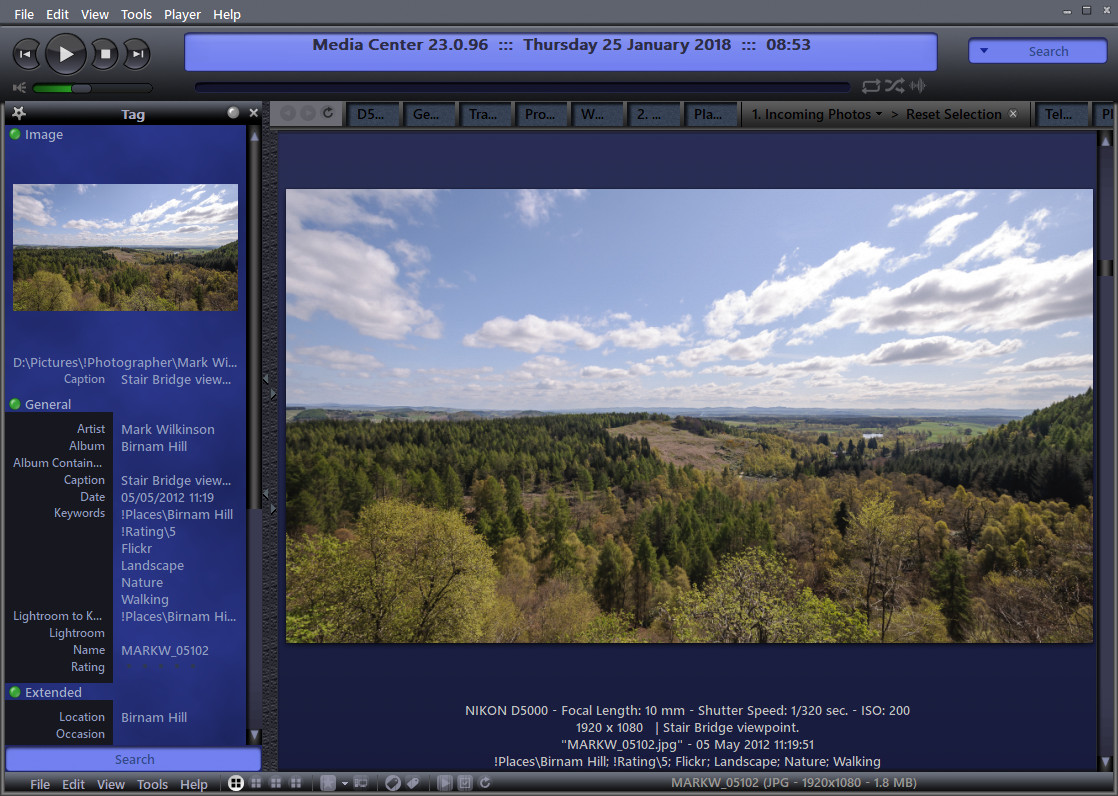
  • The experimental tag window has been skinned, shown in the image in the first post.
  • Scrollbars have been made a tad wider (4 pixels only).
  • Most of the skin has been reworked to fascilitate scaling, resulting in them being tidied up, as the 1:1 originals were hiding a multitude of sins! This has also meant some slight changes to shading and colours in some areas. Overall, scaling issue notwithstanding, I'm happy to call this final. Hope you enjoy the results.
Edit: 18/11/2015
Skin updated to handle the scaling changes introduced in build 21.0.23. This means that if you are using any version of MC earlier than that, the window control buttons (close, minimise, maximise etc.) may be missing or incorrectly placed. If this is a major problem, let me know and I'll try and sort out a backwards compatible xml file.

Edit: 25/01/2018
Tag Window fix along with a bit of a change (because I can't help myself :))
If you don't like it, just let me know and I'll change it back. It's just an xml change so not a lot of work.

Updated (24/11/2019)
Added suitable colours for the new MC 26 waveform progress bar.

Updated (11/06/2022)
Integrity checked xml vs filenames. Skin should now work correctly on Linux.
Added a Spotlight button.
Set the Spotlight page background colour.
Toned down the default button brightness a little to make it less distracting, especially in places such as the 'links' manager.

Edit (04/02/2023):
Updated attached mjp file, which should now work for Linux and Mac as well as Windows.

-marko.

gappie

  • Regular Member
  • Citizen of the Universe
  • *****
  • Posts: 4563
Re: A bit of black and blue - New skin preview
« Reply #1 on: November 14, 2008, 06:15:39 am »

ive been clicking around and must say that i like it a lot, a bit dark isnt it :D. one small thing i was wondering about is: did you left the screenshot used for the skin manager out on purpose?

thanks
 :)
gab
Logged

Magic_Randy

  • MC Beta Team
  • Citizen of the Universe
  • *****
  • Posts: 2348
  • I used to be indecisive, but now I'm not so sure..
Re: A bit of black and blue - New skin preview
« Reply #2 on: November 14, 2008, 09:28:57 am »

Very nice marko. ;D

Everything appears to work just fine. I edit in the details a lot, and sometimes a skin, especially dark skins,  does not handle the colors very well when editing. Your skin works very well very well for this.

I'll continue to work with it.
Logged

rjm

  • Regular Member
  • Citizen of the Universe
  • *****
  • Posts: 2699
Re: A bit of black and blue - New skin preview
« Reply #3 on: November 14, 2008, 09:55:26 am »

Well done marko.

It's the first dark skin that I might use on a regular basis. I think I still prefer a white background  when editing but for play mode your skin is very nice.
Logged

craft

  • Guest
Re: A bit of black and blue - New skin preview
« Reply #4 on: November 14, 2008, 12:33:25 pm »

null
Logged

marko

  • MC Beta Team
  • Citizen of the Universe
  • *****
  • Posts: 8932
Re: A bit of black and blue - New skin preview
« Reply #5 on: November 17, 2008, 01:08:47 am »

Thank you for your replies, I'm glad your enjoying the results.

I may have have found a small problem, or is it just my TV?
I find that when I open the right click menu on my TV screen, none of the menu entries are visible!! I thought maybe it was the pure black colour setting of the text, but it's not that. If I change it to something almost black, such as #000111, it still doesn't display correctly, while a bit of grey, #cecece for example, works just fine on the TV.

Anyone else seeing a virtually empty right click menu on the TV?

-marko

gappie

  • Regular Member
  • Citizen of the Universe
  • *****
  • Posts: 4563
Re: A bit of black and blue - New skin preview
« Reply #6 on: November 17, 2008, 01:44:52 am »

it works here.  :)

Logged

marko

  • MC Beta Team
  • Citizen of the Universe
  • *****
  • Posts: 8932
Re: A bit of black and blue - New skin preview
« Reply #7 on: November 17, 2008, 02:18:08 am »

Cheers gappie, gotta be summat about my TV then. Wierd. I tried to grab a screenshot to show you what I'm seeing (more or less a plain blue menu and not much else) but the captures are just fine when viewed on the PC monitor.

Strange...

Anyone else?

I used to use a DVI > HDMI cable to hook up the TV, but one day, for no good reason, it just plain stopped working, so, since then, I've been using RGB cables. Gforce 8800 GTX card. TV is 1920 x 1080

-marko

marko

  • MC Beta Team
  • Citizen of the Universe
  • *****
  • Posts: 8932
Re: A bit of black and blue - New skin preview
« Reply #8 on: November 19, 2008, 02:59:44 pm »

Well, I've had no joy at all in understanding why the menu contents are invisible on my TV, so I've changed the menu text colour to d0d0d0 as that does display correctly on my TV.

I've updated the download link to include this change.

Apart from that, I've not found anything else amiss, and apparently, neither has anyone else.
I trust that you are all happy with "Black and Blue" and will submit it to the skins pages over the weekend, once I've cooked up a 'skin.jpg' file to go with it ;)

-marko

Magic_Randy

  • MC Beta Team
  • Citizen of the Universe
  • *****
  • Posts: 2348
  • I used to be indecisive, but now I'm not so sure..
Re: A bit of black and blue - New skin preview
« Reply #9 on: November 24, 2008, 10:13:11 pm »

I've been using it for the past 10 days as my default skin.  I like it more and more each day. It kind of grows on you. 8)

Thanks...
Logged

croznest

  • Recent member
  • *
  • Posts: 13
Re: A bit of black and blue - New skin preview
« Reply #10 on: November 24, 2008, 11:45:35 pm »

Nice. This just might become my favorite. 
Logged

phalanthus

  • Galactic Citizen
  • ****
  • Posts: 461
Re: A bit of black and blue - New skin preview
« Reply #11 on: November 25, 2008, 10:43:26 am »

 ;D ;D ;D
well done Marko - nice skin
Logged

marko

  • MC Beta Team
  • Citizen of the Universe
  • *****
  • Posts: 8932
Re: A bit of black and blue - New skin preview
« Reply #12 on: December 09, 2008, 03:17:12 am »

Because they began to bug me...

I've changed the rating stars from black (quite difficult to see) to something closer to the list text:


I've also had another look at the action window...
There were a few pixels showing through at the top of some of the windows, most notably, the main window, the display window and the tag window; the one's most of us probably use the most. That has now been fixed, and the colours have been changed slightly...
Main:


Display:


Tag:


The download link in the first post contains these changes, and this is the skin I've submitted to JRiver.
(there's a skin manager preview image in there too ;))

-marko

HTPC4ME

  • Regular Member
  • Citizen of the Universe
  • *****
  • Posts: 2759
  • LIFE IS A RADIO... CRANK IT UP TO 11!
Re: A bit of black and blue - New skin preview
« Reply #13 on: December 10, 2008, 09:13:44 am »

LOVIN it... ty Marko :)
Logged

Magic_Randy

  • MC Beta Team
  • Citizen of the Universe
  • *****
  • Posts: 2348
  • I used to be indecisive, but now I'm not so sure..
Re: A bit of black and blue - New skin preview
« Reply #14 on: December 10, 2008, 09:26:01 pm »

I've meddled with this enough, I think...
-marko.

I see you are still tweaking almost a month after you had meddled enough ;D

I like it a lot. I now have it as my standard for both MC12 & MC13.

Randy
Logged

marko

  • MC Beta Team
  • Citizen of the Universe
  • *****
  • Posts: 8932
Re: A bit of black and blue - New skin preview
« Reply #15 on: December 11, 2008, 02:23:57 am »

I know, I know :P

The only thing left bugging me now are the two small issues outlined in this post. The deafening silence is telling me that these things are probably hard-coded somewhere and that there's nothing I can do about them.

Apart from those, I really do feel it's finished now... or should that be 'for now'... nah, seriously, it's finished, and submitted.
Thanks for the feedback, I'm glad you're enjoying the results.

-marko.

BenRad

  • Recent member
  • *
  • Posts: 19
Re: A bit of black and blue - New skin preview
« Reply #16 on: December 11, 2008, 10:53:51 am »

Very nice...I'm a fan already.
Logged

fidelio

  • Regular Member
  • Recent member
  • *
  • Posts: 38
  • Change this by choosing profile
Re: A bit of black and blue - New skin preview
« Reply #17 on: December 11, 2008, 03:24:41 pm »

I love it.

I changed the font and size slightly, to obtain better readability (e.g. text below pictures).

Thank you so much!
Logged

AoXoMoXoA

  • Regular Member
  • Citizen of the Universe
  • *****
  • Posts: 1551
  • I am a kangaroo . . . . no, really!
Re: A bit of black and blue - New skin preview
« Reply #18 on: December 11, 2008, 03:41:48 pm »

wow, very nice skin! 
I really like the textures on the crossbars
Logged
. . . the game is rigged

Magic_Randy

  • MC Beta Team
  • Citizen of the Universe
  • *****
  • Posts: 2348
  • I used to be indecisive, but now I'm not so sure..
Re: A bit of black and blue - New skin preview
« Reply #19 on: December 24, 2008, 11:54:04 pm »

marco, what Track Info skin would you recommend to go with this skin?

Thanks...
Logged

kurushi

  • Citizen of the Universe
  • *****
  • Posts: 683
Re: A bit of black and blue - New skin preview
« Reply #20 on: November 27, 2009, 03:18:37 am »

I really love the buttons on this skin.
But the leather texture on the handle is not my taste.
One of my prefered!
Good Job!
Logged

marko

  • MC Beta Team
  • Citizen of the Universe
  • *****
  • Posts: 8932
Re: A bit of black and blue - New skin preview
« Reply #21 on: November 27, 2009, 05:31:46 am »

kurushi, thank you for taking the time to post. It's appreciated, and I'm glad you're enjoying the results.

At the other end of the spectrum completely, I created a skin called Seamless.
I've never submitted this skin because I have a strong feeling that depending on other peoples' LCD monitor settings, not everyone will see the same things I do. There is a suggestion there that this could be down to my choice of colours, but I'm not sure, and until I am, it won't get submitted.

Getting back to "Black and Blue"...
A while back, I was asked if I could change the progress bar from dark blue to bright yellow, to help track progress when being used in a darkened room. If anyone else would like a yellow progress bar, I've attached the two files required to this post (login to access). Save the zip file then extract the contents into the skin folder, replacing the existing files.

Magic_Randy, talk about a delayed response!!! I do apologise, but I totally missed your post. I can't really offer any suggestions either as track info's are not something I use, sorry.
Anyone else out there found a track info that works well with this skin?

-marko

Magic_Randy

  • MC Beta Team
  • Citizen of the Universe
  • *****
  • Posts: 2348
  • I used to be indecisive, but now I'm not so sure..
Re: A bit of black and blue - New skin preview
« Reply #22 on: November 27, 2009, 10:33:02 am »

marko,

Your skin is my default. Thanks...

I found a couple Track Info skins that that kind of work, but they are not a perfect match. Suggestions by the group are welcome. I've been switching off between WishYou and NSF.

Randy
Logged

kurushi

  • Citizen of the Universe
  • *****
  • Posts: 683
Re: A bit of black and blue - New skin preview
« Reply #23 on: November 27, 2009, 04:15:26 pm »

The yellow looks good but too bright for me.I prefer the default.
Logged

marko

  • MC Beta Team
  • Citizen of the Universe
  • *****
  • Posts: 8932
Re: A bit of black and blue - New skin preview
« Reply #24 on: June 24, 2010, 05:07:27 am »

Today, I got around to making a "quick find" toolbar more fitting with the rest of this skin. See my "Edit" and attachment in the first post if you are interested.

Edit 29/07/2015:
Skin is under reconstruction. The current version can always be installed by double clicking the mjp file attached to the first post.

Regards,
-marko

Fabricio

  • Citizen of the Universe
  • *****
  • Posts: 685
  • No one has patience with me.
Re: A bit of black and blue - New skin preview
« Reply #25 on: August 30, 2010, 12:51:09 pm »

Today, I got around to making a "quick find" toolbar more fitting with the rest of this skin. See my "Edit" and attachment in the first post if you are interested.

Regards,
-marko

Very good. I like. "ctrl+Q" and "F3", too. Bye ...

marko

  • MC Beta Team
  • Citizen of the Universe
  • *****
  • Posts: 8932
Re: A bit of black and blue - a dark skin you might like
« Reply #26 on: August 30, 2010, 01:22:09 pm »

You're welcome. I've just added a replacement pause button to the first post too. Looks better when playing last.fm radio now.

-marko

lostvibrations

  • World Citizen
  • ***
  • Posts: 120
Re: A bit of black and blue - a dark skin you might like
« Reply #27 on: September 04, 2010, 05:32:29 am »

Just tried to install this skin on MC15, but after the "working" dialogue disappears, the skin does not appear in the skin list, even on restart.
Logged

marko

  • MC Beta Team
  • Citizen of the Universe
  • *****
  • Posts: 8932
Re: A bit of black and blue - a dark skin you might like
« Reply #28 on: September 04, 2010, 06:37:21 am »

I just tried the download link from the skins and accessories page and the package installer showed "working" followed by "downloading" and the skin was automatically applied.
Do other skin downloads from the accessories pages work for you?
I wonder if you have security software or windows permissions getting in the way of the process?

[direct download removed]

-marko.

Alex B

  • MC Beta Team
  • Citizen of the Universe
  • *****
  • Posts: 10121
  • The Cosmic Bird
Re: A bit of black and blue - a dark skin you might like
« Reply #29 on: September 04, 2010, 07:36:26 am »

... extract the enclosed folder to "C:\Program Files\J River\Media Center 15\Skins\Standard View\"

- actually to the "Standard View" subfolder in your MC15 program path, wherever it happens to be. For instance, C:\Program Files (x86)\J River\Media Center 15\Skins\Standard View\
Logged
The Cosmic Bird - a triple merger of galaxies: http://eso.org/public/news/eso0755

lostvibrations

  • World Citizen
  • ***
  • Posts: 120
Re: A bit of black and blue - a dark skin you might like
« Reply #30 on: September 04, 2010, 09:22:28 am »

Thanks, doing it manually seemed to do the trick! :)

Nice skin too! I'm running it at a resolution of 1920x1200. Some possible requests:

- The current file details at the top of the screen are very small, making it a bit difficult to read

But the skin has highlighted one problem; an annoying dead pixel right in the middle of my screen!!

:p
Logged

marko

  • MC Beta Team
  • Citizen of the Universe
  • *****
  • Posts: 8932
Re: A bit of black and blue - a dark skin you might like
« Reply #31 on: September 15, 2010, 12:59:13 pm »

Pleased to hear you're up and running.

I've added a group header graphic for grouped lists and amended the first post.

Comments welcome.
-marko

marko

  • MC Beta Team
  • Citizen of the Universe
  • *****
  • Posts: 8932
Re: A bit of black and blue - a dark skin you might like
« Reply #32 on: July 28, 2015, 01:41:41 am »

Here you go Captor, read the "Edit" and get the download from the first post.
I will be tweaking over the next few weeks, updating some of the graphics that don't scale too well, but think that this might be useable for you at the moment. Please let me know of any issues as you come across them and I will attempt to focus on those first.

marko

  • MC Beta Team
  • Citizen of the Universe
  • *****
  • Posts: 8932
Re: A bit of black and blue - a dark skin you might like
« Reply #33 on: July 29, 2015, 03:04:40 pm »

Evening Captor,

How did this go for you?

Is there anyone out there running a high DPI/Retina setup willing to look at this for me?

I reckon I'm a day or two away from having the top player bar all scaled up, and am looking for someone to try the skin as it is now, and confirm that it looks a bit blurry and obviously scaled up, and then hopefully, try the upcoming update and confirm that it looks great now!

Any takers?

marko

  • MC Beta Team
  • Citizen of the Universe
  • *****
  • Posts: 8932
Re: A bit of black and blue - a dark skin you might like
« Reply #34 on: August 02, 2015, 07:22:50 am »

Nobody?

Player bar is done and an updated skin has been uploaded. Double click the mjp file to get the update.

This is not quite as straight forward as I imagined and has required that some of the skin be udated. Changes are hopefully subtle enough not to upset anyone.

There is quite a bit to do still, but I think I will stop until I get some feedback, positive or negative, as I have no idea if this is working for those high DPI/Retina users and it would be pointless wasting time doing it all wrong...

Attached is how the Player Bar looks for me at 300% MC size setting...

Captor

  • Citizen of the Universe
  • *****
  • Posts: 506
Re: A bit of black and blue - a dark skin you might like
« Reply #35 on: August 02, 2015, 07:38:13 am »

Hello again Marko


It looks like that the previous attached file I sent was the new uppdated. Your last post came at the same time when I was sending my post :-)

It looks very good! You are saying that you are working with the skin still. Can I have a which? I donīt know if others have the same whish but I can mention it anyway ant then you can consider.
It is about the scrollbar to the right. I would be happy if that was more wide (more thick). It would be more easy to find it with the mouse cursor. Maybe you could take away the small frame on left, reight and bottom and use the right frame space for widening the scroll bar? Maybe the left to.
But, hey! I am very happy with your effort to fix this original problem so donīt think to much about that whish. It is not important. Life is smiling at me again  :D
So do you think this skin will work with MC 21 now?
B.R.
Captor
Logged
JRiver for music

marko

  • MC Beta Team
  • Citizen of the Universe
  • *****
  • Posts: 8932
Re: A bit of black and blue - a dark skin you might like
« Reply #36 on: August 02, 2015, 07:56:05 am »

It should work with MC21, yes. It should also work with the latest MC20 builds.

I'm pleased to hear we are making some progress. If what I am doing is working as expected, the next step is to work on things like the scroll bars and splitter bars. If I cannot prevent MC from scaling up the edges, I may need to remove them altogether, which would be a shame as removing the edge around the left, bottom and right would change the skin quite dramatically.

RE: Scroll bars.
What I will do is set them up for scaling as they are now, which may be enough to make them suitably larger for you. I'll post back here when that is done, and if you still need them wider, you can let me know and I'll try and take care of it.

JimH

  • Administrator
  • Citizen of the Universe
  • *****
  • Posts: 71294
  • Where did I put my teeth?
Re: A bit of black and blue - a dark skin you might like
« Reply #37 on: August 02, 2015, 08:05:26 am »

There is an option under the Tree & View menu for "Enlarge Scrollbars on Mouse Over".  I believe it requires support in the skin itself, but I'm not sure.  It works with Noire.
Logged

Captor

  • Citizen of the Universe
  • *****
  • Posts: 506
Re: A bit of black and blue - a dark skin you might like
« Reply #38 on: August 02, 2015, 08:09:14 am »

Dear Marko
Thank you very much! The scroolbar has always been a little bit narrow so it is difficult to hit with the cursor.
You have to look there when you do it. The best had be if not need to look. Just hit the mouse to the right and there it is on the scroolbar. That requires to take away the frame though.
But forget it. It is not important. And what you are saying about that the skin will look significant not as nice as now is a good reason to donīt do anything about that. I am sure you have already tryed out several different designs when you designed this skin in the first place.

By the way, I have read that you also have designed other skins. Were are they to be found? I donīt want to change  ;) but just curious..

B.R.
Captor
Logged
JRiver for music

Captor

  • Citizen of the Universe
  • *****
  • Posts: 506
Re: A bit of black and blue - a dark skin you might like
« Reply #39 on: August 02, 2015, 08:21:47 am »

Jim and Marko

It works Jim. So I guess it is supported in the skin. Very nice!
However, still need to aim on the scroolbar becuase of the frame when draging the mouse to the right side.
I will try this enlarging option for a while. Maybe just need to get use to it. Thanks!

B.R.
Captor
Logged
JRiver for music

marko

  • MC Beta Team
  • Citizen of the Universe
  • *****
  • Posts: 8932
Re: A bit of black and blue - a dark skin you might like
« Reply #40 on: August 02, 2015, 08:56:23 am »

I am struggling with a scaling problem on the left and right program borders at the moment. Hoping that I can get it figured out without having to remove them altogether. The scrollbars are independent of these. I'll let you know when I get at them.

By the way, I have read that you also have designed other skins. Were are they to be found? I donīt want to change  ;) but just curious..
See here: http://yabb.jriver.com/interact/index.php?topic=15326.msg379344#msg379344
Bear in mind that none of these support scaling at the moment. I am still learning how to use it appropriately, and Black and Blue, when finished, will be the first of my skins to fully utilise it.

Captor

  • Citizen of the Universe
  • *****
  • Posts: 506
Re: A bit of black and blue - a dark skin you might like
« Reply #41 on: August 02, 2015, 01:55:48 pm »

Dear Marko

OK, thank you very much.
You have another Black and Blue too. Interesting. I will check that out later when you have fixed that as well. Also Arctic looks nice.
It is nice with dark skin becuase the album arts looks much better with a dark background.
It is same with photos. I use ACDSee and have changed background color to be black. The pics looks much better.

B.R.
Captor
Logged
JRiver for music

marko

  • MC Beta Team
  • Citizen of the Universe
  • *****
  • Posts: 8932
Re: A bit of black and blue - a dark skin you might like
« Reply #42 on: August 07, 2015, 11:45:15 am »

Work from the last few days has been posted. Double click the mjp file to get the update.

I've added four pixels to the width of the scroll bars. Hopefully, that's enough.

Most of the 'forward facing' stuff is done now. Just a little bit of work left to do in the action window area.
Once that's done, I'll move on to the options screens.

I originally posted this skin back in 2008. Closer inspection brought on with all this scaling stuff revealed some pretty rough edges that required smoothing out, resulting in some of the stuff having to be completely redone from scratch. This means that the skin will change, unavoidably, but quite subtly, from it's 2008 original.

-marko

William-NM

  • World Citizen
  • ***
  • Posts: 115
Re: A bit of black and blue - a dark skin you might like
« Reply #43 on: August 07, 2015, 01:55:29 pm »

Thank You, marko, she's a beauty! I haven't noticed any issues [Win10, MC21, 32" 1920x1080p]. I appreciate your attention to detail and enjoyed finding this skin that I had previously missed. Nice to get  a glimpse of your 'dark side',  ;)
I also enjoy your other skins, esp. Knit-Knots.
William
Logged

marko

  • MC Beta Team
  • Citizen of the Universe
  • *****
  • Posts: 8932
Re: A bit of black and blue - a dark skin you might like
« Reply #44 on: August 08, 2015, 03:37:10 am »

Thanks William.

Did you keep the Knit-Knots player bar with cut-outs that the new stretchy search bar kind of broke, or did you update with the new one?

I think I kind of broke the rating stars in Black and Blue with this update. They look OK until you select a line in the list... then they become almost psychadelic! I'll get that fixed in the next update. Things will pause here for a short time though while I get upgraded to MC21...

Captor

  • Citizen of the Universe
  • *****
  • Posts: 506
Re: A bit of black and blue - a dark skin you might like
« Reply #45 on: August 08, 2015, 09:40:11 am »

Dear Marko
I have downloaded it now and it looks very good. And also I have (Since lasr update of the skin) I have initiated the Widen scroolbar when put the cursor on it. And it looks great.
William: Yes, isnīt she?! A beauty. I agree with that.
Thanks Marko!
Logged
JRiver for music

William-NM

  • World Citizen
  • ***
  • Posts: 115
Re: A bit of black and blue - a dark skin you might like
« Reply #46 on: August 08, 2015, 12:33:17 pm »

Hmmmm, I'm not sure if this is the new Knit-Knots or the old one??  The rating stars on Black and Blue aren't too wild... or am I behind a version on that one, too? (The story of my life, heh). In any case, I sure appreciate you 'skinners' - they add so much to the experience and I know how much time and thought goes into their creation.
Logged

marko

  • MC Beta Team
  • Citizen of the Universe
  • *****
  • Posts: 8932
Re: A bit of black and blue - a dark skin you might like
« Reply #47 on: August 13, 2015, 02:01:35 pm »

I'll get back to you about Knit-Knots, that doesn't look right at all, the buttons should not be that way.

A new Black and Blue has been uploaded.

Rating stars are a lot better now.
Some changes to edit/combo boxes. (feedback, or forever hold your peace :))
Some slight shading changes in many places.

The skin is almost completely scaled now. Just sliders and up/down buttons to do I think.

The "options" frame is impossible to scale correctly with the current skinning engine as it is doing weird stuff with the margins. I am still thinking about this, may ask for opinions before finalising.
Until then, check out the latest changes and let me know if I broke anything or you want something changed back...

-marko.

Captor

  • Citizen of the Universe
  • *****
  • Posts: 506
Re: A bit of black and blue - a dark skin you might like
« Reply #48 on: August 15, 2015, 04:57:00 am »

Dear Marko
I have tried it today and it looks very good to me. You did not broke anything :-)
And the options fram looked good as well in my eyes. There was some changes in the audio input though. Suddenly it was my surround receiver that was default. I think that had nothing to do with the skin. Maybe I by accident change that before. Anyway, easy to change back to the audio receiver.
Logged
JRiver for music

William-NM

  • World Citizen
  • ***
  • Posts: 115
Re: A bit of black and blue - a dark skin you might like
« Reply #49 on: August 15, 2015, 10:04:03 pm »

Hi, Marko
I did a reinstall of Knit-Knots and applied the new playerbar files. I think it looks as intended now. I'm quite fond of it, anyhow.  :)
Black and Blue is also looking very polished and professional these days, no issues on my system.
Thanks for the awesome skins, they make me feel good all day long, heh.
William
Logged
Pages: [1] 2   Go Up